Fri 20 Sep
2013
Origins of the Trapper Keeper
I feel like I’ve just been relieved of a tremendous burden I never knew that I had. For serious, I am so happy to learn the story of how Trapper Keepers came to be. For those who did not grow up with them as a coveted school supply:’;
“Launched in 1978 by the Mead Corporation (which was acquired by ACCO Brands in 2012), Trapper Keeper notebooks are brightly colored three-ring binders that hold folders called Trappers and close with a flap. From the start, they were an enormous success: For several years after their nationwide release, Mead sold over US$100 million of the folders and notebooks a year. To date, some 75 million Trapper Keepers have flown off store shelves.”
Read the whole story ̵ which I admit is somewhat unremarkable, but which I savored word for word nevertheless — at Mental Floss. Via Digg.
Thu 19 Sep
2013
The Pleasure of Tiny Things
Artist Diem Chau carves miniature sculptures on the tips of writing implements.

Gary Hustwit’s “The Complete Interviews”
Hustwit is the director of three already classic documentaries about design: “Helvetica,” “Objectified,” and “Urbanized.” For each, he scored copious interviews with design luminaries, including:
“Paola Antonelli, Alejandro Aravena, Chris Bangle, Michael Bierut, Ronan and Erwan Bouroullec, Neville Brody, Tim Brown, David Carson, Matthew Carter, Candy Chang, Yung Ho Chang, Wim Crouwel, Ellen Dunham-Jones, Tobias Frere-Jones, Experimental Jetset, Dan Formosa, Sir Norman Foster, Naoto Fukasawa, Jan Gehl, Jonathan Hoefler, Jonathan Ive, Hella Jongerius, Bruce Katz, David Kelley, Rem Koolhaas, Rahul Mehrotra, Bill Moggridge, Marc Newson, Oscar Niemeyer, Enrique Peñalosa, Michael C. Place, Rick Poynor, Dieter Rams, Karim Rashid, Alice Rawsthorn, Stefan Sagmeister, Paula Scher, Erik Spiekerman, Davin Stowell, Jane Fulton Suri, Massimo Vignelli, Rob Walker, Hermann Zapf, and many more… over 75 of the world’s most creative and innovative people. ”
Because of the constraints of documentary film length, his movies only include a small fraction of the wisdom conferred in those interviews. Hustwit is now raising money via Kickstarter to turn the interviews in a book.
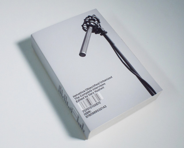
The final product will be a “high-quality paperback, approximately 400 to 500 pages long,” and is being designed by Michael C. Place. Find out more and back the project at Kickstarter.
Wed 18 Sep
2013
Spy Cameras of the Stasi
Highly entertaining images captured from The Stasi Museum, which immortalizes the paraphernalia and tradecraft of East Germany’s infamous state security apparatus. These shots highlight the Cold War era’s infatuation with hidden cameras, like the one below, with its lens disguised as a coat button, allowing the camera itself to be concealed under the garment.
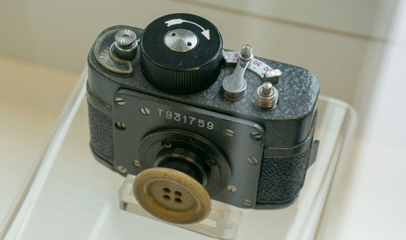
Other examples include cameras hidden in tree trunks, watering cans and of course brief cases — straight up Sean Connery style. See the images here.
Tue 17 Sep
2013
Introducing Facebox
Remarks (5)
Today my friend Matt and I are releasing Facebox, a pack of fifty, rights-cleared stock photos of real people for user interface design and business presentations. For a limited time, you can buy the pack for just US$25.
![]()
So how would you use Facebox? Let’s say you’re designing any digital product in which the concept of users needs to be represented — in comment threads, on profile pages, in activity streams, etc. Whether you’re working in Photoshop or Sketch or right in HTML, sooner or later you need photos of hypothetical users to stand in for the real users who will eventually interact with your product.
Or let’s say you’re working on a PowerPoint deck in which you’re showing user personas or user flows, or maybe even revealing a new strategy that will bring huge numbers of new patrons to your business. For any of these purposes, you might need pictures of hypothetical customers to stand in for the real customers to come.
As a designer, I come across these situations all the time. What I used to do was go to Twitter or Facebook and grab the avatars of my friends. That has its drawbacks: it’s laborious, the avatars are usually of insufficient resolution to be used at any larger size, and they’re not always suitable for presentations. Worse, it’s not exactly legal.
This is the problem that Facebox solves. It provides a rights-cleared, ready-to-use repository of fifty real people — not stagey-looking models, but the kind of people you’d run into on any street corner, and whom you could easily imagine using just about any digital product.
The pack includes all fifty faces as PNGs or JPEGs you can start using immediately. We’ve also imported all fifty into PowerPoint, Keynote, OmniGraffle (as a symbol library) and Sketch, too. We’re also including the original Photoshop file, fully set up with Smart Objects, so you can change the crop shape (several options are included, e.g., circle, rounded rectangle, star, etc.) in just a few clicks, and export at any size that suits you.
All of that for less than the price of one stock photo. Buy Facebox today.
Fri 13 Sep
2013
Into the Arctic
“Have you ever felt like being alone in the world, without communications and the comfort of our daily life? Well I have a word for you, the Arctic.”

Photographer Jonathan Björklund took these breathtaking photos of the Arctic. They are consistent with the Arctic you see in your imagination, but unexpectedly more colorful, and about a hundred times more majestic. See all the photos here.
Thu 12 Sep
2013
Phonebloks
This is a crowdfunding proposal to build a new kind of user-upgradeable phone made of modular parts. The concept lets the user swap out components as necessary, so if you feel like you want a faster processor or a better camera or a bigger battery, you can just pop out the old one and replace it with a new one. Similarly, if a single part breaks — like, say, the screen — just that part can be replaced, saving you the pain of having to toss out the whole unit or buy an entirely new one.

The video is incredibly well done and very compelling, though it does seem like an idea that’s too good to be true. I know very little about industrial design but it strikes me that there’s a certain naïveté to the idea that a commercially and technologically viable phone can be made from a fully modularized, endlessly reconfigurable system of parts. Then again, maybe we’re at a stage in technology where a little bit of naïveté or audaciousness is all that’s necessary to build something truly amazing. If the Phonebloks team can do it, it will certainly be that. Watch the full video.
Why Mobile ROI Is So Hard
Ameet Ranadive, product manager at Twitter, dives into the conspicuous gap between consumer time spent on mobile devices and ad spending on mobile devices. In short, ad spending lags consumer attention, and mobile usage and behavior are the reason why. These are hard problems but they’re solvable — and they represent a tremendous opportunity. Full article here.
Wed 11 Sep
2013
Passing Around Passwords
Remarks (3)
My devotion to and affection for Agile Bits’ 1Password has been continual and unabated since I first started using this indispensable security utility several years ago. I rely on it many, many times a day, across several different devices, and it never lets me down. In fact, though I ostensibly use it to remember and generate passwords, I’m fond of saying that the real reason I use 1Password is so that I can tell other people how awesome 1Password is.
Yet 1Password is for the individual use case. It’s not so helpful for situations when passwords need to be shared by more than one person, in teams.
There are a few would be contenders trying to solve that problem by turning password management into a cloud service. Earlier tonight I tried Mitro. They have an attractively designed Web page but I found the product itself pretty lacking — it looks like it’s not even finished. To that point, Mitro currently ships only with an extension for Google Chrome, at least for now. I actively use three desktop browsers and at least two mobile browsers, and 1Password covers almost all of these scenarios — anything less is a tough pill to swallow.
To the Mitro’s credit, when I emailed the company about their missing browser extensions, someone got back to me right away, within minutes. Then again, when I sent a follow-up query, it went unanswered.
Compare that with competitor TeamPassword, whose founder and CEO Brian Sierakowski both emailed me and instant messaged me almost as soon as I signed up. Brian was super-friendly and helpful, and he promises that the TeamPassword solution is much closer to ‘1Password but for teams’ than Mitro’s, which is enticing. Still, I hit some snags in the login process, and while Brian is working with me to get them sorted, I have yet to get access to TeamPassword.
I also heard from members of the founding teams of both SimpleSafe and Meldium, which seem to do similar things. Unfortunately, I haven’t had a chance to try either of them out.
Obviously, this is a problem that a lot of people are thinking about actively, which makes me happy in spite of the unimpressive results so far. Even Agile Bits is working on this problem; the current iOS versions of 1Password incorporate a workflow for sharing passwords, and the Mac version will have the same soon, as the company details in this blog post. Their approach is similar to the one that LastPass uses, from what I understand. That is, they offer a means to send a password, but not a channel for doing so; there’s no cloud service attached to 1Password’s sharing mechanism. That’s a little disappointing, but in the end, it may be sufficient for what I need, because at the very least it will let me keep telling everyone I use 1Password.
Tue 10 Sep
2013
The Noun Project
Add Remarks
I find myself more and more impressed all the time by The Noun Project, the online resource for crowdsourced pictograms. Its goal is to build “a global visual language that everyone can understand” and “to enable our users to visually communicate anything to anyone.”
When I first became acquainted with The Noun Project several years ago I thought that mission statement meant that the site intended to flesh out the commonly used ISO graphical symbols that we see so often in public signage, extrapolating what amounts to a widely understood visual glossary into a full pictorial lexicon. Basically, I thought they were going to build a whole world around Helvetica man.
Mon 09 Sep
2013
Cards Are the Future of the Web
This post by startup Intercom is a little self-serving, but it does hit the nail on the head for something that is happening right now: a fundamental shift towards a new interface paradigm based on cards, or compact, specialized, focused units of mobile-optimized functionality. To its credit, Google has been talking about this for some time, and others are starting to concur. In my view, cards could very well be what the mobile web is supposed to look like. Read more here.
Thu 05 Sep
2013
The Booth
Photographer and friend Joseph Holmes project “The Booth” captures the dying days of film projection with these beautiful portraits of the people who run the projectors and the hidden rooms that house them.

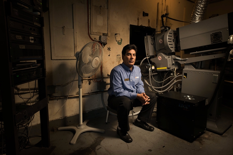

You can view the entire series online, but starting in October and running until early February, you can see prints in person at The Museum of the Moving Image in Astoria, New York.
Wed 04 Sep
2013
Survata Tests Yahoo’s 30 Logos
This is the kind of nonsense that results from fundamentally misunderstanding what a logo is. As has been widely reported (and lamented by designers), Yahoo engaged in a bit of stunt identity design over the past month or so, fielding thirty re-imaginings of the company’s logo, one per day, You can see the first twenty-nine on this page, and when it loads in your browser, don’t feel bad if you think for a moment that you’ve stumbled across one of those sites that promises you hundreds of fonts for free — most of these logos are half-hearted at best.
To Yahoo’s credit, they did not put the logos forward as candidates, i.e., they refrained from asking the Internet to vote on them. That didn’t stop market research startup Survata from doing just that, though.
“We were curious about which logo consumers preferred as the best fit for the Internet giant, so we used the Survata logo testing tool to find out. We asked 12,725 respondents to pick their favorite of five logo variants (randomly selected from the 28 variants released prior to publication).”
Just skimming the results they’ve published on the Survata blog demonstrates the absurdity of both their own research and the fact that Yahoo put these logos out into the world. This “face-off chart” in particular has all the charm of pulling out a spreadsheet on a date.
A logo is really a visual manifestation of all the complex ideas, values and people that fuel a company — crunched and munged and somehow blacksmithed together to look simple and understandable. It does nothing for one’s confidence in the Yahoo brand to see that the company cares so little for its public image that it would be willing to float thirty random, meaningless expressions of itself out there, expressions that have clearly not been through the real process of logo development. It just looks like Yahoo doesn’t take this seriously.
Imagine that I threw four wheels and a mess of auto parts together, with no regard to how they actually function or work as a single machine, and said, “What do you think of this car?” Actually it’s as if I did that thirty times. And then someone came along and asked 12,000 people to vote on their favorite pile of wheels and auto parts. What good could come of that?
Feast on Yahoo’s thirty or so logos here, and read the Survata report here. Also, if you’re a company in the market for a new logo, please don’t follow these examples.
Tue 03 Sep
2013
Designing Fictional Interfaces
Jayse Hansen designs imaginary interfaces for Hollywood movies. His credits include “The Avengers” and “Rise of the Planet of the Apes.” In this interview, Hansen talks about how he came to specialize in FUIs (fictional user interfaces)”; “Star Wars” was an early influence, but I was happy to see him mention being influenced by K.I.T.T.’s then-fantastical dashboard in “Knight Rider” too. He also discusses his process, and how his work is an offbeat mix of interface design, motion design, research, staging, animation and client service. Great stuff. Full article here.
Mon 02 Sep
2013
Sketch 2.3
Sketch, which I now use for the majority of my design work, has a new version out today. It still lacks the feature that I want most — symbols/smart objects — but there are lots of promising improvements nevertheless.
Two of the biggest are integration with Sketch Mirror, a new iOS companion app that lets you preview your Sketch documents in real time, and background blur, which as the name suggests renders a Gaussian blur-like effect on anything directly beneath a shape set with this property.
In this example, the right half of the coffee cup image is obscured by a yellow rectangle set to 7% opacity, with a 10 pixel background blur. The blurring effect updates immediately when images below are moved on the canvas. Just in time for iOS 7, people.

(Image courtesy of Unsplash.)
More on the update here. By the way, while writing this post I just noticed that Bohemian Coding, the publishers of Sketch, cite an interview I did with .Net Magazine praising Sketch right on the app’s marketing page. Just to be clear, I am in no way associated with Bohemian Coding.
Sat 31 Aug
2013
Lou Reed Acoustic Demos from 1970
“In August of 1970 Lou Reed quit The Velvet Underground. This decision was followed by a severe mental breakdown and two long years of regret and isolation… These demos were recorded during the fall and winter of 1970. They reflect Lou at his lowest point. He didn’t make any more live appearances that year after leaving The Velvet Underground. The only thing he recorded were these twelve tracks. They are the first known recordings of Lou Reed as a solo artist.”
Fri 30 Aug
2013
Kazuki Umezawa
Twenty-eight-year old Japanese artist Kazuki Umezawa assembles digital collages from imagery he encounters online.
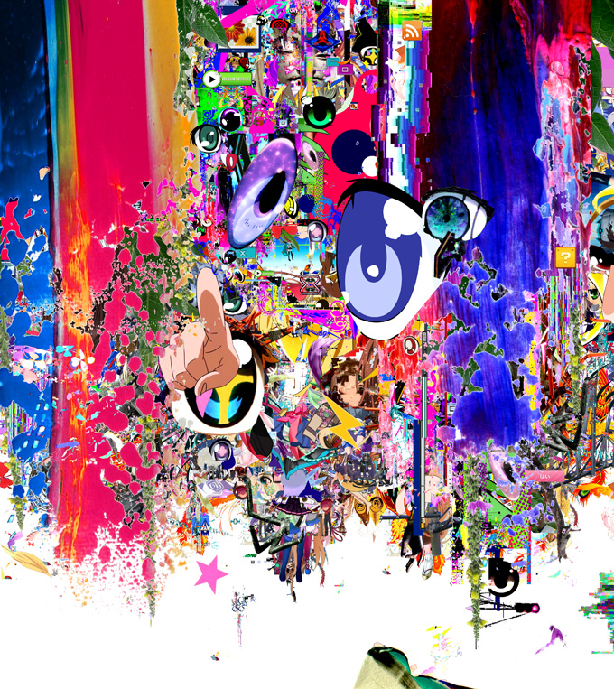
Nice enough stuff but not much better than lots of the stuff that used to be done in Mixel on iPad. Sniff. More on Umezawa’s work at Spoon & Tamago.
Thu 29 Aug
2013
Long Live the King
Remarks (1)
Jack Kirby, the legendary artist, writer, and so-called “King of Comics,” would have turned ninety-six this week. Though he built one of the most vaunted bodies of work in the industry, there are still plenty of folks outside of comics fandom who have at best only a passing idea of who he was or why he is so revered — even if they’ve paid out of their own pockets many times for the movies, toys, books and countless other forms of paraphernalia that have been adapted from his many, many creations.
Thankfully, there are lots of points of entry for those curious about the man and his work. Here are just a few off the top of my head.
Over at The A.V. Club yesterday they ran a very helpful beginners’ guide to Kirby’s career, which is relatively brief but still comprehensive. This is a good place to start, as is the Web site for The Jack Kirby Museum & Research Center, which is currently virtual-only but has ambitions to “manifest itself in the physical realm.”
A few years ago I picked up a copy of Mark Evanier’s beautiful, oversized hardcover monograph “Kirby: King of Comics” from a Barnes & Noble bargain bin. It’s a brisk, engaging read and a visual delight. Kirby drew in a style designed to deliver a maximum of drama within each of the many panels on a page. He could get a whollop out of just a few square inches, but in this book’s huge reproductions, his work is practically explosive. It’s a beautiful way to pore over the artist’s very particular way with scale, composition, line, depth, and human anatomy.
Finally, for those curious about Kirby’s somewhat tortured role in the evolution of the American comic book industry, I highly recommend Sean Howe’s “Marvel: the Untold Story,” an account of the business and editorial side of the company that was the platform for Kirby’s greatest run of work. It’s essentially the secret origin for this huge strain of pop culture, tracing the emergence of comics from seedy, early-20th Century publishing, through their initial golden age in the late 1930s and 1940s, their rebirth in the late 1950s and 1960s, and on to the industry’s lurching growth through the ensuing decades.
Tue 27 Aug
2013
Climate Name Change
A petition to the World Meteorological Organization to switch away from naming extreme storms after normal people, e.g., Katrina, Sandy, Andrew, and instead name them after climate change deniers like Rick Perry, Michelle Bachmann and Marco Rubio.
“Since 1954, the World Meteorological Organization has been naming extreme storms after people. As scientific evidence shows that climate change is creating increasingly frequent and devastating storms, and with climate scientists declaring these extreme weather events as the new normal, we propose a new naming system. A system that names extreme storms caused by climate change after the policy makers who deny climate change and obstruct climate policy.”
The proposal is of course meant to provoke a laugh, but the accompanying video is surprisingly well made. Watch it and read more at Climatenamechange.org.
Coming Soon: Facebox
Remarks (9)
My friend Matt and I spent a few days earlier this week working on a new side project. It’s called Facebox and it’s almost ready. Starting today if you sign up for the launch at Facebox.io, we’ll give you a discount on the debut pricing too.
Technically Facebox will live on the Internet, but part of its appeal to us was that it was a project that would let us get up from our desks and get into the real world. In fact, it practically required us to walk all over New York City in order to get it done. We lucked out; the weather around here has been unseasonably, almost unconscionably pleasant for August.
So what is Facebox? I’m not going to explain too much about it now except to say that it’s built for designers. It’s also decidedly not huge or world-changing in any respect; it’s small and specific, focused on a relatively minor problem that nevertheless plagues designers everywhere. It’s one of those things that Matt and I have both found ourselves wanting many times, but we never found that anyone had bothered to build it, so we decided to do it ourselves. Anyway, you’ll find out when it launches, which should be in just a week or two. For now, sign up to hear about the launch.
Mon 26 Aug
2013
Square v. Portrait
Remarks (7)
This photo I put on on Instagram last week turned out to be one of my more liked posts.

Though I’m a sporadic Instagram user, I think it’s an amazing product. Their early selection of the square photo format was a genius response to the constraints of the camera phone and a spot on insight into how to simplify photo composition for a mass audience.
All the same, I often lament the success of the Instagram square. Rectangles just make pictorial storytelling more interesting. Here’s how I would have cropped the same image in a portrait-oriented frame. (I had to recreate the vintage effects, so they don’t match the photo above perfectly.)

I’m not arguing that Instagram should allow portrait images. I’m just saying the world is more interesting than just squares.
Fri 23 Aug
2013
How Sci-Fi Portrays the Cosmos
Photographer Charles Morgan Smith combed science fiction movies and television series to cull these various depictions of outer space. Shown together, it really becomes apparent how each creative team’s vision of the cosmos is unique.

More at It’s Nice That.
Thu 22 Aug
2013
Recreating Photoshop Blend Modes
Remarks (9)
It’s kind of ironic, but one of the things that has made it easier to move away from Photoshop is the immense popularity of some of its very own features. A good example is the program’s blend modes — darken, multiply, color burn, lighten, screen, color dodge, etc. These have become so popular that when other graphics programs like Acorn, Pixelmator and Sketch implement similar functionality, they generally replicate them almost exactly. Switching made simple.
My favorite of these blend modes, by far, is multiply. As the name suggests, this mode gives you the product of two or more layers, multiplying each pixel on the top layer by the pixel or pixels in the layers directly beneath it. The result is a darker image that is usually quite visually rich. I use it all the time.
Sticky Jots
A new product from two students at The School of Visual Arts’ MFA Interaction Design program. Sticky Jots are pre-printed sticky notes that facilitate sketching and brainstorming for digital products. There are versions for user stories, for phone apps and tablet apps — and there are even clipboard-like device mockups of the iPhone and iPad that the stickies fit into, for more convincing presentation of your ideas. Sticky Jots come in several different combos, and they’re already sold out of their initial run, but you can pre-order the next run.
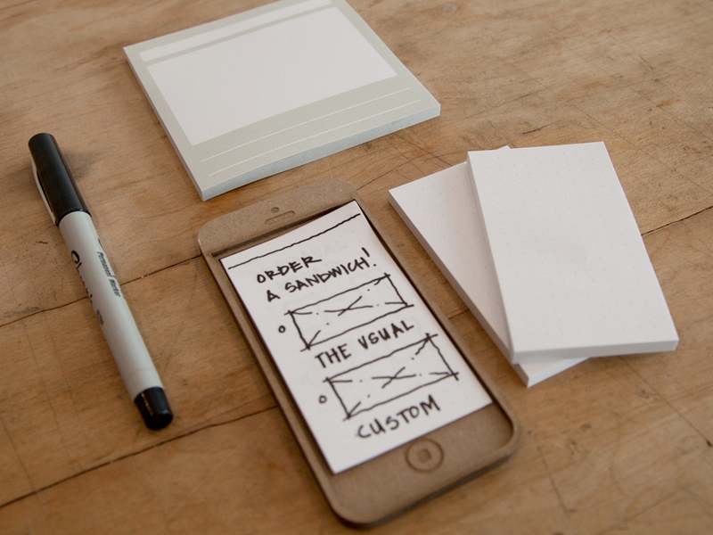
As a side note, the app POP — which stands for Prototype on Paper — lets you snap pictures of your sketches and make them interactive easily. More here.
Tue 20 Aug
2013
Erika Hall on “Founder’s Choice”
My friend Erika at Mule Design Studio wrote a really salient follow-up to my post yesterday about designer founders of startups. It’s an essential complement to what I wrote, so I encourage you to read it in full on Mule’s blog.
My Favo(u)rite Magazine
Compiled by Andrew Losowsky and Jeremy Leslie to benefit Bob Newman, a legend of editorial art direction who suffered a serious accident earlier this year, leaving him in a coma. “My Favo(u)rite Magazine” features dozens of designers, writers and artists honoring their favorite magazines in text and images. It’s available for sale in standard and limited editions, with all proceeds going to Newman and his family. See also the full list of contributors.
Mon 19 Aug
2013
Designer Founders and Choosing Problems
Remarks (7)
Now and then, designer founders of new startups ask me for advice on the companies they’re building. Having tried and failed to build a sustainable business as a designer founder myself, I feel a little leery about offering advice. At the same time, with the benefit of hindsight, I can recognize some of the same missteps that we made with Mixel.
The most prevalent one is not putting the user at the center of the company. This is somewhat ironic, because designers often pride ourselves on being advocates for the user experience. But there is a difference between user-centric design and building a user-centric business.
Thu 15 Aug
2013
Tension and Practice in Photography
In this video, veteran documentary photographer John Free gives five minutes of unrehearsed advice on how to become a better street photographer. His central concept is that tension is a major impediment to getting the right shot, and that practice — which is normally foreign to the art of photography even as it’s a core concept of most any other skill — is a key to “getting rid of tension.” It’s good stuff. Watch the video here.
Wed 14 Aug
2013
Cartoon Network Trains in Taipei

About a decade ago it suddenly became possible to buy all of the ad spaces in a New York City Subway car. The Taiwanese have raised the bar considerably: it’s now possible, as Cartoon Network has done, to advertise throughout the inside and outside of a train. More images at the animation blog Catsuka, and a write-up and video at Cartoon Brew.
How Master Cinematographer Roger Deakins Got These Ten Shots
Deakins is responsible for some of the most stunning and memorable cinematographic works of the past two decades, including almost every major Coen Brothers film and last year’s “Skyfall.” In this short piece for Vulture, he gives background on ten of his works. Full article here.