January, 2010
Japanese Ofuro soaking bathtub

We just came across a new bathtub design by Matteo Thun for Italian company Raspel.

The tub is completely made from larch wood, even the plug.


As beautiful as this tub is, I still want a traditional hinoki tub! There’s a pretty cool book called “The Japanese bath” which has a lot of inspiring content not only about traditional Japanese tubs but also connecting the tubs with outdoor spaces.
IDS: Roundup
We kind of dropped the ball on Design Week this year, for obvious reasons. But here is a quick look at a few other things that caught our eye at IDS10.
The ULTIMATE: space (concept)
Arren Williams’s bathroom was inspired by Calvin Klein Euphoria.

The dark wood paneling was of course a defining feature for us. This was the ultimate his and hers bathroom, with this section being the his side.

They meet in the middle in this cozy chill out room. Bev Hisey’s wool felt butterfly chairs were super cozy to flop out on (we tried).

In the her side, plenty of storage in these retro styled dressers, a large bathtub in the center and some interest light fixtures that you could totally diy. All you need is a ceiling medallion from the hardware store, paint and a mirror lightbulb like the one recently featured on Door Sixteen but smaller.
Jason MacIsaac (Ministry of the Interior): Rolling Hills

Again a no brainer in our world with all that wood…

…to create beautiful intimate spaces.


The student section felt small this year…

New George chair by OCAD student Vincent J. Monastero was really the only piece that was fresh and that we could see in production.
You know, two years now we have missed Come Up To My Room, which is a real shame because that is where the really interesting stuff happens. Goal for next year is to switch it up and cover CUTMR. There’s always too much to be done…
Kitchen: painted!

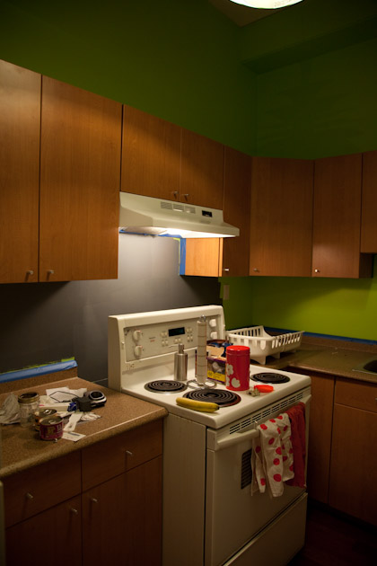
Well now seems likes a good time to lighten the mood a little. We did paint the kitchen last week but it took a long time to get it nice and clean after a few weeks of mess. Ideally, we would love to rip out all the cabinets, counter top and floor and replace the ugly bulky appliances but it doesn’t seem prudent when we will be making big changes over the next 2 years. So we’ve decided to just live with it (I cringe just saying it) and instead make those little changes through lighting (changed out the ugly UFO Home Depot light for the vintage snowball-inspired fixture we got awhile back, and added an under counter light for above the sink), a bit of paint, and new nobs. Makes a big difference!


Bagel trivets by Oji Masanori, they look so good all three in a row.

Kerstin Boulogner’s Surt sa raven tea towel, you can’t go wrong with olives and foxes!

As a house warming gift a family friend gave us these great vintage Norwegian plaques that we now have above our sink.


The one thing we did was install new hardware on all the cabinets, they are much cleaner looking now.

We found a few of these Aarikka tins which we actually are selling at the store, we kept one aside for ourselves.

Immediately we could see what kind of a difference the grey makes. Instantly calming.

This is what it looked like when we moved in.


Ahhh….
When 4 becomes 3

This week we had to say goodbye to our very much loved cat Grover (aka Guvnor). I realize this is a depressing post (sorry mom, Jen, Hollie, Alana, and anyone else who had the chance to connect with him), but it will explain why we here at Kitka have been a little lackluster lately.

Begging for food - look at those eyes work it.
Grover was an amazing cat. We often joked that he was quite morose, but he was really just very serious (and the complete opposite of princess Isha). If I could just anthropomorphize for a second, he would be a proper English bachelor, a bit of a dandy, forever in his stuffy study, surrounded by books, a tipple and a cracking fire, with a nagging spinster sister taking care of him.
But seriously, Grover was handsome and elegant. When he slept with us at night, he took up more than his fair share of the bed with his long and lean body laying perpendicular to us, of course. When treats were on offer, he trotted with a perky gait. He was John’s lap cat and my snuggle monster. Once he caught a real mouse, and when met with screams of horror from a group of us girls, he referenced the fake fun fur mouse by touching it to his real catch of the day, perplexed as to why we were not singing his praises. Oh, and sometimes he chased his tail.

In the early days of the blog, getting in my way (and looking bored) while trying to photograph some thrifting
Today I woke up with a broken heart. I thought things would feel better but the whole experience of letting a pet go has been more traumatizing than I ever could have imagined. We learned in December that he had a cancerous tumor in his mouth and it had already invaded the bone. The difficult thing was that he was an otherwise healthy cat – eager to eat and snuggle, but obviously in a lot of pain and discomfort. We had a vet come to the house (thank goodness since I was a total mess) to put him to sleep but honestly, it wasn’t the peaceful moment we were expecting (it took about 45 minutes, 45 minutes too long if you ask me). I can’t help but feel guilt and regret. Has anyone else experienced this (the realization that the process is not so peaceful, and feelings of guilt and regret after)? The house feels awful and empty without him, and Isha can only bring us so many mice to cheer us up (aha, here comes one now, no kidding).

Isha, on the left, is our little ray of sunshine. We worry about how she will eventually react but so far she seems to be managing okay.
IDS10 Prototypes & Studio North
It was the Interior Design Show over the weekend, so if you didn’t get the chance to check it out, we’ve covered some of the highlights!
This year, the Prototypes were very diverse, each offering glimpses of what’s to come in new Canadian design.

Science and sons gave us our favorite design of the evening: “Radio Canada” a radio with only 2 stations, CBC radio 1 & 2. It was just one of those things that we saw and desperately wanted.


Bounce lounge by Sidney Molepo

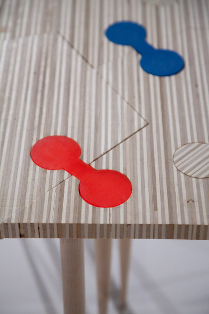
Fracture, a modular table by Tychotic design

We loved the tapered maple legs, and notes of colour among the salvaged plywood top

Trays by Emil Ragusila, an interesting interpretation of corian, which can be cut and sanded like real wood.


Toboggin, by Devin Schaffner

Karst stools, by Kevin Karst Designs

Portico portable patio system, by Carmen Yatscoff

Everro by Andrea Leitner

NXL chair by Obill design

Shallmar by Jean Willoughby

Softwall, (made from used newspapers and felt) by Breathe architects

Viceroy designed by Human Republic

Masquerade designed by Human Republic

The Practice of Everyday Design gave us a wonderful look into how creative CNC technology can be with their white lacquered Stalac coffee table.

Modular seating system by Ian Vanderberg design

LED chandelier by Group Two Design INC, unfortunately it wasn’t on during the show…

Mahabali mats by Christina Covello designs
A sampling of the Studio North section below:

Shawn Place gave us three chairs to drool over.

We loved the cane body and counter weighted leather neck rest on this Lounge chair.

The Wegneresque hand woven rocking chair was as beautiful as it was comfortable.

And finally Shawn’s interesting three legged white oak dining chair.

Colourful mortar and pestles from Tahir Mahmood.

We just had to include SMASH’s drawer booth!

Felt products from Finland’s Verso design

We loved these beautiful plywood pendant lights from Secto design

The Brothers Dresslers gave us a unique spin on the classic school chair with their blend of wood, felt and metal.

We loved the stack-ability of this honeycomb inspired design by Balance Glassworks.

Two Toques design gave us simple bedside tables.
Radiant Dark: Assets & Values
MADE‘s Julie Nicholson and Shaun Moore continue to be amazing and dedicated promoters of Canadian design. Radiant Dark Assets & Values is the third event of its kind.
I’m not going to lie. This years Radiant Dark suffered a bit at the hands of a bank (surprise surprise). Although Commerce Court makes sense as a location in relation to the theme, awful fluorescent lighting, distracting granite floor, and bank branding detracted from what was an otherwise interesting sampling of new independent Canadian design. The following is but a sampling:

Top marks go to Anneke van Bommel’s Silhouette Cutlery Series (Poutine Fork, Ice Cream Spoon, Knife). Maybe we have poutine on the brain (we did go there for dinner after Radiant Dark) but love her play on disposable utensils.

Anneke van Bommel continues her exploration of cutlery in the Lost & Found Series. Using antique and vintage cutlery she re imagines them into new forms and designs.

Lubo Brezina in collaboration with Scott Eunson’s Shrine Dedicated to the Memory of Demolished Barn and Fallen Trees was also a major attraction for us, seeing as Lubo built our amazingly beautiful reclaimed wood desk at the mjölk shop. With this piece, they explore the abandonment of farms for urban sprawl, aiming “to preserve the memory of the farm land, the barn and its structure, the space and the wood”.


Grant Heaps’ Garden Chairs 1-6 references the stitched work of Rosie Lee Tomkins and vintage needlework patterns.

I wish I took a close up of the textiles, because they were beautiful…

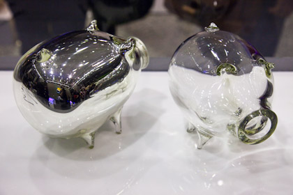
Jill Allan’s Bacon Savers (Piggy Banks) reference the fragility of the economy and our relationship to money.

Kristen Lim Tung’s Between the Covers (storage box) are porcelain book covers that contain a secret hiding spot.

Bev Hisey’s gorgeous hand knotted carpet, titled Blue Gold, is an ode to Canada’s lakes, rivers and tributaries.
Stay tuned for IDS 2010 coverage!

