September, 2009
What?! This is crazy amazing
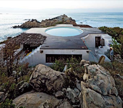
Wow this is something spectacular. A stunning Mexican vacation home designed by artist Gabriel Orozco and architect Tatiana Bilbao. The home is actually a 1:1 scale replica of the Jantar Mantar observatory in New Delhi, set on a rocky plot overlooking the pacific ocean.
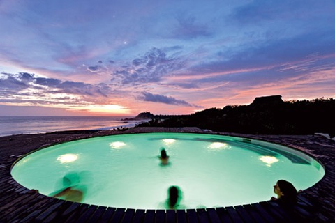
The pool on the roof has got to be the main focus of this home , I would’ve been happy with just having the ocean for swimming.
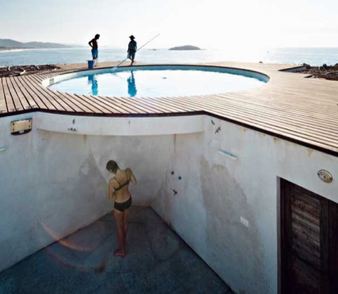
Super cool outdoor shower.
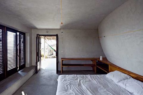
Beautiful minimalist concrete rooms look nice and relaxing.
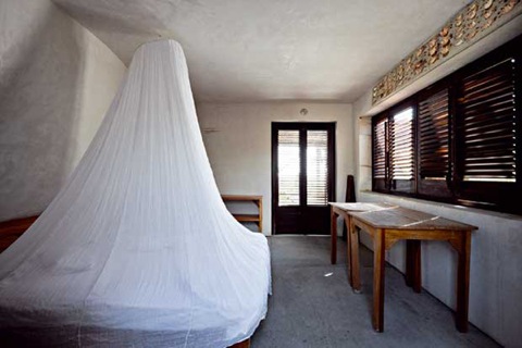

Jeez louise…
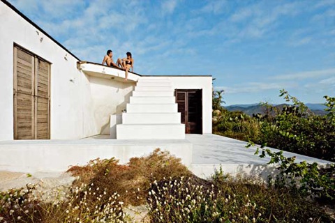
The home is made of concrete so the kitchen and the living room are always open to the outdoors.
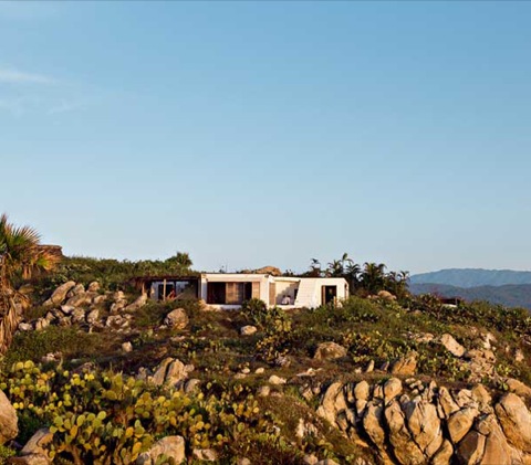
This place gave me plenty of inspiration for our new apartment! 100% concrete rooms and a pool on the roof.
Actually make it 2 pools, so our apartment is twice as awesome.
via Trendir
The Junction Store Watch: SMASH
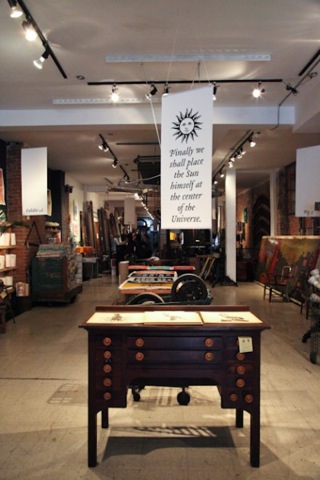
Besides our future shop, there are a number of great destination stores in The Junction. First on our list is SMASH. Aside from an interesting showroom of old timey and reclaimed objects, they often have really interesting, and sometimes bizarre, art parties and showings, which we can’t wait to check out once we’re in the hood!
SMASH
2880 Dundas West (at Keele)
Toronto, M6P 1Y8
416 762 3113
info@smash.to
store hours: monday to saturday 10 to 6, sunday 12 to 5
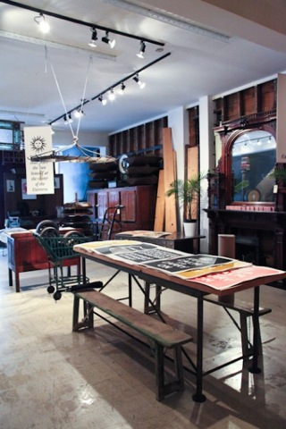
[budget buy: screen printed posters]
Who are you? Paul Mercer – I’m co-owner and principle buyer of SMASH.
How long has the store been open? We opened the store in June of 2008.
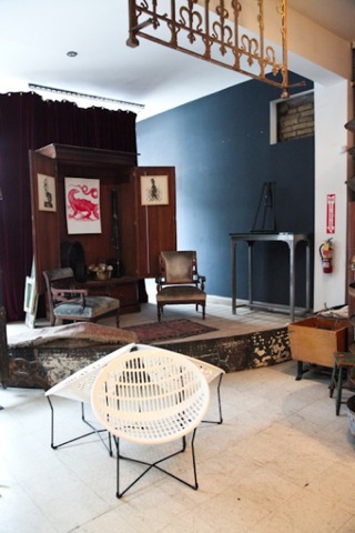
[budget buy: solair chairs]
Why did you open your store? We opened the store – you might call it a showroom – because we knew Toronto was ready for an ambitious and slightly off-kilter source of well-picked reclaimed, industrial and architectural materials. We also set out to -and this has borne itself out – have the store be a place that can source materials and have an in-house design team. Read the rest of this entry »
Cozy: Hans Wegner chairs & Sheepskin throws

Well it’s getting chilly out there and there’s nothing more cozy than Hans Wegner chairs and sheep skin throws! Unfortunately we don’t really have any Hans Wegner furniture, so these nice images will have to suffice.
I love this image! The Flag Halyard chair (1950) is one of my favorite chairs of all time, maybe one day I’ll be able to own one…
From “Modern Retro”

The Peacock chair, designed in 1947

The Y chair, or more commonly known as the “Wishbone” chair, designed in 1950. We were lucky enough to pick up a pair of vintage Y chairs for only 200 each, now we just need to find 4 more!
These 2 above images come from stylist Deborah Mclean, it looks like the perfect cozy cottage.
via Busy Being Fabulous
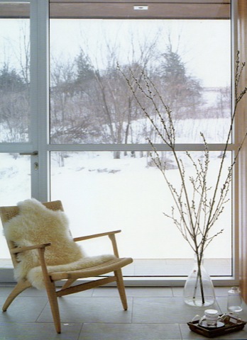
Beautiful Wegner folding chair, designed in 1949.
“Scandinavian modern home”
IIDEX/NeoCon 2009
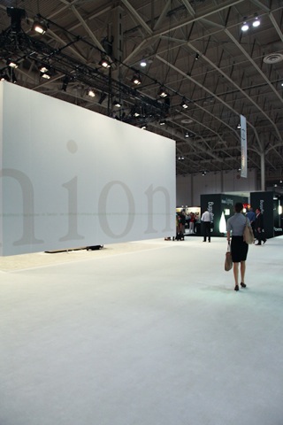
On Thursday we popped over to IIDEX/NeoCon, a trade show/conference “for the design, construction and management of the built environment” (the quote is there because, quite frankly, I wasn’t sure how to describe it). From our view point it was definitely a show for tradespeople, so there wasn’t much to report on unless you are super psyched about corporate office furniture. But, that’s why we’re here…to suss out what is going on so that you don’t have to.
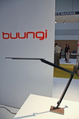
buungi was at IDS, but we accidentally neglected to feature them in our roundup, which is hilarious because buungi won the “best collection award” for Studio North at IDS way back in February. Masoud has been producing his lights made-to-order but he’s shopping around for a manufacturer so he can get back to exclusively designing (based on his website, you can buy his lights through Eurolight).
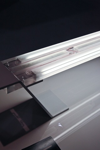
Titled Light Balance, a plate of powder coated steel is held in balance by a cantilevered acrylic light bar.
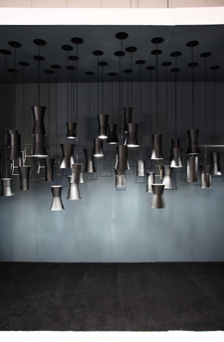
This display of pendant lights immediately caught our attention. Created by Calgary-based Christiaan+Planck, the Sentry Pendant System were designed so that they can be completely disassembled into their individual components, making them completely recyclable, as well as interchangeable into nine different styles. They come in white or black and I think they will be available through architectural lighting company LightForm.
Click here to Read the rest of this entry »
Machine age Modern warehouse sale!!!!

Christmas is coming early this year.
Inspiration: The Beatles
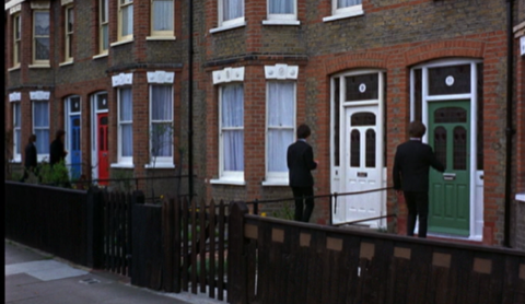
Last night I was watching “Help!” which is pretty hilarious. It was really neat what the set designer came up with while designing the Beatles’ house. Four rows on townhouses with 4 different coloured doors and 4 different coloured theme rooms for each Beatle.
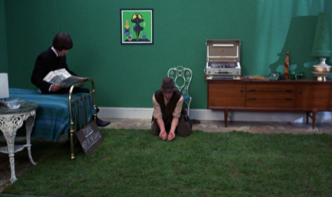
George has the green room with a beautiful teak credenza, brass bed and grass rug.
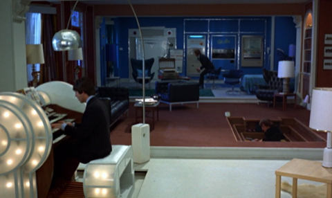
Paul has the white room with a huge glowing organ with comic books instead of sheet music, Arco floor lamp, and birch furniture.
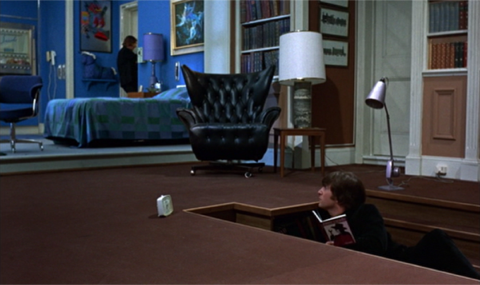
John has the brown room with a really neat sunken bed that has all sorts of built in shelves for books. I like the lone clock sitting by the bed, and how he’s holding a copy of his own book. Read the rest of this entry »

