August, 2009
Kitka wants: Hinoki Bathtubs!

We are currently obsessing over Japanese hinoki bathtubs, the light wood contrasted against concrete, or among a white bathroom is so beautiful. (Trenir)

Bathroom from the C1 house by Gwenael Nicolas from Curiosity, and Tomoyuki Ustumi from Milligram Studio.
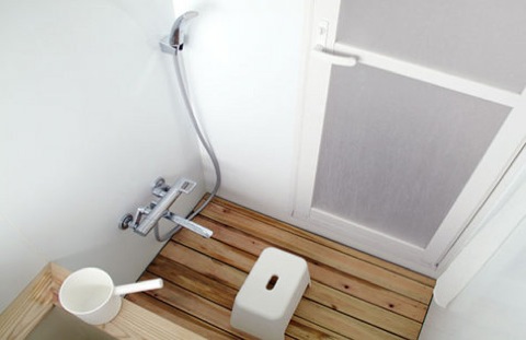
To go along with your Hinoki tub, you might as well create a Hinoki slatted shower matched with white faucet and stool.
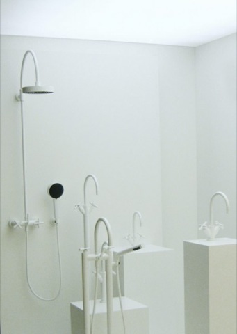
I love this beautiful white bathroom hardware from Sieger Design. I’m kind of tired of chrome faucets, they get so dirty so quickly and they show soap scum and hard water. I should probably just suck it up and clean the bathroom but I’d rather have the illusion of cleanliness and opt out for white.

I think this may be the way to go, the good old fashioned round soaking tub (Materialicious)
via Remodelista
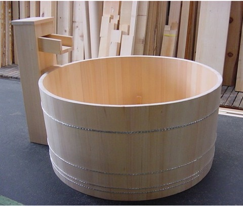
A round bathtub by Bartok Designs, which was founded by Italian architect Iacopo Torrini who’s been exporting Hinoki bath tubs since 2002. The tubs are produced with hinoki wood from the Kiso Valley, and can range in price anywhere between $3000 to $5000.
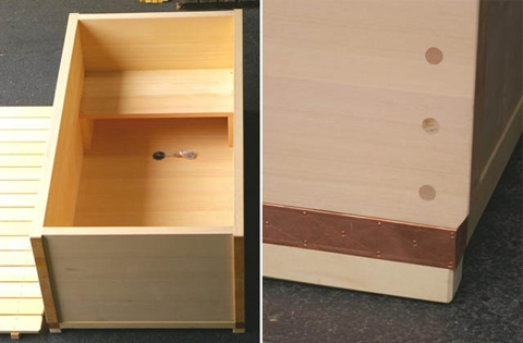
Some more detailed images of the different options Bartok offers, I love the joints they use on their tubs, they have an amazing craftsmanship which definitely warrants the big price tag.
Most of us can’t make the investment to ship a hand made bath from Japan all the way to North America, but all is not lost. There is a wonderful line of Hinoki wooden accessories that are available for a very decent price.
Below is a beautiful Hinoki bathmat, we want one for the cottage bathroom! $40 from Canoe


This Hinoki tissue dispenser is really handy, $35 Canoe
I really love Hinoki tubs for interior bathrooms, but I am also pretty keen on retro cedar tubs for the outdoors. An American company called Snorkel still produces these tubs which are heated by wooden stoves. I really love this idea since you can choose when you want to take a dip without using too much energy.
Honestly, I just want to be as happy as this guy:

He is rocking my world right now.

Janis Joplin enjoying her tub.

Kee Kee wants to come in the tub.

If you get a hot tub, you get to party with all these chicks. If that’s not incentive, I don’t know what is.
The BIG Reveal!
Dear Kitka readers, you’ve been waiting with bated breath for our final reveal and that day has finally arrived.
For those of you who are just joining us, here’s the short version. Back in the 70s, my parents bought a cute set of cottages set in a busy beachy area on Georgian Bay. On a tight budget, they made improvements such as blowing out the porch, installing California style windows, building a walk out deck and eventually installing an open concept kitchen. And then nothing happened for a very long time. The years came and went and we were still sitting in the Ogden’s living room set (the Ogdens were the previous owners for several generations). In 2004 I inherited the cottage when my father passed away. I was totally unprepared for the responsibility and the place fell into a bit of a state. My mom tried her best to keep it from going totally under and two years ago we didn’t even open. So when I introduced John to the cottage last summer, it was ripe for the picking. And we were so on the same design page, it was a relative snap to make it the space we’d only ever dreamed about.
So enjoy our hard work—we hope that it inspires you!

You’ve seen this picture plenty of times, but we finally had the second PH light strung up above the black table. It finally looks complete!

You saw this image last week, it’s still playing host to some odds and ends. Eventually we’d like to see a Day bed in the corner where the telescopes are standing, but we’ll save that for next year. Pictured in this photo is a bee hive shaped paper floor light by Isamu Noguchi, Marushka sail boat print, and Reindeer hide from Finland.

The full view of the living room. The three legged teak table is from Juli’s grandmother and sitting above is a pair of Kosta Boda Snowball candle holders.
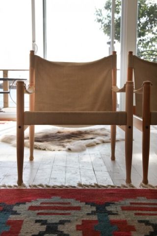
A pair of Safari chairs by N. Eilerson, the beautiful reindeer hide lays on the floor behind.
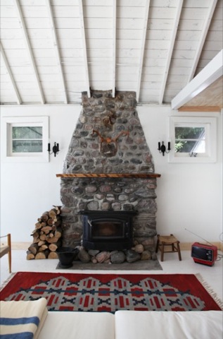
We are still trying to decide if we should paint out the old stone fireplace white. It’s looking a little worse for wear, but once you paint it, it’s hard to go back. These types of fireplaces are pretty typical of the area so it adds that bit of history into the mixture. No cottage is complete without a pair of antlers above the fireplace, bought from The Painted Table on Queen W.

We found an old black enamel bucket for cleaning ashes underneath the cottage.
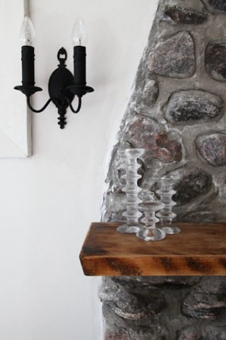
We found the original sconces in the boat house and spray painted them a matte black, the Timo Sarpaneva candle holders we purchased from Atomic Design.
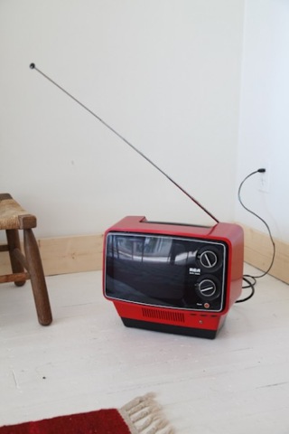
A vintage RCA television, always good for some Seinfeld re-runs.
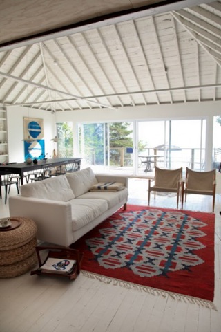
The rug we picked up on a trip to Stockholm, it’s called “Kopparklinten” which roughly translates to “copper mountains” and is by Swedish artist Judith Johansson circa 1952, and was inspired by the aerial view of power stations. The sofa and rattan stools are from IKEA, and the teak magazine rack is by Jens Quistgaard for Dansk.

We tried to do the cottage on a budget, especially when it came to the kitchen. We used Ikea kitchen cabinets which we assembled ourselves, the kitchen wall and ceiling is finished with fir ply 4″x8″ boards so we didn’t have to spend money on a back splash, and we saved money on the counter top by using birch plywood which we sealed using a clear coat finish. Since we didn’t have that much storage space we wanted to make sure we had appliances worthy of display, so we splurged on The Rowenta coffee maker and toaster designed by Jasper Morrison.
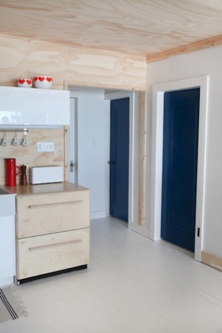
The wooden cabinets are hiding an under counter fridge that we purchased for only 500 dollars (retail value $2500!). It was a demo at a kitchen store so we had to find new covers for the black exterior of the fridge, which Steve made out of birch plywood. We painted the doors to the bedrooms blue, just to add a bit of fun to the hallway and bring the colours of the dining room into the kitchen.
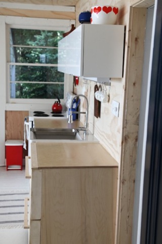
We were originally wanting long stainless steel handles for the under counter fridge, but we found out we had to make a special order to get them in the size we were looking for. John came up with the idea to make wooden handles and we’re so glad he did, they look so cool and saved us 30 dollars in kitchen hardware. We’ll take a closer look at the kitchen another day and go through the components we used and the costs we accrued.
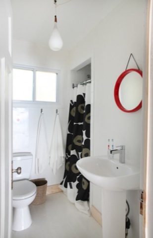
The bathroom was something we can’t really take credit for. Steve our contractor, who was amazing, put together all the plumbing and installation of the bathroom, and tiled the shower. What we can take credit for, is the decisions that went into the bathroom. The teak and glass hanging light fixture is from a store on Queen st. called Atomic, and the shower curtain is Marimekko.

The pedestal sink we found for under 100 dollars, and the chrome bathroom fixture is energy efficient and costs 159 dollars from Home Depot. We found that cool tooth brush holder at Value Village, and the red mirror is from Atomic and reminds me of a boat’s round window. We mounted it onto the wall using leather ribbon.

We used vertical tiles to emphasize the height of the shower, and a chromed out trumpet shaped Kohler shower head.

The very affordable Pegasus toilet which features a dual flush system was 149.99 dollars at Home Depot, the medicine cabinet above we found at a local antique market in Helsinki for 10 dollars. (I don’t know how it survived the long trip home since it was too large to fit in the over head compartment and had to be put underneath the plane with no protection besides a garbage bag). Since there are no closets in the entire cottage and no storage in the bathroom, John came up with the built in wooden shelf solution that can hold multiple rolls of toilet paper.

Juli’s old bedroom was turned into a Cowboys and Indians themed room. The wool blanket to the right is a vintage Hudson’s Bay blanket that we picked up in Stockholm of all places, and the blanket to the left features similar colouring and stripes but is labeled Whitney Point, bought from The Painted Table on Queen W. The guitar sitting on the floor comes in handy for impromptu singalongs around the camp fire, and the task lights are from Luxo.

This is our bedroom, it’s pretty minimalist but that’s what we intended for this room. The blanket is a vintage emergency blanket from Ontario Hydro that we found in the cottage’s loft, and the cozy slippers are by Swedish designer Pia Wallen. The Dala horse was an Etsy purchase, and our only means of lighting is the Mayday light on the floor.

The third bedroom has a wonderful blue and white wool blanket which we purchased at Camp Collectibles in Midland, and three vintage Dunlop tennis rackets which all have different coloured leather handles were picked up from Value Village. There is a public tennis court down the street and Juli and I love to play a quick game before racing to the lake for a nice long swim.
It’s a pretty amazing transformation but it’s hard to appreciate how far we’ve come. Let’s revisit the horror (the horror!) that was the BEFORE: Read the rest of this entry »
Festivo Candleholders

On a recent trip to one of Kitka’s favourite stores Atomic, we picked up a set of three Timo Sarpaneva Festivo Candle holders. Now if only I can get my hands on a collection of i-Glass decanters…

The Festivo Candleholder was designed in 1966 by Finnish designer Timo Sarpaneva for Iittala. We came across hundreds of these on our trip to Helsinki but oddly enough, they were pretty expensive considering the vast quantities many of the vintage stores had.

The Festivo Candleholders we created using the “charred wood technique”, which involves using wooden molds made from roughly hewn and carved alder wood. The wooden molds would become destroyed in the process and quite expensive to reproduce, so they eventually switched to metal molds.
Thrift: Børge Mogensen bench

I am proud to announce we have an addition to the furniture clan here at Kitka, let me introduce you to our new (old) Børge Mogensen bench.
A while back Juli did some photography work for one of our favourite stores to loiter at in the city Machine Age Modern. Juli had some store credit left over from the shoot, and I was looking for something to spend it on. We were chatting with Jake and Carol about design and somehow we mentioned how Børge Mogensen was one of our all time favourite designers, and the owner Jake said that he had something in the back that may be of some interest to us. For the amount of store credit ($250) plus an additional $100 the bench was ours (basically what Jake paid for it).

It was a bit rough around the edges and pretty worn in, but the design was unmistakably Mogensen.
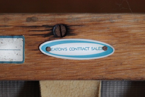
The Sofa was a contract piece for “Eaton’s” and was used at Mount Sinai hospital (there was a Mount Sinai sticker and serial # but it was too hard to photograph). It was really neat to find out that something so familiar to the city like Eaton’s and Mount Sinai had Danish designs in their offices. I wonder if they commissioned Mogensen to produce these and there aren’t that many of them around, or if they were readily available for the public consumer…

The tired leather needs a lot of reinforcing to get back to it’s former glory. After the hours I spent refinishing that Danish Safari chair, I don’t know why I’m already jumping on another project.

The high density foam fillings they used on these old chair pads last forever, it’s always a big bonus to have the original cushions.
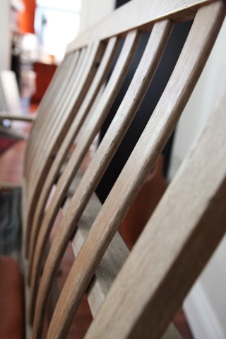
The solid oak slats on the back of the bench have a beautifully subtle curve to them, providing interest against the strong lined shape.
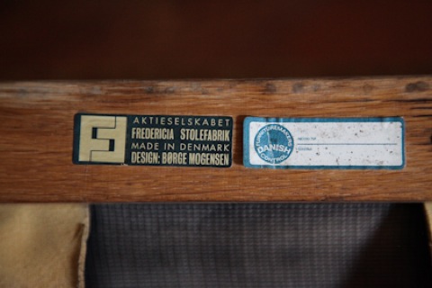
“AKTIESELSKABET – FREDERICIA STOLEFABRIK – MADE IN DENMARK – DESIGN: BORGE MOGENSEN”
I can’t wait to get to work on it! Hopefully I’ll have some updated pictures for you guys soon!
Renovation Blogs
Renovation blogs are becoming quite popular these days, and with good reason. Young folk are following in their baby boomer parent’s steps buying fixer uppers and on a budget making them their own. The cheap suburban model will always exists, but it’s what people do with older homes that makes for interesting design and decorating. And this time around, we have the advantage of learning from our peers and their experiences about construction, materials and products that we wouldn’t necessarily have figured out or stumbled across ourselves.
So, since it’s Friday, I thought I’d give you some ample reading for the weekend (and possibly a little bit into next week…we promise no matter what, you will get a big reveal on Thursday!). The following are a few sites that we here at Kitka have been following lately.


[via]
Morgan is forever changing up her look with amazing new furniture finds…and she is so THRIFTY she puts us to shame. She is one of those lucky people who lives in California and has access to bungalows—a rarity here—and old people’s stuff, and even though she bemoans her space once in awhile, her home is fab. Mostly she spares us the demolition dirt, and teaches us instead how to reinvigorate a room that you may have grown tired of (and she grows tired often). Keep an eye on her Etsy store because the accessories that go out the door often end up on there.
———————————————–

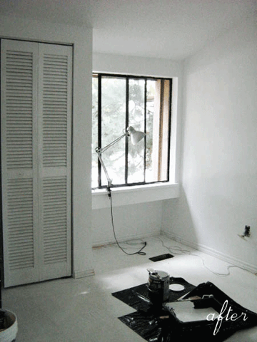
Amazing what a little paint can do…
[via]
West Coast (Vancouver) blog Poppytalk‘s husband and wife team have started another blog that will cover the renovation of their newly purchased townhouse. My attention was peaked when I read: We moved in at the beginning of the month, and are living in one room upstairs. This room is the master bedroom, where we’ve set up sleeping, eating, living and working quarters. I know, a little crazy, but like I said, this is a “makeover on a budget” and since we don’t have the luxury of renting a different place while we do this, we’ll just have to make it work. After having experienced the cottage reno, mouse poop, incessant dust, garbage mountain and all, I’d have to say this challenge should make for some very interesting blog posts!
Their townhouse is very 70s, decor and all, which should make for a gorgeous transformation. To aid along the way, they are discussing their inspirations, which will be fun to see how close they come to, or how far they stray from, in the end. This blog is fresh, so you’ll basically be following them from the start. FUN!
———————————————–
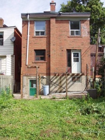
Rear view before
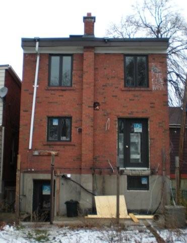
Rear view after, with new windows and doors. What a difference!
[via]
Arren is a Toronto-based stylist, editor and trend reporter who is renovating a mid-60s house along with his partner David. This is a case of vision. Because seriously, if I had been shown this house I would have passed it by. This is because I remember as a child of no more than six, I lived on a lovely side street off of Yonge, north of Lawrence. And on this street, there was an anomoly, a 70s square building of about 3 storeys, probably containing 3 apartments, that I thought to be terribly ugly in amongst the typical houses in this neighborhood (upon reflection, I probably picked up this attitude from one of my parents, because it’s not normal for a 6-year old to notice things like this). But Arren has shown me the way. The box style is perfect for a modern home so it appears that all these places need are new mod windows and doors, proper street appeal, and an updated interior (of course none of that is as simple as it sounds). Besides, I wasn’t the only one who felt this way. According to Arren in the early stages, Kind words and concerned looks [were] the norm.
———————————————–
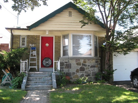
Before – super cute, but tiny!
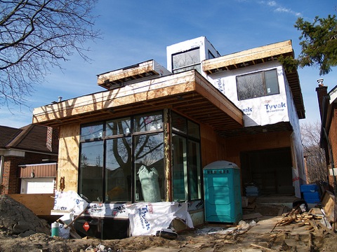
Getting there…modern, spacious and green.
[via]
Jeremy and his wife are nearly finished building a brand spankin’ new home on top of the site of their initial post-war bungalow purchase in mid-Toronto. Their blog chronicles their entire experience, from chooing an architect, to buying windows, green solutions, financials, and all the nitty gritty that I can imagine is super confusing and scary when taking on a project like this.
———————————————–
And finally, the renovation spectacle over here at Kitka is not over yet. As we mentioned, we are moving in November to the Junction area of Toronto. This is a whole new beginning for us, moving to a new neighborhood (and bribing our friends to follow suit), downsizing to an apartment from a house, and starting a business (which will be revealed to you in the next few months).
We are going to have to initially make the apartment our own through some smaller temporary projects, and at some point down the road, we will be doing a full transformation of making two apartments into one that we can grow into. Exciting times are ahead, indeed!
Cottage Stuff: Using what you’ve got + one new thing too!
Ok, so we’re being a little bit terrible. The cottage is basically done and yes, we are totally holding out on the kitchen and full living room reveal. Mostly, this is because we are currently in a whirlwind of time deprivation. John is working every day this week until fairly late into the evening, we have a family event on the weekend and we’re in the midst of putting our home on the market. It’s crazy town. Contractors are flying about fixing all those annoying little projects and things that you easily learn to ignore for years on end, but that buyers will notice immediately. We’re looking to put it on the market for next weekend, so I am working double time to get things looking gorgeous (why can’t we just live our life like this? why do we become complacent with our space instead of keeping it tidy?).
I spent all day today unearthing the long forgotten floor of our office (I just walked in here to write this and said something to the cat—yes, I talk to my cat—and my voice actually echoed!). I am so inspired by the cottage and our minimal furniture and decorating, that I am determined to pare down the last 12 years of my life and break free from the STUFF.
So now that the update is over, back to the cottage.
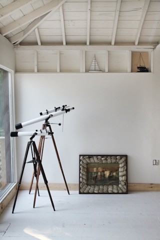
Next year we may build a day bed for this front corner, but until then this is where the telescopes are. In the exposed shelving we’ve been going with a sailboat theme. The one on the left is an actual wooden toy sailboat John picked up in Port Dover years ago, and the picture on the right is a Marushka print we picked up on Etsy. We’re toying with putting this crazy shell framed piece of art work that my dad picked up about 8 years ago in this area too.

This piece has baffled me since it first appeared on the scene. Yes, my dad got really into fish and water themed things, but this just seemed out of character, much to my immense enjoyment. The image itself is fantastic. A super old print of a man and woman in a rickety boat with a rough sea. It’s just so…romantic.

These two little rugs came from my grandmothers condo in Winnipeg. She was so obsessed with maintaining the carpeting that she covered major swaths of her place with little carpets, much to our collective exasperation (tripping and falling factor=high). The colours and graphic prints in these little rugs compliment the white floors perfectly.
And finally, John felt you needed something a bit more sexy than my random snapshots of stuff.

John here, I was lucky enough to find these two chairs during two separate occasions, it must have been fate. The chairs were designed by N. Eilerson marked made in Denmark, they are more commonly known as “Safari Chairs”.
We found our first Safari chair at Rogue Gallery in Queen St East several months ago, it was in Martin’s infamous “storage unit”. It wasn’t doing anyone any good just sitting there in storage so Martin let us take it off his hands for $75 dollars. The second chair wasn’t as easy. I found it on an eBay auction a few weeks later, except this one was a bright orange and the “Buy it Now” price was a staggering $350. Having just purchased the exact chair for $75 weeks before I sent her an offer explaining that I had just purchased the same chair at a reputable furniture dealer in Toronto, and my offer of $100 dollars was more than fair. The seller accepted, and it was only a 40 minute drive away to pick it up! The really horrible thing was sanding down all of that orange paint! It took me forever, and the orange got all over my clothes. I don’t know how many hours it took to remove all that awful orange but the result is so worth it.
I’ve never had a matching pair of chairs in a living room, they look so great together.
Now to avoid complete over exposure on our part, we’d love for you to share your spaces with us. We used to do this more when we started the blog, and we’d love to get back to it!
Don’t make us beg.

