July, 2011
Ceramics by Nathalie Lahdenmäki
We really appreciate materials. Between leather laptop cases, birch bark trays, and brass pot trivets, we seem to have one of every natural material here in the shop. One thing we really wanted to explore in the store was ceramics. An artist both of us really admire is Helsinki based ceramicist Nathalie Lahdenmäki, ever since we saw her work we knew the next time we visited Finland we would have to see her collection in person.
We trekked to Nathalie’s studio on the 2nd day of our trip to Helsinki, and we were met with apple juice and biscuits served from vessels by her series “Linum”.
Nathalie shares her workshop with a number of other notable ceramicists and artists.
A few notes on Nathalie Lahdenmäki:
Graduated in 1999 as Master of Arts in ceramic and glass design from the University of Art and Design Helsinki
Senior lecturere at UADH 2001 -
2008 Designer of the year – Design Forum Finland
Winner – Mino ceramics competition in Japan in 1998 and 2005
Design Plus Award – Frankfurt
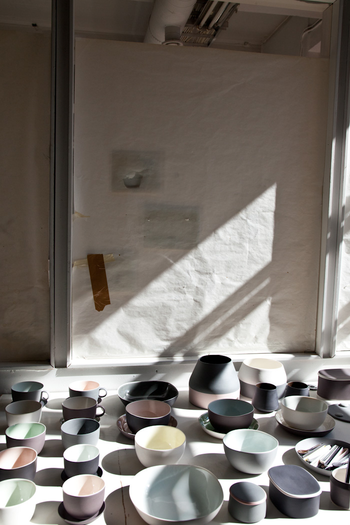
Linum is a collection of vessels made with neutral matte surfaces with glazed interiors. I found this quote and I thought it really summed up the experience of the series:
“I highly value everyday moments. Maybe what I am trying to do is introduce some solace and consolation into daily life through everyday objects of beauty.”
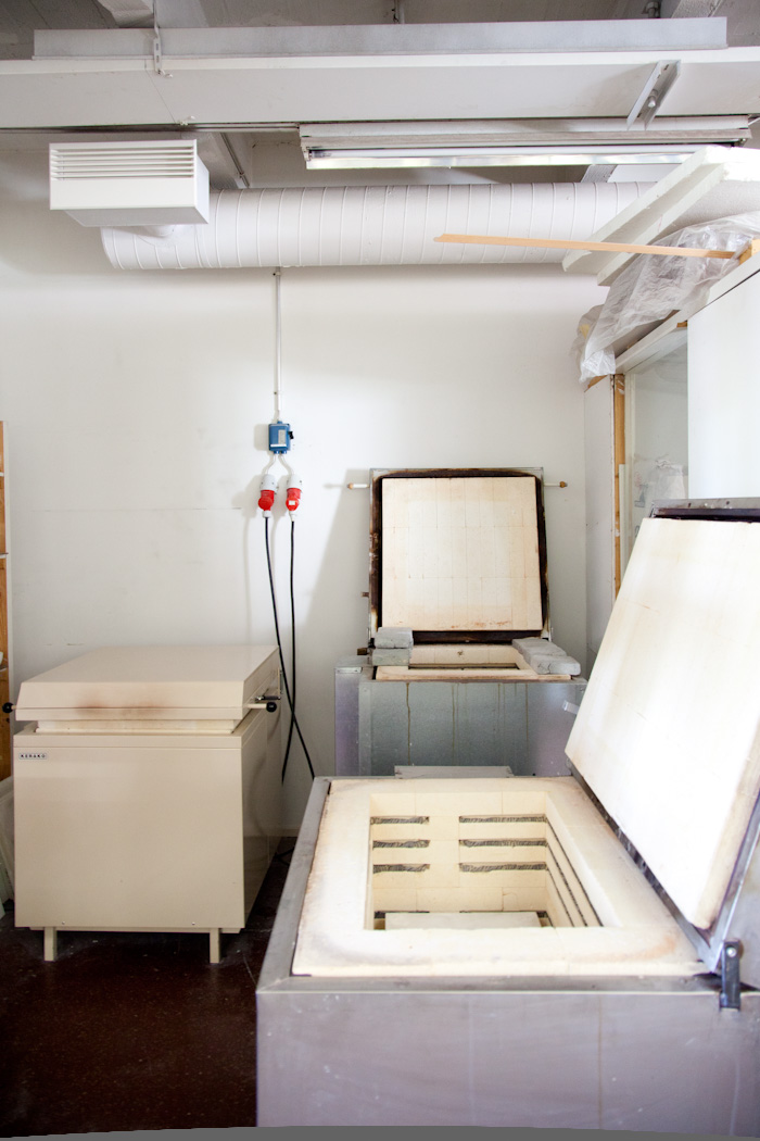
The kiln. Nathalie’s ceramics are all handmade from the mixing of the clay bodies to the glaze, and each piece is individually signed, even the tiniest ceramic spoon.
You can begin to see the scale of the pieces, and how they interact with each other.
A collection of ceramic spoons.
Sami knife, a collaboration between designers and traditional Finnish knife makers exhibited by Design Forum Finland. Many notable artists designed knives for the event including Nathalie (her knife shown in the above photograph). Also notable designers like Naoto Fukasawa, Jasper Morrison, Harri Koskinen, and Konstantin Grcic.
see the rest of the knives by following this link.
“Fire candle holder”
Designed by Nathalie for Arabia Finland, and still in production. We would love to get this into the store for the winter.

Since all of her work is made by hand, we had to wait patiently until our order was ready. We’re happy to announce we now have her collection on display.
from mugs, to glazed bowls, and pin cushions we’ve already sold a few pieces.
Price points:
Small plates $30
Linum cup $32
Spoons $35
Tea cup $40
Demolition part two
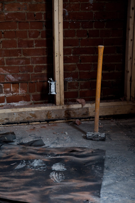
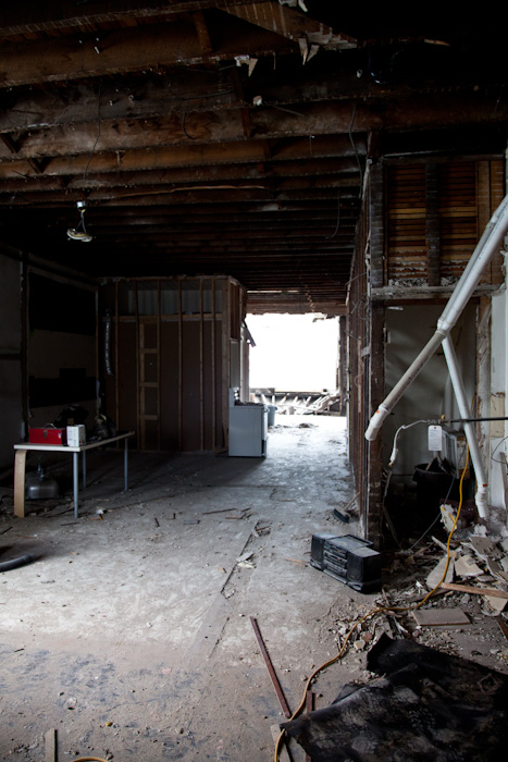
We hope this week will be the last week of demolition. the walls are gutted right to the brick and the ceiling has completely opened up, we’re looking for anything that could be salvaged but it looks like we need new everything, floors, drywall, windows.
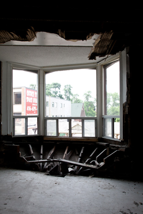
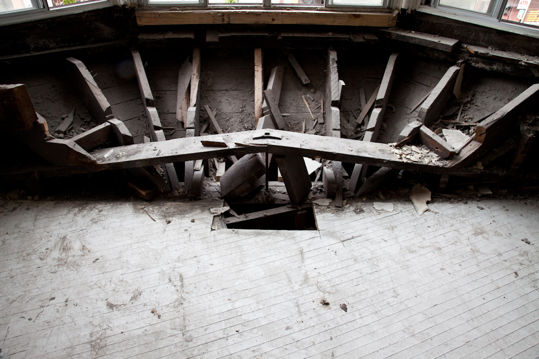
The front oriel windows float off the end of the building.
This is something you don’t see often, 19th century engineering. Using a similar formula to a suspension bridge, the weight of the windows are supported by a long horizontal beam and to offset the sag, two beams are connected at an angled point and a metal spike is driven in the center.
Surprisingly enough this tactic was enough to hold the oriel windows for over a century, but after a lot of water damage and rot to the original beams this will have to all be replaced (budget buzzkill).
We would love to plaster over the brick walls instead of using drywall as it would add such a beautiful texture. We fell in love with white painted plaster after seeing it used countless times in buildings by Alvar Aalto. Unfortunately we have to keep in mind sound and insulation.
Peeling back the walls you can see some of the original details like the remnants of an old window.
Or this beautiful curved wall detail made with the building’s original plaster.
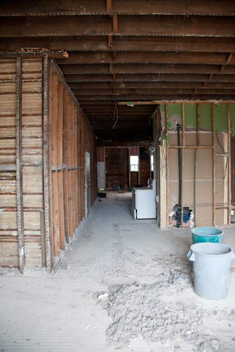
You can now see all the way from the back to the front.
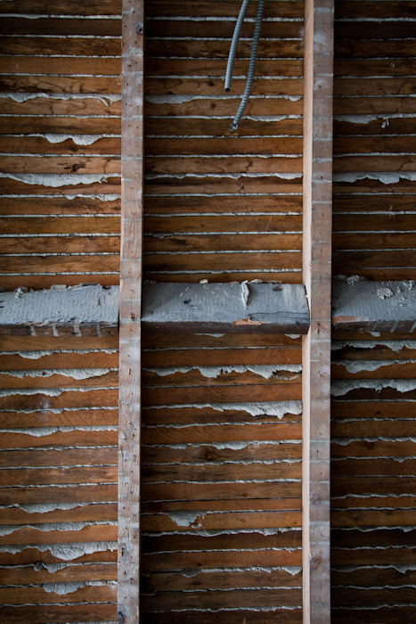
These are the original ceilings which might look beautiful sprayed white but the pattern is very busy and distracting, plus having a clean drywall ceiling means hiding all of the wires used for lighting.
So many decisions to make!
New website now online!
We’re very excited to report our new website has launched. We now have an online market place offering a self check out service.
The products you’ll find here are pieces that are generally kept in stock and easy to package and ship. Of course if you saw an item that was on our old website there is still a good chance that it is still available to order. Simply contact us directly and we can work on processing the order.
We worked with graphic design team Sali Tabacchi, and kept it as simple as possible while also keeping in mind an easy interface.
We still have a lot of products in the store that we will be adding progressively.
We hope you like it, and let us know if you find anything buggy or odd.
David Ericsson for Mjölk
It was almost a year ago that we featured the work of David Ericsson on our blog. I remember seeing photos of the exhibition “Carl Malmsten made me do it” and almost instantaneously felt a connection to the works displayed. The use of natural materials, the impeccable craftsmanship and above all else the experience and thoughtfulness of his designs. Just from the photos you can appreciate the tactility of his work, and you can imagine how you could use any work in your own home.
I think it was the same day that I saw his exhibit that I contacted David to see about showing his work in the store, so when we eventually scheduled a trip to Stockholm, seeing David’s work in person was a top priority.
In the above photo: “The chair” made from solid beech wood. All of the strapping for the chair is connected to the frame by simple black finishing nails. The chairs are all left unfinished for an even patina.
We sat down for some coffee and sweets.
A collection of leather shade lights designed for the “Carl Malmsten made me do it” exhibition. When I first saw his lighting designs they reminded me of flesh and bone, the wood bases are curved at the end like a big bone, and the leather shade represents the skin. I told this to David and he said that it wasn’t his intention to mimic flesh and bone, and that the use of material and shapes came as a natural progression for use, longevity, and tactility. The wonderful blend of leather, turned beechwood, and brass fittings will develop a beautiful patina with age and use.
David’s office complete with his beautiful writing desk and vintage swivel chair. A small collection of Tobasco bottles sit at the edge of his desk near his custom desk lamp.
An old Japanese desk utensil organizer.
A collection of antique lights sit near their office window, a constant inspiration for Ericsson.
A fully upholstered chair, and the human lamp which was recently featured in Elle interior.
Santa Claus.
“Carl Malmsten made me do it” and “dr. design” embossed leather shade.
The “Bibliotekslampan” Library lamp is kept next to his “String” library unit and used to search the spines of books to read when it’s dark.
A new wall mounted prototype with a hand spun aluminum shade is mounted in his daughter’s room. It’s from a series called “Lamp Francis”, a collaboration between David Ericsson and Marcus Berg.
To read more about this collaboration please visit: DMOCH
The beautiful family.
Now we’re back in Toronto and recently received our first shipment from David Ericsson, and it’s currently being displayed in our front window.
One of our favourite lamps is now available to buy and see in the store, the “Bibliotekslampan” Library lamp.
It is embossed with “Bibliotekslampan for Mjölk” and we hung one up next to our own library in our new apartment.
The inspiration of the light is for searching the spines of books in a dark library.

The light is also beautiful hung up and used as a bedside lamp.
The leather strap is used for mounting the light to the wall.
Believe me, they are even more beautiful in person. We’re really looking forward to a long relationship working with David Ericsson, his work encompasses everything we love about design.
Price: $675
Demolition
If you’ve been to the shop this week you might have noticed a lot of noise going on upstairs. We have begun the first stage of renovating our home above the store, taking out all of the interior structure and leaving a blank slate to be put back together.
Over the last 2 years we’ve been putting in a little bit of work here and there to make our apartment nice to live in, but all the work we did was simply cosmetic. This old building has a lot of structural and electrical issues that need to be taken care of sooner than later.
It was a little hard committing to renovating our place, there is a lot on our plates and we did have the living room the way we wanted but there were so many things we couldn’t fix without getting invasive like: stucco ceilings, way too many awkward rooms, a college dorm kitchen, no windows, and the very obvious issues with structure. It’s impossible to capture with photographs but you can actually feel the floor sinking as you walk close to the Bay window area, this is perhaps our biggest problem area to fix during the renovation.
So why now?
Besides the obvious fixes to get the building back to code, we just feel that this is the best time for us to take on our future home. We want to have a family some day soon, but we’ve had a lot of friends who went through renovations during pregnancy, and it was very stressful time. Why not try to start enjoying our home sooner than later. Plus, we’re really excited to collaborate with Studio Junction again on this project. Christine and Peter have played such an important role in our life, and it wasn’t even a question of whether or not to work with them again. We were talking about the future of the building even before designing the store.
The good thing about a building this narrow is that there are no internal load bearing walls, so we can just gut the whole place and start from scratch. In the meantime we’re temporarily renting an apartment just down the street. We’re excited to share some insight during the next stage in our renovating endeavors. Also we’ve got our temporary apartment looking pretty good in the meantime, more on that to come!


