Make WordPress UI

Recent Updates Toggle Comment Threads | Keyboard Shortcuts

  • Matt Thomas 12:29 am on May 25, 2013 Permalink | Log in to leave a Comment
    Tags:   

    Howdy, UI group. This Friday brings you version 1.3 of MP6, the WordPress birthday weekend edition. This iteration is largely focused on responsive and RTL improvements, as well as bug fixes. Here’s what’s new:

    • First pass at some basic CSS transitions on link hovers, etc.
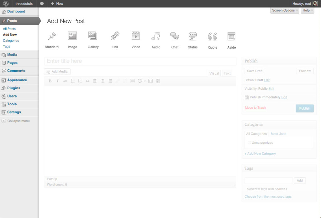
    • First pass at MP6 styling on post format picker.
    • Mobile: Adjusted theme customizer margins.
    • Mobile: Changed tablet breakpoint from 768px to 782px to match core.
    • Mobile: Fixed word-wrap issue on custom post types .widefat table headers and footers.
    • Mobile: Menubar now scrolls independently of the main column, so menu links are always visible even if you’re at the bottom of a long page.
    • Mobile: Better performance when scrolling in the admin.
    • Mobile: It’s now easier to dismiss dropdowns on touch devices.*
    • RTL: Corrected positioning of post-format-options.
    • RTL: Fixed tagchecklist position.
    • RTL: First stab at mobile style conversion for RTL.
    • RTL: First stab at admin-bar positioning.

    *There’s a known issue with the positioning of the New and Account dropdowns on mobile webkit browsers. We’ll have a fix in trunk as soon as we can (free WordPress blogs to anyone who has insight on a solution!)

    This week includes contributions from Joen Asmussen, Michael Erlewine (mitcho), Till Krüss, Andy Peatling, and myself. As always our thanks go to everyone who’s contributed by reporting bugs, offering suggestions, and testing it on your sites. If you’ve reported an issue here that hasn’t been resolved yet, rest assured it’s on our list and we’ll get on it soon.

    I’ll be out part of next week, so no IRC chat on Monday. We’ll continue to work on refining the responsive experience and RTL issues and stomping out whatever bugs you guys find.

     
    • Dean Robinson 1:16 am on May 26, 2013 Permalink | Log in to Reply

      hopefully the formatting below works…

      *There’s a known issue with the positioning of the New and Account dropdowns on mobile webkit browsers. We’ll have a fix in trunk as soon as we can (free WordPress blogs to anyone who has insight on a solution!)

      I had a bit of a play around this morning and my initial impression was that “position:fixed” is behaving a little more like “position:absolute” on mobile safari and the “position:relative” on its parent elements is causing the odd positioning.

      So, I’ve added this around line 125 in admin-bar.css (rules likely need some clean-up and definitely some better testing) to reset the position on the parent elements

      .touch #wpcontent #wpadminbar .ab-top-menu,
      .touch #wpcontent #wpadminbar .ab-top-secondary,
      .touch #wpcontent #wpadminbar #wp-admin-bar-wp-logo,
      .touch #wpcontent #wpadminbar #wp-admin-bar-updates,
      .touch #wpcontent #wpadminbar #wp-admin-bar-comments,
      .touch #wpcontent #wpadminbar #wp-admin-bar-new-content,
      .touch #wpcontent #wpadminbar #wp-admin-bar-my-account {
      	position:static;
      }
      

      Before: http://cl.ly/PDqy
      After: http://cl.ly/PD1c and http://cl.ly/PD4Z

      However, this results in the update/comments/new icons aligning left instead of right.

      I was able to trick them back into place using this, it works, but the negative margins make me nervous.

      .touch #wpcontent #wpadminbar #wp-admin-bar-comments,
      .touch #wpcontent #wpadminbar #wp-admin-bar-new-content,
      .touch #wpcontent #wpadminbar #wp-admin-bar-my-account {
      	float:right;
      }
      .touch #wpcontent #wpadminbar #wp-admin-bar-comments {
      	margin-right:95px;
      }
      .touch #wpcontent #wpadminbar #wp-admin-bar-new-content {
      	margin-right:-97px;
      }
      .touch #wpcontent #wpadminbar #wp-admin-bar-my-account {
      	margin-right:-147px;
      }
      

      Result of above hack: http://cl.ly/PDXK

      Disclaimer: No idea if this would break things outside of mobile webkit (it was still ok in desktop firefox and safari), but hopefully it helps point anybody smarter than me in the right direction toward a solid solution.

      • Matt Thomas 3:33 pm on May 29, 2013 Permalink | Log in to Reply

        Thanks for taking a look at this, Dean (sorry you were held in moderation; I’ve been out for a few days). We’d also figured out that setting the parents to position: static fixed the dropdown issue but I hadn’t yet figured out a workaround for positioning those icons. Negative margins do make me a bit nervous as well, though if we limit the number of items that are visible in the toolbar on mobile browsers (hiding links that plugins add to the toolbar) that might be a fine solution. Or, as you mentioned, it may at least point us in the direction of a better solution.

    • JakePT 3:52 am on May 27, 2013 Permalink | Log in to Reply

      It looks like the admin table issue I raised in the last post is partly fixed. The rows no longer get extremely tall, however apart from the ttile column they are still very narrow:

  • Matt Thomas 8:59 pm on May 17, 2013 Permalink | Log in to leave a Comment
    Tags:   

    Hey, UI gang. Here to help you wind down the week is the latest update to MP6, version 1.2.

    We’ve been focusing primarily on solving some of the trickiest responsive questions this week. Some we’ve found solutions to, and some we’re still discussing. We’ve also got a wild idea for the front-end of the site that we’ve got some mockups of to discuss.

    Here’s what’s new this week:

    • A new position for the “hamburger” button that opens/closes the mobile menu. It’s now part of the adminbar, and stays put when scrolling the rest of the page. There’s a much more obvious active style, and we’ve greatly increased the reliability of the button (no more multiple taps to get it to open anymore!).
    • Increased the size of wpadminbar dropdown menus for mobile sizes so that links are easier to tap. (We still need to work on making these easier to close without activating a link).
    • Improvements to the media uploader for responsive. Still needs work, but is more functional now.
    • Fixed buglets appearing because of Jetpack’s 2x retinafying code interfering with MP6.
    • Better positioning of icons in the wpadminbar.
    • Improved responsive layout on the Akismet configuration page.
    • Added new icon glyphs to the Dashicons font.
    • Reworked the way Open Sans is declared in the plugin.
    • Fixes to checkboxes and radio buttons.

    Once we decided that the adminbar was the best possible place to put the hamburger button for mobile, I started thinking about whether that same interaction might make sense on the desktop version of the dashboard. After all, we’ve already got a button that hides and shows the dashboard, it’s just always been at the bottom of the menu. What if we put it at the top, in the adminbar? The benefit would be that even desktop users would grow to understanding the meaning of the button, since its purpose, hiding or showing the menu, is the same whether you’re on desktop or mobile. If we took it that far, it could even go to the front end of your site; allowing access to any part of your blog’s dashboard within two clicks of your live site. This would be a bigger change than what we can do with just CSS in MP6, so it’s a topic we’re interested in your thoughts on, to see if it’s a good candidate for a potential core patch suggestion.

    This week’s edition of MP6 includes contributions from Joen Asmussen, Mel Choyce, Ben Dunkle, Till Krüss, Andy Peatling, and myself. Many thanks, as always, to those of you who have shared your feedback and ideas with us so far. Keep them coming!

    We’ll be in #wordpress-ui on Freenode May 20, 2013 at 18:00 UTC to discuss this week’s work; please meet us there if you’d like to chat about what’s new.

     
    • Hassan 9:32 pm on May 17, 2013 Permalink | Log in to Reply

      The idea of bringing the admin menu on the frontend (along with the admin bar) is just brilliant, I think.
      I don’t know why this never occurred to me before :)

      We need to make it a reality… after heavily testing it, indeed.

    • Hassan 9:47 pm on May 17, 2013 Permalink | Log in to Reply

      By the way, the update notification bubble is sometimes orange and sometimes blue. Is this intentional or a bug? I prefer the orange; the blue looks a bit wonky when the it’s on a highlighted menu item which is also blue.

    • mindctrl 12:34 am on May 18, 2013 Permalink | Log in to Reply

      Looking good. Bringing the admin to the front end is nice. A couple questions though.

      1. How much weight is that going to bring to the front end?

      2. Will we be able to totally disable that feature via filter/option/something where the weight doesn’t come with it if necessary?

    • Just a guy 12:58 am on May 18, 2013 Permalink | Log in to Reply

      I love it!

    • Dean Robinson 12:39 pm on May 18, 2013 Permalink | Log in to Reply

      If we took it that far, it could even go to the front end of your site; allowing access to any part of your blog’s dashboard within two clicks of your live site.

      Hot.

      +100

    • Aaron Hockley 4:50 pm on May 19, 2013 Permalink | Log in to Reply

      Random question: why do the MP6 updates not show up as updates w/in WordPress (I don’t get an update notification; can’t update from within the admin screens, etc)? I’m seeing this on several sites (multiple web hosts) so I trust it’s not a “just me” problem.

    • Matt Van Andel 5:08 am on May 21, 2013 Permalink | Log in to Reply

      Making the dashboard menus available from the frontend is just brilliant. I love, love, love the idea.

      That aside, I like the idea of having the mobile and desktop hamburger button consistently in the top-left of the admin bar as well.

    • Lea Cohen 5:22 am on May 21, 2013 Permalink | Log in to Reply

      I love the idea of bringing the admin menu on the front end !

    • Lea Cohen 5:35 am on May 21, 2013 Permalink | Log in to Reply

      And 2 more RTL issues:

      1) The adminbar doesn’t change direction on RTL.
      This is what it’s supposed to look like (the screenshot is wide, so I’m just linking to it, not embedding it here), and this is what it actually looks like with MP6.

      2) It seems that press-this didn’t get any RTL care:)

    • JakePT 6:37 am on May 21, 2013 Permalink | Log in to Reply

      I’m having an issue with plugins that add columns to a custom post type using the manage_edit-POSTTYPE_columns filter. All the columns apart from the Name column become extremely narrow on small screens, forcing each letter to a new line, meaning the rows become very tall.

      Note that I haven’t used any custom CSS to resize the columns in the normal view.

    • Nick Halsey 9:22 pm on May 21, 2013 Permalink | Log in to Reply

      I love the frontend menu idea, although I think we risk putting too much visual weight on the active/open menu indicator on the backend using those mockups; I can’t think of a good solution other than retaining the existing treatment in the admin and only changing mobile and the frontend. Since the menu will usually be expanded in the admin for most users, the active menu icon is distracting, and the expanded/collapsed states are used more by preference than as active/inactive states.

      Also, the TinyMCE icons are being misaligned vertically unless they have dropdowns…

    • Ipstenu (Mika Epstein) 9:35 pm on May 21, 2013 Permalink | Log in to Reply

      Post Format images don’t show up with MP6 active

      • Matt Thomas 11:18 pm on May 21, 2013 Permalink | Log in to Reply

        Hmm, I can’t reproduce this one. I’m on the latest version of trunk, and the icons seem fine. Try an svn up or delete/re-install and if you’re still seeing it, let me know what browser and that other good stuff.

        • Ipstenu (Mika Epstein) 12:02 am on May 22, 2013 Permalink | Log in to Reply

          Tested a fresh version. Fails on Chome (mac) every time. Also tested on Firefox and Safari, same thing. It works until I turn on MP6.

          • Matt Thomas 12:11 am on May 22, 2013 Permalink | Log in to Reply

            Aha! Reproduced it after updating WP to the latest nightly. Looks like something changed there; I’ll figure out what.

          • Matt Thomas 12:45 am on May 22, 2013 Permalink | Log in to Reply

            Since the icons moved to colors-fresh/colors-classic, I took the opportunity to go ahead and add them to colors-mp6 as dashicons. Should be all fixed up now in trunk, with a first pass at some MP6-ish styling.

    • JPry 9:18 pm on May 24, 2013 Permalink | Log in to Reply

      Here’s a suggestion for a bit of consistency:

      It would be good on the Plugins page to change the `border-left` property to the same orange-ish color that is visible behind the update count. This would make it much easier to distinguish plugins that have an update available.

  • Siobhan 5:26 pm on May 17, 2013 Permalink | Log in to leave a Comment  

    Hello UIers! The kind folks at Balsamiq have provided us with a free license for MyBalsamiq for the WordPress project. If you don’t know what Balsamiq is, it’s a tool for creating mockups (and it’s pretty cool)

    If you are working on anything relating to the main WordPress project and sister projects (BuddyPress, bbPress, GlotPress) and you need to put together mockups let me know and I can add you to the account. Email: siobhan at wordpress dot org.

    Update: this is for people working on the core WordPress project and sister projects. It is not for people creating third-party plugins and themes.

     
    • Shane Pearlman 5:35 pm on May 17, 2013 Permalink | Log in to Reply

      if you need to do anything with the admin we have some balsamiq templates of the admin: http://tri.be/?s=balsamiq. some are way out of date, but are a good starting point. I probably have them all up to date in some internal projects if you need anything specific.

    • Siobhan 5:42 pm on May 17, 2013 Permalink | Log in to Reply

      Shane’s templates are awesome. I’ve used them many times :)

      That also reminds me: there’s a user-contributed collection of UI components and design for Balsamiq. If anyone wants to contribute any I think that would make them very happy.

    • Jose Castaneda 6:03 pm on May 17, 2013 Permalink | Log in to Reply

      Not going to lie: That is pretty awesomesauce!

    • Hugh 9:19 pm on May 17, 2013 Permalink | Log in to Reply

      I use Balsaiq for some other work I do. What is MyBalsamiq?

    • paaljoachim 10:59 pm on May 20, 2013 Permalink | Log in to Reply

      Very cool Siobhan! As I came across this UI project I also posted a few things further below which I thought might be added to the UI but it is not a part of this specific project. So I have been playing with the thought on how to improve the admin area menus and submenus of WP. Using Balsamiq would be very cool! It sure would be easier then using Photoshop (which I used to create some mockup of the menu area in WP), or Inspect Element in Chrome which I used to give UI tips to the guy who create Ultimate http://wordpress.org/plugins/ultimate-tinymce/

  • Matt Thomas 1:09 am on May 11, 2013 Permalink | Log in to leave a Comment
    Tags:   

    Howdy gang. On this fine Friday evening we bring you version 1.1 of MP6. This was a short week for several of us, so this week’s edition consists of a few small updates:

    • More additions to the Dashicons icon font, including buttons in the visual editor (TinyMCE). Some plugins, including Jetpack, may still insert some PNG buttons that still need to be replaced.
    • CSS fixes for better layout positioning and cross-browser consistency.
    • More consistent results for custom checkbox and radio inputs.
    • Removing the PNG “stalk” on comment counts in lists.
    • Set textareas to overflow auto to prevent permanent scrollbars in IE.
    • Other small bugfixes.

    This week’s iteration includes contributions from Joen Asmussen, Mel Choyce, Ben Dunkle, and myself.

    Because this was a short week for us, don’t fret if an issue you reported hasn’t yet been fixed. Rest assured it’s on our radar.

    Thanks again to everyone who’s contributed your feedback so far — keep commenting below to share your ideas, suggestions, or just bug reports, we appreciate them all.

     
    • Nick Halsey 2:21 am on May 11, 2013 Permalink | Log in to Reply

      Looking better and better!

      I’m guessing no one’s looked at it in IE8, though. Surprise, *no* icons! I actually kind of like the simplicity it brings, but it renders several things useless, like tinyMCE :) I just noticed it today in 1.0 and 1.1 doesn’t fix it.

      • Matt Thomas 2:56 pm on May 11, 2013 Permalink | Log in to Reply

        Thanks, Nick. We’ll have to build workarounds for IE8 and other obsolete browsers that are still officially supported. That will likely be one of the last things we do though, as changes we make elsewhere can end up breaking special cases created for IE<9.

    • gibuh 2:55 pm on May 11, 2013 Permalink | Log in to Reply

      Error establishing a database connection, is the message after trying to host. can you help.
      i used
      http://www.ostraining.com/blog/wordpress/move-your-wordpress-site/

      • Matt Thomas 2:57 pm on May 11, 2013 Permalink | Log in to Reply

        Sorry, I’m afraid we can’t help there — this isn’t related to the MP6 plugin for WordPress. If you installed MP6 and are now seeing errors, delete the mp6 folder from your /wp-content/plugins/ directory.

    • Sofia Rose 3:03 pm on May 11, 2013 Permalink | Log in to Reply

      Im liking the new look! Any idea when it will make it into core?

      • Matt Thomas 4:25 pm on May 11, 2013 Permalink | Log in to Reply

        That will be up to the core team, but we aiming to have it ready for them in time for 3.7. Many factors could change that though.

    • Lea Cohen 6:07 am on May 12, 2013 Permalink | Log in to Reply

      Hi

      Thanks for the fixes of RTL!

      There is one problem that I still see: In the New/Edit Post screen, in the tags meta-box, the x is located on top of the tag name.

      The css should be changed like this:

      .tagchecklist span a {
      margin: 0 -17px 0 0;
      }

    • kai-ser 6:05 pm on May 12, 2013 Permalink | Log in to Reply

      I’m fine with replacing TinyMCE Icons with dashicons where possible, but
      background: none !important; on a .mceIcon renders TinyMCE plugins resp. WP-plugins like TinyMCE Advanced useless, they rely on the ‘core’ icon sprite file. :/

    • Ipstenu (Mika Epstein) 11:02 pm on May 12, 2013 Permalink | Log in to Reply

      Check box marks for images aren’t showing.

      http://cl.ly/image/0Y120N0f3l2d

      So there, as you can see in the thumbnail above, I clicked float right. No checky boxy mark.

    • paaljoachim 7:37 am on May 13, 2013 Permalink | Log in to Reply

      What is the process you are using to make the adjustments to the layout and design of the UI?
      The reason why I am asking is that I am playing with the thought of redoing certain elements (menus and submenus) of how the UI is put together in WP. To bring in another view of how things can be done. This means finding a simple way of actually changing the UI.

      • Matt Thomas 6:01 pm on May 13, 2013 Permalink | Log in to Reply

        Our approach is pretty simple; it’s mostly just CSS restyling what’s already there. No reason why you couldn’t make your own plugin that makes bigger changes to the markup and such, but that’s not something I’ve got experience with.

        • paaljoachim 10:29 pm on May 15, 2013 Permalink | Log in to Reply

          I do not have experience with it either. I am thinking of playing with the WP UI making test modifications to show possible interesting adjustments that can be done with the side menu and panels.
          As there are not just color modifications but other adjustments as well for instance the left line showing active plugins to make it even more clear which are active and not (which is a simple and good idea). Are you guys also planning on adding additional Admin color schemes under the user profile similar as to what exists today? Giving additional color options for the user.

          • Matt Thomas 7:50 pm on May 17, 2013 Permalink | Log in to Reply

            No plans for additional color schemes beyond the one we’re building now (color schemes are a surprising amount of work) but when we’re done, we imagine customizing the visuals of the admin by writing a plugin could make it super-simple to customize the admin, as easy as changing color options in a well-built theme.

    • Tom J Nowell 11:35 am on May 13, 2013 Permalink | Log in to Reply

      I had thought the menubar had been changed to open on the left in mobile, but there are a number of issues that remain and have persisted:

      • The mobile menu needs to be on the left, and more importantly, needs to be a part of the admin bar. As it stands, the button to access it is hidden underneath other elements on various pages, most notable the ‘About WordPress’ page where a WordPress logo sits over the top, making it very hard to navigate away
      • The WordPress logo in mobile is misaligned and is cut off at the bottom
      • Various other icons are misaligned in the admin toolbar
      • Non Core menu icons are misaligned with their Core counterparts, some completely broken

      Usability wise, it’s got significant problems:

      • On an iPhone 4S, I had trouble making the menu slide out, it would slide out half a centimeter then hide itself, i had to press several times.
      • Trying to add an image, I selected media, and the sub menu slid out, but before I could tap on ‘add new’ the screen went blank and I was taken to the main media library page
      • There is a particularly troublesome problem in that the admin toolbar has no concept of overflow. Everything is expected to fit magically into the toolbar. It doesn’t, and when it doesn’t, it overflows on to the page, making links at the top hard to read or innaccessible. Various toolbar links flow into eachother overlapping, some over the top of the page outside the toolbar, and the user avatar covers up the menu link making it hard to click

      In attempting to upload the above photo via my phone, I noticed a bug on the add new page, the image box is wider than the screen, making the edit/view link innaccessible:

      Overall the style of MP6 is working out nicely, but it feels untested

      Hardware/Software tested:

      • iPhone 4S iOS 6.1.3
      • OS X Mountain Lion, Chrome 26
      • Matt Thomas 6:06 pm on May 13, 2013 Permalink | Log in to Reply

        Thanks for the comprehensive list; I’ll add it to our to-do list. As we’ve stated before, MP6 is experimental and you should expect things to break while we continue to develop it. Rest assured that it is being tested in a multitude of browsers, both desktop and mobile, but since we’re releasing new versions weekly, every week there will be some things that are newly-broken and some things that have been reported but are not yet fixed.

        • Matt Thomas 7:52 pm on May 17, 2013 Permalink | Log in to Reply

          As an update; a couple of the issues you posted here have been taken care of in this week’s work. Others will remain outstanding for a while longer — our list is long but we’re working through it. :)

    • paaljoachim 1:39 pm on May 13, 2013 Permalink | Log in to Reply

      It looks nice. Now how do I change it back to standard WP look? Or change the black to another color?
      Or add in lines between each menu section to visibly split each section (as in the regular WP UI)?

    • Hassan 9:03 am on May 14, 2013 Permalink | Log in to Reply

      Plugin info modal needs some love.

      1. When a plugin’s name is (ridiculously) long, the header doesn’t auto adjust.

      2. When the content area is shorter than the FYI sidebar, backgrounds break.

    • MicioDue 3:13 pm on May 15, 2013 Permalink | Log in to Reply

      Hi,
      I use IE10 and I still receive the annoying unsecure browser warning in admin page, even in a fresh installation of WP 3.5.1. Won’t it be useful to add in future versions a proper tag just after tag to force IE browser mode, avoiding IE to fall back to compatibility mode?<br/> <a href="http://web.archive.org./web/20130530014021/http://msdn.microsoft.com/en-us/library/jj676915(v=vs.85)" rel="nofollow">http://msdn.microsoft.com/en-us/library/jj676915(v=vs.85)</a>.aspx

      • MicioDue 3:15 pm on May 15, 2013 Permalink | Log in to Reply

        (text was scrambled in my previous post…)

        Hi,
        I use IE10 and I still receive the annoying unsecure browser warning in admin page, even in a fresh installation of WP 3.5.1. Won’t it be useful to add in future versions a proper meta http-equiv=”X-UA-Compatible” tag just after title tag to force IE browser mode, avoiding IE to fall back to compatibility mode?

        msdn.microsoft.com/en-us/library/jj676915(v=vs.85).aspx

      • Matt Thomas 7:53 pm on May 17, 2013 Permalink | Log in to Reply

        Hi Micio — do you get the same warning with and without MP6? If so, you should probably report this in a core trac ticket so it can get fixed in WordPress itself.

    • Just a guy 6:30 am on May 16, 2013 Permalink | Log in to Reply

      I like it! The new styling on the checkboxes and radio buttons is nice, but the dropdown menus could use a similar retouch…they look a bit out of place and outdated now.

      • Matt Thomas 7:54 pm on May 17, 2013 Permalink | Log in to Reply

        I agree; sadly most browsers provide very few (or no) options for customizing select elements with CSS. There may be some other options for dropdowns in the future (requiring new code, not just new styles) but I’m afraid for now they’ll be sticking with their default browser-supplied styling.

  • Matt Thomas 12:04 am on May 4, 2013 Permalink | Log in to leave a Comment
    Tags:   

    MP6 1.0 

    Here we are in the tenth week of the MP6 experiment, and with it comes our tenth release, 1.0. And while the version number is simply the one that comes after 0.9, it’s also beginning to look nearly complete. We’ve worked our way through our primary to-do list, concentrating now on responsive issues and core issues for which we’ll be submitting patches. Here’s what’s new this week.

    • Restyled toolbar submenus with a dark background that matches menubar submenus.
    • Made all the various delete/trash links the same color red, and removed inconsistent backgrounds/borders.
    • Improved the alignment of notices within thickbox containers.
    • Added right padding to top level adminmenu links to leave room for the current arrow indicator.
    • Improved the appearance of the file upload input.
    • Improved the appearance of the comment moderation confirmation screen.
    • Removed the blue hover state from disabled page navigation links.
    • Removed the wayward borders within the .widefat table.
    • Fixed a z-index issue causing toggle arrows to overlap expanded widgets on the widget management page.
    • Submenu and current item arrows in the .folded and .auto-fold states are now the same size.
    • Corrected the alignment of the New link in toolbar.
    • The annoying bug where the W menu opens by default on every page load has been fixed.
    • General coding standards improvements throughout.
    • Updated the Dashicons icon font.
    • Mobile: Improved theme updates table styling.
    • Mobile: Fixed toolbar quicklinks line height.
    • Mobile: Improved plugins list styling.
    • Mobile: Menu management page improvements.
    • Mobile: Allow the HTML editor buttons to wrap to two lines on small screens.
    • Mobile: Improved styling of the link manager on small screens.
    • Mobile: Adjusted height of select elements to match button height.
    • Mobile: Bigger touch targets in the file editor’s file list; larger textarea for the editor.
    • Mobile: Improved styling for post format options on small screens.
    • Mobile: Fixed TinyMCE split buttons and list boxes.
    • RTL: Added RTL tests to /branches/.
    • RTL: Fixed meta/post box widget positioning.
    • RTL: Fixed Plugin/theme editor submit button position.
    • RTL: Fixed dashboard comment widget avatar position.

    Whew! This week’s iteration includes contributions from Joen Asmussen, Mel Choyce, Ben Dunkle, Michael Erlewine (mitcho), Till Krüss, and myself.

    We’ll be in #wordpress-ui to discuss your feedback on Monday, May 6 at 18:00 UTC. Thanks again as always to everyone who’s contributed your feedback so far. As always, please keep it coming — we’re interested in any suggestions, bug reports, ideas, or patches you may have. If you’ve reported an issue that we haven’t addressed yet, it won’t hurt to mention it again (with a screenshot if possible) at this point.

     
    • Hassan 11:30 am on May 4, 2013 Permalink | Log in to Reply

      Great progress as always. Here’s what I have for you today:

      1. Some delete/remove links still sport the old red background and/or underline on hover, e.g. Delete link on any active widget and Delete link on themes page. That’s probably because there is no global “delete” style shared throughout wp-admin?
      2. the tables in Plugins > Add New > Featured, or Popular, or Search Results etc. have a plain white background with no different grey and white background for even and odd table rows.
      3. The new style for Upload Files and Media Library tabs in the media modal is much better now, however, there is still that soon-to-be-dead “burnt orange” color when hovering over the tabs. Another thing is that this new style is broken if you Add Media from QuickPress > Screenshot. Also, why not make them consistent with page tabs style? i.e. grey background on inactive tab(s).
      4. I see that icons in the toolbar now also turn blue on hover (e.g. comments icon), but when in the frontend with the toolbar visible, the search icon which opens up the search field does not have a hover effect; it’s dull.
      5. So, because Firefox does not (yet?) support customizing checkboxes/radios with CSS does that mean no workaround (e.g. JS) will be implemented?
      6. The issue of disappearing submenu in admin menu when moving the mouse near the arrow (reported by me here, point #2) is still there, I see. So, here you go, “it won’t hurt to mention it again” :)
      7. Are you planning to implement different border colors for the notification message class `.updated` (e.g. red for failed/unsuccessful)? Or have you settled on just making it green regardless?
      8. In IE10, if I have a blinking text indicator in a field (e.g. Enter title here when adding new post), and I hover with the mouse over a side menu that has a submenu, this blinking text indicator appears on top of the submenu. This is only happening in IE. Screenshot.
      9. IE10 again, the numbers inside number fields look wonky but they revert to good-looking state as soon as you click inside them. Screenshot.
      10. I think this is probably outside the scope of MP6 since it would require markup modifications, but can we please address the placement of those Help and Screen Options panels when the new design is out? They totally look like they don’t belong to wp-admin, let alone the fact that many users can’t see them at all.
      11. Hey, since we’re doing spring cleaning, let’s update the default grey loading spinner image! I never liked it anyway.
      12. Hovering over the grey comment icon in post listings table turns the icon’s color into blue, but the “tail” of the comment bubble is orange (!). Screenshot.
      13. Can we get rid of the default disabled scrollbars in textareas in IE? Screenshot. I hear `overflow: auto;` can do the trick ;)
      14. As a result of the increased font size, the Edit link in publish meta box appears in a separate line when the date is long. Screenshot.
      15. I’m not sure about the new icon for “Status” in publish meta box. What is it anyway?? Since it’s thinner than the eye and calendar icons, it looks like it is not aligned correctly : /
      16. Yep, TinyMCE icons also need to follow the new “great flattening” movement. They’re separate as TinyMCE is a standalone plugin, I know.. but still.
      17. I find it a bit confusing that the Unapprove, Spam, and Trash action links in comments table turn blue upon hover even though their original colors are orange and red.
      18. In the theme customizer there is a redundant blank row above the Close and Saved buttons at the top. Screenshot.
      19. In the Widgets area when Enable accessibility mode is selected, the Cancel button displays an underline on the text when you hover over it– that shouldn’t be. Screenshot.
      20. Done with my rant! I love WordPress :D

      • Joen Asmussen 10:35 am on May 10, 2013 Permalink | Log in to Reply

        This is an impressive laundry list, thank you!

        I’ve adressed a couple of your issues.

        1+2+10+11: Keeping in mind MP6 is just a plugin for now, some changes are best left until an eventual core merge happens. Particularly changes that are best done after core changes have been made. The plugin list, for example, lacks an “alternate” CSS class, and your idea of a global “delete” style is a good one. I invite you to consider creating one or a couple of trac tickets to improve the markup here and there.

        5: I don’t think we’ll work around Firefox inability to style checkboxes for the plugin phase, but it’s certainly worth bringing up the discussion when MP6 merges with core.

        6: Yep, that’s certainly not idea. It’s related, I suspect, to the left pointing arrow that takes focus for a short time. Like MT said, though, there’s a core ticket to improve the overall hover/flyout mechanism, which should fix this.

        7: We really wanted to! But distinguishing between types of notification messages require CSS classes that currentlhy aren’t there. This needs a core change.

        8: Wow, that is wonky. I haven’t been able to fix this. The z-index behaves as it should, so why the caret stays on top I do not understand. So I’m inclined to call this an IE bug.

        9: Higgs on a cracker. This is an issue only in the metro version of IE10, and even there the page requires only a reload to “fix” itself. I suspect it’s related to the fact that those boxes are HTML5 “step” boxes. Modern browsers show a little up/down arrow to allow you to increment or decrement the number. Again inclined to call this an IE bug.

        10: We’ve actually been through a fair stack of mockups trying to address the placement of these, but we arrived at your conclusion as well, out of scope for mp6. In order to give these tabs the proper redesign they deserve, there’s markup related to notifications to change as well!

        12: Great catch, fixed!

        13: Sure, let’s try that.

        16: I think you’ll be pleasantly surprised later today.

        17: Yep. Fixed.

    • mindctrl 1:33 pm on May 4, 2013 Permalink | Log in to Reply

      Thanks for the update. It looks like you have the date wrong for the next chat.

    • Manny Fleurmond 1:49 pm on May 4, 2013 Permalink | Log in to Reply

      I sorta liked the admin bar menus being the lighter grey; made a nice contrast with the bar itself.

    • yoramzara 5:10 pm on May 4, 2013 Permalink | Log in to Reply

      I am using RTL (Hebrew). The desktop version looks great. The mobile version is not usable. I recommend using http://wordpress.org/extend/plugins/juiz-smart-mobile-admin/
      It works better

    • Marko Heijnen 10:46 pm on May 5, 2013 Permalink | Log in to Reply

      Open sans should only be loaded when user is logged in. So the code need to be wrapped in if( is_user_logged_in() ) {}.

      Also curious what the state is of broken menu mentioned here: http://make.wordpress.org/ui/2013/03/30/another-friday-another-iteration-of-the-plugin-that/#comment-22843

    • Nick Halsey 1:05 am on May 6, 2013 Permalink | Log in to Reply

      It’s looking good overall, but a couple of issues:

      • No way to access the admin menu on Windows Phone 7/IE 9 mobile (rendering WordPress completely unusable). It’s fine on WP8.
      • Dashicons don’t work on Windows Phone 7 (see also http://core.trac.wordpress.org/ticket/23985). May be tolerable if you could at least access the admin menu.
      • Loving the responsiveness, but it makes a poor assumption that smaller viewport == touch (by making stuff bigger). This leads to weird UX when resizing windows; for example, snapping windows to half-screen in Window 7/8, when the admin bar get bigger and takes up more of the reduced screen real estate for no apparent reason. It also doesn’t account for the increasing emergence of touch screens on laptops and desktops with bigger viewports. Maybe input-type detection of some sort could better inform touch-target-related design decisions than viewport size?
      • Admin menu can display incorrectly in smaller viewports when toggling the menu from collapsed to expanded at medium viewports. For example, if you resize your window to a viewport where the admin menu is automatically collapsed (but not yet hidden fully), then expand (and also if you re-collapse) it, then resize your window past the breakpoint where the menu is fully hidden, it gets all messed up.
      • Depending on a variety of factors such as number of top-level menu items, screen resolution, etc., it’s possible to get stuck with a collapsed admin menu, with the expand button and some menu items stuck behind the browser’s on-screen back button in IE 10 Immersive (metro). I don’t think there’s anything we can do about it, but it can be very annoying. Issue is probably present without MP6, but is related.
      • Nick Halsey 11:51 pm on May 7, 2013 Permalink | Log in to Reply

        It turns out that issue 4 is setting a setting somewhere that makes the menu display (poorly) on WP7. So they may be related.

        Also, on the posts index page the table rows are super tall on WP7. There’re a bunch of other miscellaneous issues but I’d only worry about the significant ones since WP7 is slowly on the way out. Keep in mind that IE9 mobile is the devices’ ONLY allowed browser, though, so lack of support for the browser excludes users of the device from using WordPress there (except for the feature-limited app).

    • Mr Papa 4:14 pm on May 6, 2013 Permalink | Log in to Reply

      hey Matt, looks like you are hooking into ‘init’ to load the Google Open Sans font… can you change that to admin_init so it does not also get loaded on the front end??

    • Jose Castaneda 9:26 pm on May 8, 2013 Permalink | Log in to Reply

      Looking good so far will have to test with mobile ( iPhone 5 ) tomorrow.

    • Shiva Poudel 9:37 am on May 9, 2013 Permalink | Log in to Reply

      Hey authors how can I use custom dashicons or others font after using this MP6 Plugin….

    • Lorelle 6:03 pm on May 9, 2013 Permalink | Log in to Reply

      My college class is using the UI test on our sites and have found 2 issues.

      Firefox versions 17-19 are having trouble with the Edit Post > Publish > Visibility button. When clicked to access Public, Private, and Password Protected, the user is jumped down the web page and the Visibility feature does not open. They have to switch to Chrome to use that feature.

      The Autosave notification pops up on when editing posts on the first visit in hours, days, weeks, and months when no change to the page has been made. This happens across a variety of browsers and operating systems and remains reproducible over the past two weeks.

      Is there a specific place for WordPress.com users to report issues on this?

      Thanks.

      • Matt Thomas 4:34 pm on May 10, 2013 Permalink | Log in to Reply

        Hi Lorelle — I wasn’t able to reproduce the first issue you mentioned using Firefox 17, 18, or 19 on my Mac. Here’s a video of me trying to reproduce: http://f.cl.ly/items/0k2w3c0c1J0J3P0M2r3z/Untitled.mov Could you try that with MP6 (and any other plugins) disabled to see if it makes a difference?

        I haven’t experienced any issues with autosave either in developing MP6 so far. There’s no official support for MP6 since it’s still an opt-in test, but if you can provide more details on your setup here we’ll keep trying to reproduce the issues.

    • rvlawrence 9:18 pm on May 9, 2013 Permalink | Log in to Reply

      Is this the new admin theme for the next version of WordPress? When is it coming out? Or is it just a plugin? This isn’t clear.

      • Ipstenu (Mika Epstein) 11:03 pm on May 9, 2013 Permalink | Log in to Reply

        It’s a plugin for now. It may (hope) end up in 3.7 :)

        • rvlawrence 12:42 am on May 10, 2013 Permalink | Log in to Reply

          Oh wow, great to hear! Is this plugin OK to use on a live site now? Looks very fresh and modern. WordPress needs this.

          • Matt Thomas 12:53 am on May 10, 2013 Permalink | Log in to Reply

            Many people are using it on live sites, but your mileage may vary and things may still break at unexpected moments while we continue hammering on it. :)

    • Hassan 8:43 am on May 7, 2013 Permalink | Log in to Reply

      What tha?? I’ve posted a comprehensive comment here since Friday and it’s still saying “Your comment is awaiting moderation”, while obvious spams like this one above get the green light?!

    • Matt Thomas 3:46 pm on May 7, 2013 Permalink | Log in to Reply

      Not sure why your comment was originally held for moderation; I’m guessing it was the number of links. The spam comment has been removed.

    • Hassan 10:26 am on May 8, 2013 Permalink | Log in to Reply

      Yeah, I guess I had too many links.. that’s probably why :P

    • Matt Thomas 4:29 pm on May 11, 2013 Permalink

      It might be helpful to leave separate comments for each issue or group of issues; it makes it a little easier for us to reply to them individually (and reduces the chance of you getting caught in the spam filter). :)

  • Matt Thomas 11:26 pm on April 26, 2013 Permalink
    Tags:   

    MP6 0.9 

    Thank goodness it’s Friday, because we get to bring you this week’s edition of MP6, the secret plugin that’s a little less of a secret every day. This week’s edition is primarily focused on improvements to the responsive design and 6PM (that’s MP6 in RTL). Here’s the details:

    • We’ve styled reset links as text links instead of buttons so they’re reduced in visual weight.
    • Long links in the menubar now wrap to two lines instead of being truncated. (ref)
    • Fixed unreadable inactive widget titles. (ref)
    • Fixed checkboxes collapsing to 0 width in the media manager. (ref)
    • Fixed radio buttons and bottom margin in edit image popup
    • Mobile: The menubar now opens on the left for consistency with the standard desktop layout.
    • Mobile: Labels and inputs on settings pages are now full-width, with no floats, for a cleaner mobile layout.
    • Mobile: Reduced the size of avatars in the Recent Comments list so there’s more room for text.
    • Mobile: Larger radio buttons that are easier to select by touch.
    • Mobile: Set text inputs to 16px to prevent iOS auto-zooming when entering text.
    • Mobile: Better styling of Undo actions in the Recent Comments list.
    • Mobile: Icons in the toolbar are now better aligned.
    • RTL: Fixed positioning of menubar.
    • RTL: Fixed screen meta positioning.
    • RTL: Fixed main content well and screen options positioning.
    • RTL: Made improvements to menubar text and icons.

    This week’s iteration includes contributions from Michael Erlewine (mitcho), Till Krüss, and myself.

    We’ll be in #wordpress-ui to discuss your feedback on Monday, April 29th, at 18:00 UTC. Thanks again as always to everyone who’s contributed by sharing your feedback, patches, and suggestions — please keep them coming! If you’ve reported an issue that hasn’t been fixed yet, don’t fret — we’re compiling items as we get them and keeping track of what’s still outstanding.

     
    • wordsauce 2:19 am on April 27, 2013 Permalink | Log in to Reply

      Have you heard anything about compatibility issues with mp6 and the WordPress MU domain mapping plugin?

      • Matt Thomas 5:18 pm on April 29, 2013 Permalink | Log in to Reply

        I haven’t had a chance to look at that plugin myself yet; but if you can provide some screenshots for us we can take a look.

      • Ipstenu (Mika Epstein) 9:47 pm on May 2, 2013 Permalink | Log in to Reply

        Even having a custom wp-content shouldn’t matter… What problem are you having, though?

        • johnchoo 6:51 am on May 16, 2013 Permalink | Log in to Reply

          I just customized my wp-content folder which caused MP6 to stop working.

          The admin now just looks like a non-styled admin panel.

          I’m guessing that after the wp-content directory change, something in the plugin folder stopped connecting with the admin settings?

          I deactivated the MP6 plugin and everything is working fine now.

          Would like to get this fixed though because MP6 is so much better!

          It’s kind of painful to have to look at the default admin now haha.

    • Hassan 4:58 am on April 27, 2013 Permalink | Log in to Reply

      Where can I find some of these “reset links”?

      • Matt Thomas 5:08 pm on April 29, 2013 Permalink | Log in to Reply

        It’s in the QuickPress interface: http://cl.ly/image/1f1x0q0l3L0K

        I think reset buttons in forms are kind of bad/scary anyway (wipes out all your input, with no undo), so I wanted to reduce its visual weight compared to the Add Media and Save Draft buttons.

        • Hassan 8:16 am on April 30, 2013 Permalink | Log in to Reply

          Oh, didn’t notice that– which proves the new design did indeed achieve its purpose, eh? ;)

        • Hassan 12:21 pm on April 30, 2013 Permalink | Log in to Reply

          …btw just noticed, when you click a reset link, that is, its :active and :focus states, it will still show some button-ish look– not something you’d expect when clicking on a text link.

    • Rami Yushuvaev 12:18 pm on April 27, 2013 Permalink | Log in to Reply

      The RTL looks much better, but there are still few issues.

      • Matt Thomas 5:09 pm on April 29, 2013 Permalink | Log in to Reply

        Mitcho will be continuing to look at RTL issues this week; if you know of any that haven’t been reported just let us know.

    • paaljoachim 10:28 pm on April 27, 2013 Permalink | Log in to Reply

      I apologize if this is the wrong place to post this, but the below is something that should be discussed.

      I began my test and have sent it through the feedback form at the admin-feedback page.
      Bottom line. Colors need to be accessible by the user so he/she can change the black, the grey background and the white boxes. This can be a rebranding section inside the settings area.
      Draggable areas: posts, pages, categories. To reorder.
      Media library: user created folders.

      Content Blocks do not work as these have to be initially created outside of a page/post. Block only show code inside the content area of a page or post.
      Content needs to be added in an intuitive way inside page/post. Improve the toolbar (Show/Hide kitchen sink just call it show/hide.)
      To split the content area into columns click the grid icon and an overlay is seen. Click a grid cell add media, or text etc. Move to another grid cell/space add content. Something similar to this: http://wp.smashingmagazine.com/2011/10/14/advanced-layout-templates-in-wordpress-content-editor/
      Click an icon if need be have a dialog box come up.

      Use Add Media for media. If the user selects multiple images (can be done by clicking inside a small check box on the image) have another dialog box come up to help with creating the gallery. But use the Add Media button and the existing but very much future improved toolbar to add content. It is not a good idea to go a totally new way.

      Content creation is a hot potato that needs a good intuitive approach. Having a grid layout (similar to a table) would help a lot.The user should be able to customize the toolbar to remove and add various content icons that is needed.

      • Matt Thomas 5:16 pm on April 29, 2013 Permalink | Log in to Reply

        These are some interesting suggestions to be sure, but many of them are likely outside the scope of MP6. We’ve limited this project to a visual redesign of the existing interface, for two reasons. One is that it’s a big visual change for users to adapt to, and if we combined a dramatic visual redesign with significant changes in information architecture it would present a significantly higher barrier to existing users (cf. the Windows 8 start screen). Second is just a practical consideration — we’ll be able to roll out a visual redesign into core WP a lot faster if we don’t attempt dramatic UX changes at the same time. That’s not to say they’re a bad idea, or aren’t worthwhile areas of improvement, just that they should happen independently of MP6.

        • paaljoachim 6:35 pm on May 1, 2013 Permalink | Log in to Reply

          Then I hope Core developers will pick up the ideas I suggested and expand them onward. I noticed two new features in MP6 the visual design.
          For rebranding – one part is color customization. Just inform the user that a new possibility called rebranding has been added. That the user now can customize the color scheme, wp icon, avatar, favicon and other rebranding options in one rebranding section inside the Settings area. Do not force a change upon the user, just inform that options are added so the user can customize it themselves.

          Content Blocks I have not seen before, and am puzzled why I see it there. Since this is not visual redesign but a new feature. As I already suggested, it is not a good route to take. It is a lot better to improve the TinyMCE tool bar so the user can get used to this instead of a new content block creation area (actually pretty much the same goes for post types which is a discussion on the core forum page).

          • Matt Thomas 7:04 pm on May 1, 2013 Permalink | Log in to Reply

            Thanks paal; we will definitely take your suggestions into consideration as we keep working.

            The ability to customize the color scheme of the dashboard will likely be easier to do with MP6 than it was before (because everything, including icon colors, will be controlled by CSS. That said, our plan currently is to only ship with a single color scheme for the sake of simplicity. I think a plugin that customizes the color scheme with an easy color selector would be awesome once MP6 is part of core, but I don’t think there are any plans for color customizers out of the box, as they add complexity that most users won’t need.

            Content Blocks aren’t a part of MP6; that must be a part of a plugin or theme you’ve got installed.

            • paaljoachim 8:37 pm on May 1, 2013 Permalink

              So color schemes will be controlled by CSS. That is interesting!
              If I take it one step further… Switching the WP icon for ones own company icon and other rebranding options using CSS would also be interesting. When options are controlled by CSS it makes it easy to share stylesheets with others. Interesting! Thanks Matt!

    • ckluis 12:06 am on April 30, 2013 Permalink | Log in to Reply

      @paaljoachim – you can check out:

      visual composer
      ether content
      titan editor
      carrington build
      multi-edit plugin
      elegant builder
      page builder
      aqua page builder

      My personal preference would be for a solid core of something like 320press using bootstrap as a base with the ability to load new CSS files for design. Then you could use a layout tool like the above and have the cleanest possible classes because you only have to change the design classes.

      • paaljoachim 9:36 pm on May 2, 2013 Permalink | Log in to Reply

        Content creation is such an important feature to get right and is one of the most asked for features. What about creating a content creation work group? Ckluis shares some of the ways that various developers have found a way to add content. There are likely some great developers out there that are just waiting for the chance to take part in a content creation work group hosted by WP.

    • studiograsshopper 9:34 am on April 30, 2013 Permalink | Log in to Reply

      There’s an issue with widget control panels which are wider than usual, resulting in the expand arrows of the background Active/Inactive widgets being visible where they shouldn’t be. here’s a screenshot:

      http://i647.photobucket.com/albums/uu196/adewsuisse/38ed95ca-4d49-4aa3-ba32-8795d5f6dd24_zps201e75c0.jpg

    • Ipstenu (Mika Epstein) 4:44 am on May 2, 2013 Permalink | Log in to Reply

      I reported it once before, thought it was fixed…

      The text for new posts (+ New) is vertically aligned poorly. If you remove line-height: 1;
      from #wpadminbar .ab-label, it works.

      #wpadminbar .ab-label {
      display: inline-block;
      height: 33px;
      }
      
      • Matt Thomas 3:56 pm on May 3, 2013 Permalink | Log in to Reply

        That block of CSS looks suspicious anyway. :) I’ve corrected the height and removed the line-height properties.

    • rvlawrence 2:56 am on May 4, 2013 Permalink | Log in to Reply

      Is this going to be in WordPress 3.6?

  • Matt Thomas 11:54 pm on April 19, 2013 Permalink
    Tags:   

    Greetings, Savvy WordPress Enthusiasts. Time for another update to the plugin that gives WordPress that new car smell again, MP6.

    This week, we worked on getting MP6 into the hands of a few million new potential testers. We’ve already gotten some interesting feedback from WordPress.com users, and hopefully our experience getting WordPress.com’s various moving bits working alongside MP6 will help pave the way for plugin authors when the new design has started making its way into core.

    In version 0.8, we have:

    • Prepared MP6 for a new opt-in test on WordPress.com.
    • Updated the Dashicons font with more consistent icon alignment.
    • Removed cursor: default from current items in the menu bar. (ref)
    • Updated color of widget titles so they’re readable on the new blue background. (ref)
    • Improved typography on Post Revisions page.
    • Fixed the alignment and sizing of checkboxes. (ref)
    • Removed CSS for old PNG icons.
    • Fixed display issues with the bulk editor.
    • Made improvements to Press This.
    • Improved the legibility of the Browse Happy outdated browser warnings.

    This week’s iteration includes contributions from Joen Asmussen, Ben Dunkle, Till Krüss, and myself.

    As usual, we’ll be in #wordpress-ui on Monday April 22 at 1800 UTC to discuss your feedback on this week’s edition. Thanks as always to those of you who have helped with feedback, patches, and suggestions so far.

     
    • mattatifpd 4:17 am on April 20, 2013 Permalink | Log in to Reply

      Loving this more with every iteration! One bug I’ve noticed is that plugins that add their titles to the “Settings” menu sometimes have long titles. So far, those long titles don’t wrap. This should fix that (though I don’t know if this affects other things I haven’t yet noticed):

      In colors-mp6.css line 214, change this:
      #adminmenu .wp-submenu {white-space: nowrap;}
      to this
      #adminmenu .wp-submenu {white-space: normal;}

      Here’s a screenshot of the title not wrapping (as an example): https://www.dropbox.com/s/r6ec7mjfx6c9cbm/Discussion%20Settings%20%E2%80%B9%20Matt%20Cromwell%20%E2%80%94%20WordPress_2013-04-19_21-09-20.png

      Hope that helps!

    • Hassan 11:50 am on April 20, 2013 Permalink | Log in to Reply

      Good job folks.

      1. I see that Firefox isn’t getting any custom checkboxes/radios love still?

      2. Try to hover over any admin menu item that has a sub menu, now move your mouse slowly to the edge of the menu approaching the grey arrow, the sub menu will go away. There is a “blind spot” there, I believe. This happens only when admin menu is expanded.

      3. There is inconsistency in the size of the arrow when the admin menu is collapsed. Screenshot.

      4. wp-list-table headers still need some love folks! They’re not easily distinguished from textual row data.

      5. I think field labels (e.g. in You Profile page) shouldn’t be bold; leave the emboldening to the h3 section headers instead, so that titles are distinct from content. Comparison screenshot.

      6. There is some inconsistency around those red-ish Delete/Remove links through various areas in wp-admin. Sometimes they have underlines, sometimes it’s a border-bottom. Hovering sometimes puts a red background on the whole link, sometimes it’s just a border etc. Also, the padding on hover isn’t correct for the Delete Menu link under Settings > Menus.

      7. I’m still not sure how to put this, but this “visual unification” thing for the admin menu and toolbar is still missing something… I wish I could figure out what it is.

      8. Those new icons in the Publish meta box are cool! Yay, calendar icon is no lonely anymore :D

      • Matt Thomas 12:38 am on April 25, 2013 Permalink | Log in to Reply

        #1 – No checkbox love for Firefox, sadly, as Mozilla’s support for changing the appearance of checkboxes is not great.

        #2 – I think the script for menus may be changing to the amazon-style instant dropdowns, but will keep this in mind.

        The rest I’ll take a look at. :)

    • Ulrich 12:59 pm on April 20, 2013 Permalink | Log in to Reply

      I am correct in understanding the responsive design is not finished yet. This is what I when I resize my chrome browser and try to open the menu.
      http://pix.am/HeqX.png

    • Jose Castaneda 3:08 pm on April 20, 2013 Permalink | Log in to Reply

      @Hassan I noticed #2 as well while using Chrome, Safari and Firefox but IE10 seems to not have that issue.

      One thing I did notice is when you hover on the table pagination the styling seems to lack a little contrast.
      http://img803.imageshack.us/img803/9237/mp6tablenav.png

      The second is the footer seems a little odd when the menu is expanded:
      http://img713.imageshack.us/img713/51/mp6footer.png

      • Matt Thomas 12:39 am on April 25, 2013 Permalink | Log in to Reply

        Thanks, I’ve added both of these to our list.

      • Matt Thomas 12:46 am on April 30, 2013 Permalink | Log in to Reply

        A fix for the table pagination issue is now in trunk.

        I haven’t managed to reproduce the second issue with the footer overlaying the sidebar; let me know where you’re seeing that if you still are.

    • juicypixels 9:16 pm on April 20, 2013 Permalink | Log in to Reply

      The footer is messed up for me. Line 3479 is .rtl #wpcontent, #wpfooter but should be .rtl #wpcontent, .rtl #wpfooter.

    • NumberKruncher 2:09 pm on April 21, 2013 Permalink | Log in to Reply

      The checkboxes are still appearing incorrectly in the “Edit Gallery” section (see http://pbrd.co/11XdIEc). This is occurring with 0.8 on my development server plus on my wordpress.com account.

    • Ipstenu (Mika Epstein) 10:46 pm on April 23, 2013 Permalink | Log in to Reply

      Widget titles are totally readable in active widgets now! Yay!

      Not so much for inactive: http://cl.ly/image/3p1e3j1p1Q2t

      May I suggest this?


      #wp_inactive_widgets .in-widget-title {
      color: #0074A2;
      }

    • John Blackbourn (johnbillion) 8:42 am on April 26, 2013 Permalink | Log in to Reply

      Small issue: The table headers on the comment moderation screen are missing some padding.

    • Jamàl 6:06 am on April 30, 2013 Permalink | Log in to Reply

      It seems the plugin loads Open Sans stylesheet in the front end.

  • Matt Thomas 2:38 am on April 13, 2013 Permalink
    Tags:   

    MP6 0.7 

    Hey gang. It’s still Friday in part of the world, which means the latest iteration of MP6 is now available. This week was mostly dedicated to refining what we’ve been working on so far, expanded testing and support for multi-site installations (particularly one really big multisite installation), and styling some of the new UI that’s landed in WordPress 3.6.

    Here’s what’s new in 0.7:

    • The Post Revisions page is now supported by MP6.
    • Updated styling for Menu Management and Widgets pages
    • Customized radio buttons that match MP6 checkboxes.
    • Default notifications now use green instead of red for their border color.
    • Adjustments to sticky menu positioning.
    • Prevent Jetpack retina styles from overriding MP6.
    • Enqueue Open Sans instead of loading via a CSS @import.
    • Include missing wpmini-blue images.
    • Reverted page tabs to look like tabs; we’ll explore more options here.
    • Visual bugfixes.
    • New version of Dashicons with additional glyphs.

    In addition, Mel put together a simple example page for Dashicons that lists all available icons and the corresponding CSS/HTML/glyph for each. We’ll continue to update this page with more information on using Dashicons. http://melchoyce.github.io/dashicons/

    This week’s edition includes contributions from Joen Asmussen, Mel Choyce, Ben Dunkle, Till Krüss, and myself.

    Like (almost) always, we’ll be in #wordpress-ui at Monday April 15 at 1800 UTC to discuss your feedback on this week’s edition. Thanks as always to those of you who have helped with feedback, patches, and suggestions so far.

     
  • Mark Jaquith 3:52 pm on April 11, 2013 Permalink
    Tags: post format ui   

    @saracannon has posted her take on a new direction for post format UI, addressing some of the concerns that surfaced after @lessbloat‘s tests. Re-thinking WordPress Post Format UI.

    The one that is closest to what I was thinking, and the best balance between showing the new UI (to people who are already using post formats or who have a theme with special support), and getting it out of the way once you’ve chosen, is the “In Page decision with post editor greyed out” one.

    post-formats-classic-i-copy-1024x698

    I’m curious to know what the UI team thinks. I’d like action taken on this ASAP, so that we can get the UI settled for beta 2.

     
    • Terry Sutton 3:59 pm on April 11, 2013 Permalink | Log in to Reply

      The modal doesn’t feel quite right to me. A) So many sites are adding those ultra-annoying modals, and It would feel a little like that to me, and B) with the exception of the Media modal, i feel like it doesn’t fit with the current UI direction. It’s very well done, so I don’t want to sound too critical, but it doesn’t feel quite right to me.

    • Mel Choyce 4:01 pm on April 11, 2013 Permalink | Log in to Reply

      Was just about to post this below, but I guess it belongs here now:

      I love these explorations! I know we don’t want increase the barrier between thought and post, but I do think that by choosing to write a post, you’re already making a decision. I like that we’re prompting users into action by making them decide on a post format. I wish we could test this with a selection of .org users, who might have different goals and behaviors than .com and tumblr users.

      Going on to the individual exploration, I’m not a huge fan of modals — especially since they never seem to act correctly on a small screen — but I can see them being a handy solution here. What would happen if someone automatically closes the modal, though?

      Overall, I agree with Mark — I definitely think #2 is the right direction. It makes a lot of sense to me, especially since it’s bringing you to the right screen and prompting you for action without the distraction a modal window might have. It helps directly reinforces how your decision effects what you’re posting. With a modal, there’s a little bit of a disconnect between what you choose and how that changes what you see.

      Building on this, I can also envision a setting that allows you to set your default post format, which would highlight your default when you land on the new post page and have the others greyed out. Alternately, we could do the selected/default icon in color and leave the others b+w. Power users, people who just post one type of content, or even professionals creating sites for clients could set defaults or disable formats entirely, and I think #2s method would make any of those changes easier.

      • Mark Jaquith 4:08 pm on April 11, 2013 Permalink | Log in to Reply

        So I was thinking that if you clicked into the post editor or title, it’d select Standard and let you go on your way. Just like before. And we could give focus to the post title, and select standard if you just started typing a title. Again, just like before. So this way you can’t miss the new UI, but you can also just skip past it when you just want to start composing.

    • esmi 4:09 pm on April 11, 2013 Permalink | Log in to Reply

      The perennial issue with modal windows is ensuring that they are fully accessible to those using screen reading software or those who don’t use a mouse. Ensuring this level of accessibility can put a lot of additional strain on the UI devs. Is that really something you want to impose at this stage of the game?

      • Mark Jaquith 4:13 pm on April 11, 2013 Permalink | Log in to Reply

        I’m not advocating that we use a modal. I agree with your concerns (and have more of my own). See above comments. Updated post with screenshot to be clear about the approach I was talking about.

    • sara cannon 4:13 pm on April 11, 2013 Permalink | Log in to Reply

      The greyed out area can also surface and choose “standard” as a format when clicked / tapped

    • Ipstenu (Mika Epstein) 4:17 pm on April 11, 2013 Permalink | Log in to Reply

      Would it still be possible to switch between? Sometimes I change my mind, and one thing I HATE about how Tumblr does it is that I have to totally start over :/ I Even if there was a warning that any standard specific content would be lost, the main part of the post below I’d like to keep.

      • Chip Bennett 4:19 pm on April 11, 2013 Permalink | Log in to Reply

        Looks like the sidebar meta box is retained – or, is rolled into the Publish meta box, as a dropdown or radio select.

      • sara cannon 4:20 pm on April 11, 2013 Permalink | Log in to Reply

        Yes, in the publish meta box there will be a switcher. I also think this is essential

        • Terry Sutton 4:53 pm on April 11, 2013 Permalink | Log in to Reply

          So I’m clear — the switcher won’t stay above the post title as it is now in Beta1? IE: the icon bar will go away after you’ve made your choice?

          • Mark Jaquith 4:59 pm on April 11, 2013 Permalink | Log in to Reply

            That’s the idea. Big and up top on first load. Tucked away once you’ve chosen (either explicitly or implicitly). Addresses the two big issues we’re having in beta 1: not obvious enough before choosing, in the way after choosing.

            • sara cannon 5:00 pm on April 11, 2013 Permalink

              and resolves any potential confusion for users that might think they can use all the buttons/formats on one post

            • Terry Sutton 5:06 pm on April 11, 2013 Permalink

              Ok. In that case, I’m split on the idea of it going away to a metabox, or staying above the post title as it does in Beta1. So after you’ve chosen which post type, here’s what you see: http://cl.ly/image/2g1f3o2D3m1U

            • Brian Richards 5:36 pm on April 11, 2013 Permalink

              I can’t decide whether or not I’d like for the UI to disappear completely after choosing my post format. I do like the notion of “putting it out of the way”, but what happens if I’ve accidentally clicked/tapped the wrong format and wanted to quickly click/tap on a different one — is the UI only removed after I begin entering content?

              I know from the explanation that the UI just gets moved into the Publish metabox, but it’s unlikely I would know or expect this behavior otherwise.

              The alternative of keeping it in place (and dimming the unselected choices) doesn’t sound like a great solution either because, as already discussed, it stays in the way and could lead to later confusion about the purpose of the buttons (e.g. “is this how I add a link to my post?”).

              Tough call…

    • Chip Bennett 4:17 pm on April 11, 2013 Permalink | Log in to Reply

      +1 to “In Page decision with post editor greyed out. Icons will go away and the “switching” will be in the sidebar like above.” It looks great, and appears to be a huge improvement to what we have now (3.5.1 and 3.6 beta 1).

      -(Eleventy Frillion) to a modal.

    • Robert Dall 5:06 pm on April 11, 2013 Permalink | Log in to Reply

      OMG you are awesome @saracannon I loved how you covered all the bases here… A couple comments.

      The Modal system as @AndyPeatling put it on twitter. “Not sure forcing the UX would be well received for dot org though. Most don’t care or use them.”

      The Post format switching as a radio button would to far to long leading pushing the category, tags, feature image to push them lower in the window.

      Icons with Text +10,000 looks awesome!
      One comment regarding the icons getting greyed out on the hover is it is opposite of the hover state in the admin menu on the left. We should keep the standard hover over icons the same through out the admin section of the site.

      Can we choose icons only or text only or both like Apple offers in there mail application? It seems that would suite the best of both worlds.

    • Tom Auger 5:08 pm on April 11, 2013 Permalink | Log in to Reply

      Really love this new direction. The in-your-face visual icons really bring this often-underused part of the post to the front.

      My only comment is – does the editor really need to be greyed out? Should we not just default to “Standard” and then let the user switch it up from there. I can just see a ton of bloggers who don’t currently use post formats get really annoyed when we add another click to the process.

      • Robert Dall 5:15 pm on April 11, 2013 Permalink | Log in to Reply

        I see your point most bloggers will choose the standard post… It beta1 it already chooses standard by default and I think we should keep it that :-)

      • sara cannon 5:19 pm on April 11, 2013 Permalink | Log in to Reply

        Mark pointed out above that we will still have the title field focused like normal – so start typing like normal and there is no extra “click” and standard is chosen for you

    • Ryan Cowles 5:38 pm on April 11, 2013 Permalink | Log in to Reply

      Awesome work, Sara! These concepts look rad.

      While I don’t have much to say in regards to the UI itself, I think this part is important: “you can turn all post formats off from within core settings to override what your theme set. ”

      If a new step in the post creation flow is introduced that forces the user to select a post format, I think the user should be allowed to disable it. Therefore users that only use one post format aren’t forced to go through an unnecessary step each time a new post is created. Just my $0.02.

    • Helen Hou-Sandi 6:04 pm on April 11, 2013 Permalink | Log in to Reply

      I think this is a good compromise between representing the “choose once” part and not blocking users from just writing a new post as they currently can. What’s currently in trunk definitely does not reflect that it’s (generally) a one-time format selection before you get started. I think with smart wording in the feature pointer letting the user know that they can turn this off in screen options in addition to the filter that’s already been committed, it will work out okay.

      Question about the “just start typing to make a standard post” interaction, though – what happens to the switcher? Does it disappear and cause everything to shift up while the user is typing? That seems less than ideal to me.

    • Chip Bennett 6:09 pm on April 11, 2013 Permalink | Log in to Reply

      Crazy thought: what if the big ol’ post format icons were stacked vertically, to the left of the post editor (i.e. a third column on the post-edit screen)?

      Still have the everything-grayed-out-before-selection UI, but then let the icons remain where they are after selection.

      That would allow for easy switching, and would not cause the UI to jump around with appearing-then-disappearing icons above the post editor.

    • thirzah 6:13 pm on April 11, 2013 Permalink | Log in to Reply

      (random person chips in) Love it – but minor thought – if they are at the top, and (what looks likely to be) more meta boxes pushing post/data entry ever downwards, would it be possible to make the ‘publish’ box pinnable, or copied at the bottom, or something? – Yours, Lazy Scroller :)

    • sara cannon 6:19 pm on April 11, 2013 Permalink | Log in to Reply

      For responsive screens, we can wrap the icons. because they will be eliminated after choice – we don’t have to worry about real estate

      980: ​​http://s.sar.ac/image/3B2H2v0P1841
      768 ​Option 1: http://s.sar.ac/image/1D1e002x2i0X (5 across slightly spread out)
      768 Option 2: http://s.sar.ac/image/2a3u3v3E3p03 (5 across slightly spread out & centered)

    • nathanrice 6:30 pm on April 11, 2013 Permalink | Log in to Reply

      I have some deeper issues with the new Post Formats, but first let me say that I like the idea of a “decision first” approach with the ability to change in the publish box. Makes a lot of sense to me, and doesn’t clutter the post UI with buttons. It’s a little out of the way, which may have UX implications, but the initial decision path more than makes up for that.

      As for the Post Formats strategy itself, I’m troubled by the decision to turn this feature on by default. From reading through a few trac tickets, I can see the logic behind why this decision was made, but it still seems like it’s going to be a bit of a shock, especially to theme developers who may not see this coming, and certainly to users who will now have a UI that their theme isn’t at all prepared for.

      If this is the wrong place for this discussion, please tell me where I can go to bring this up with the powers that be. I’d like to understand the rationale if there was no other alternative, but otherwise, I’d like to see if there isn’t a better alternative than what we’ve got currently. And if my initial assumption is incorrect, I apologize.

    • Hal Gatewood 6:39 pm on April 11, 2013 Permalink | Log in to Reply

      Rough potential tabbed idea… http://goo.gl/143Zu

    • Drew Jaynes (DrewAPicture) 7:40 pm on April 11, 2013 Permalink | Log in to Reply

      I really like this concept a lot better. Plus, there’s parity with the hide/show overlays we used in the menus UI refresh.

      The thing I’ve consistently heard from talking to people about the new formats UI is that an intermediary choice step would solve a lot of the headaches and I think take this approach over what we have now will be a big step in the right direction.

    • Archetyped 4:18 am on April 12, 2013 Permalink | Log in to Reply

      “In Page decision with post editor greyed out” seems like the best option as others have noted.

      I agree with @markjaquith that clicking the title/description fields should automatically select the default post format and close the selection UI, however, I would suggest it be even a bit more flexible than that. I would suggest that clicking anywhere outside of the “post format selection UI” should automatically select the default post format (e.g. standard post) and close the post format selection bar just as if someone had selected the format itself. This allows for a much larger hit target for the user to get to the editor and start creating content without much delay.

      I think it was also suggested that the post format selection UI go away immediately if the user starts typing in the title field (focused by default). I like this as well.

      In addition, how about an option in WP’s settings to allow the user/author to set the default post format. The editor fields for the selected post format’s would be displayed by default when creating new posts and the appropriate button would be highlighted in the post format selection UI.

      This would be a productivity boost for users who post mostly videos, or mostly links, or mostly status messages, etc.

      • sara cannon 4:53 am on April 12, 2013 Permalink | Log in to Reply

        “I would suggest that clicking anywhere outside of the “post format selection UI” should automatically select the default post format ” — yes! I’m not sure if this was mentioned in the above threads but this is definitely something that should be included.

        @melchoyce also has mentioned the idea of setting a default post format in a comment above. I think that idea should definitely be explored further and is a logical next step. Part of why I think this is – we have ten formats with no hierarchy for preference.

    • Grant Palin 6:48 am on April 12, 2013 Permalink | Log in to Reply

      I generally dislike popups, modal or otherwise, when they are not really necessary. I could have made an exception in this case since the choice it would provide would determine the appropriate UI. It’s something that kinda needs to be done up-front.

      That said, it’s still a jarring change, and the better option may be the row of icons above the editor, which maybe shrinks or fades when a choice is made in order to stay out of the way. At least it’s top and center that way.

    • Avryl 11:24 am on April 12, 2013 Permalink | Log in to Reply

      I don’t really get the concept of selecting a post format. All post formats do more or less the same, you can add media, add a title, add a description/content. Why not just have one and detect what’s posted?

      Or maybe, have two buttons in the media uploader, one “insert in post” and one “make an image post”, same for a gallery, video and audio. When the user adds a link to the content, give the option to make a link post. Maybe this would be more obvious if there’s an “add link” button next the “add media” button or by somehow integrating them both in TinyMCE. A status post can be created if there’s no title.

      I’m just wondering, but what happens when a user inserts an image into the content of a standard post format and nothing else? Then that would be an image post right? Maybe it’s possible to detect if the user assigns the “wrong” post format, as in the UI test?

    • jrbeilke 2:45 pm on April 12, 2013 Permalink | Log in to Reply

      Nicely done Sara. I also prefer the in-page decision for post formats and think it stands out more than the current beta UI without being too obtrusive.

      I am concerned about all of the new decisions that a writer will be faced with when adding a new post. At a minimum the screen options/theme support should help to control the available post formats. Defaulting to a standard post when no selection is made would also streamline the process for those that want to stick with their current workflow.

      Another issue that I’ve run into while testing is the admin Posts screen, and posts without a title. It would be nice to tweak the Posts screen to show a snippet from the post if no title has been set. Maybe it’s just me, but with some of these new post formats (ie Aside and Status) a title isn’t necessary, but makes administration difficult without it.

      Posts without titles – http://i.imgur.com/M40SwIR.jpg
      Mockup Posts with snippets – http://i.imgur.com/WtwfSnt.jpg

      • Konstantin Kovshenin 2:46 pm on April 12, 2013 Permalink | Log in to Reply

        Related/possible solution: #24011

        • jrbeilke 3:09 pm on April 12, 2013 Permalink | Log in to Reply

          Thanks, didn’t see that ticket.

          Looks like it might work, but if it’s tied into save_post then what if there are already existing posts without titles? Will the user have to go through and re-save all of the posts that are missing a title?

    • Matt Mullenweg 8:10 pm on April 14, 2013 Permalink | Log in to Reply

      Also as food for thought: we’re supporting too many formats. Anything where you’re giving a user 10 choices before they get started is going to be rough from a usability and design perspective, especially given it’s not really obvious what that choice does not just to the form, but to the post when it’s published.

      There is some direct and indirect data about which formats are most used, perhaps we could apply our 80/20 principle to just supporting the 3-4 formats that would make the biggest difference to users.

      • Ipstenu (Mika Epstein) 3:49 am on April 15, 2013 Permalink | Log in to Reply

        What if you consolidate?

        Image and Gallery – Make it one, and if someone puts in an image, it shows just one. If it’s a gallery code, or they attach mulitple images, then use a gallery? To steal a page from Tumblr, that’s how they do it.

        You could do the same for audio/video maybe. Though that would be harder to theme in both cases.

        • sara cannon 10:51 pm on April 16, 2013 Permalink | Log in to Reply

          ^ I really like this solution – we just use the format “image” in the UI, but then when a user attaches more than one, it automatically makes it the “gallery” format in the background (no need to manually switch). It solves a UX problem where someone might decide to upload more than one after-the fact. (image->gallery is really one of the main use cases for decision-changing that I foresee)

      • Mark Jaquith 12:46 pm on April 15, 2013 Permalink | Log in to Reply

        The formats have been defined in code and in the codex for a while, so dropping some formats would result in data loss for some.

        One thing that has been considered is hiding less-used formats, so that instead of 10 options, you might have 5 options and a “more” button.

      • Ian Stewart 3:21 pm on April 15, 2013 Permalink | Log in to Reply

        +1 for hiding seldom used formats.

      • Andy Peatling 5:09 pm on April 18, 2013 Permalink | Log in to Reply

        I posted usage stats for frontend WordPress.com posting here: http://core.trac.wordpress.org/ticket/19570#comment:154

    • chabis 10:32 pm on April 17, 2013 Permalink | Log in to Reply

      There needs to be some careful rethinking about the post formats. two assumptions:

      A. many users want to create a post with a single content (gallery, audio, image, etc) and a post format is fine for that.
      B. many other user want to create a post that contains an image, a text, another image, then a video, etc.

      Now how do you make clear to the user that A. is not equal to B.? A. is a complete view change from a Post to a Gallery whereas B. is a Post with multiple content elements.

      In my point of view, and as mentioned before, the user gets confused by post-formats and the icons. Especially the icons can me users think that they need to click on the format to insert a media. And at the same time the decision hurdle is too high, maybe a user changes its mind during the editing process, what do you do then?

      Maybe we need to think about the editor in a slightly different way. It should be intelligent enough to make assumptions with the added and future content. The text-editor of koken.me is just a wonderful inspiration for that:

      http://help.koken.me/customer/portal/articles/632095-text

      • Anointed 6:37 pm on April 21, 2013 Permalink | Log in to Reply

        WOW, just WOW, that koken admin is SWEET! Especially the media manager. thnx for the link, not sure I would have ever found it on my own. Really gives the WordPress media manager something to aim for.

    • Anointed 6:34 pm on April 21, 2013 Permalink | Log in to Reply

      Not sure where to make this request, but this seems as good a place as any.

      I actually like the new post-formats setup, especially the video format where the actual player shows up on the page after clicking publish. This makes it so much easier to understand what is happening and to make sure the video oEmbed url works and you have the right video.

      My only request, is it would be nice to have the video player display PRIOR to clicking publish.

      Right now, we are able to make sure we have everything else right prior to publishing, but cool as this new player showing up is, we still don’t know that everything is perfect prior to publish as we can’t see the player.

      So, please make the player show up as soon as the oEmbed url/embed code/etc is inputted into the box.

  • lessbloat 6:10 pm on April 9, 2013 Permalink  

    How can I help with 3.6? 

    Are you looking for something to work on for 3.6, but don’t know where to start? Here a breakdown of a few open UI & front-end dev tasks broken down by skill set:

    UI

    HTML5

    CSS

    JS

    If you’ve always wanted to help out with core, but you’ve never taken the dive, now is your chance. ;-)

     
    • trishasalas 7:19 pm on April 9, 2013 Permalink | Log in to Reply

      I’d love to help out with ticket 23810. I have a test subject who is legally blind as well as color blind…Question though, I am unfamiliar with the ticket system, how would I get started?

    • ArielK 7:35 pm on April 9, 2013 Permalink | Log in to Reply

      Why Post Format also appears in themes that do not support it?
      It’s just unnecessary and misleading.
      Until 3.5.1, if the theme did not support the Post Format, it did not show up on the page.

      • mrwweb 8:01 pm on April 9, 2013 Permalink | Log in to Reply

        @arielk As best I can tell from looking at code in 3.6′s code (though I haven’t read anything about this), it seems like the extra post-format data will be appended/prepended to the the_content() if the theme doesn’t handle it separately. I’m not completely sure about this, so I’d love someone who knows more to clarify, but I think I’m seeing that.

        • ArielK 8:08 pm on April 9, 2013 Permalink | Log in to Reply

          @mrwweb I’m not talking about the theme itself, I’m talking about the display on the edit post.

          • mrwweb 9:05 pm on April 9, 2013 Permalink | Log in to Reply

            To clarify: *Because* post format data for 3.6 is displayed on the frontend regardless of the theme, it’s no longer theme-dependent on the backend.

      • lessbloat 8:51 pm on April 9, 2013 Permalink | Log in to Reply

        I think the plan is to have fallbacks for all post formats, for all themes, even those that don’t support post formats. See http://core.trac.wordpress.org/ticket/23347 for more.

c
compose new post
j
next post/next comment
k
previous post/previous comment
r
reply
e
edit
o
show/hide comments
t
go to top
l
go to login
h
show/hide help
shift + esc
cancel