October, 2012
Maison Louis Carré by Alvar Aalto
I was having a conversation last week about my favourite architect Alvar Aalto, and as I chirped away I mentioned the very beautiful details of Maison Louis Carré. I’m usually not one for taking others photographs and putting them on Kitka, but I’ve been compiling some inspirational photography to keep as a reference for our own home and I felt compelled to share with you these beautiful photographs.
Each set actually comes from very different places:
The first is by Doctor Casino – a Flickr user who has a wonderful eye for architectural photography.
The second was pulled from the Maison Louis Carré website.
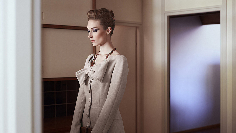
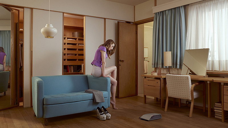
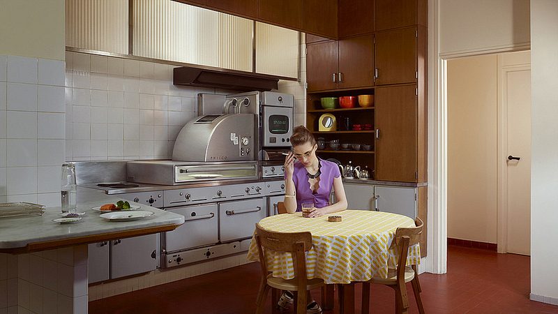
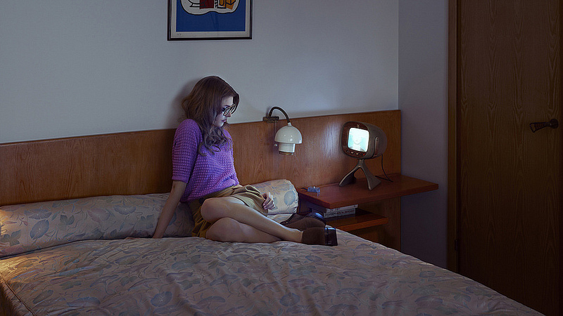
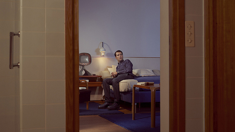
And the third – a contemporary fashion shoot by photographer Ben Sandler.
The home itself was completed in 1959 for very famous art collector Louis Carré. Aalto was asked to make a family home in the French country side with an incorporated gallery. Aalto felt that both art and family life are not separated by one and another, in fact the tendency is the reverse. There is a very intimate connection between them.
The other stipulation the client asked of Aalto was that the home be made of materials that had lived.
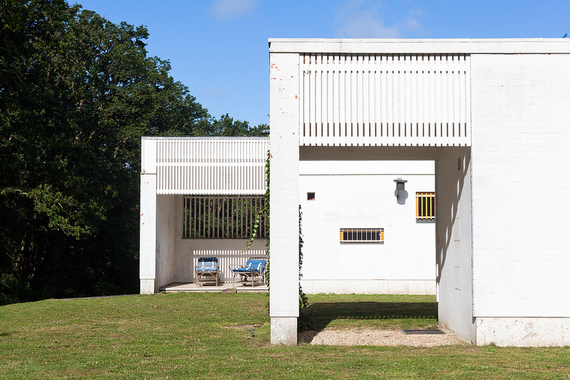
This was a task that Aalto was pleased with. He sourced the stone work locally from Chartres, and treated the brick with a white plaster lime-wash. The exterior was completed with copper sheeting, pine, and a slate roof.
The exterior is perhaps one of Aalto’s most extensive with regards to landscaping – carving down the elevation from the back of the home like waves creating a visual downward movement.
The elements on the inside are just as beautiful as the exterior.
Let’s take a look…
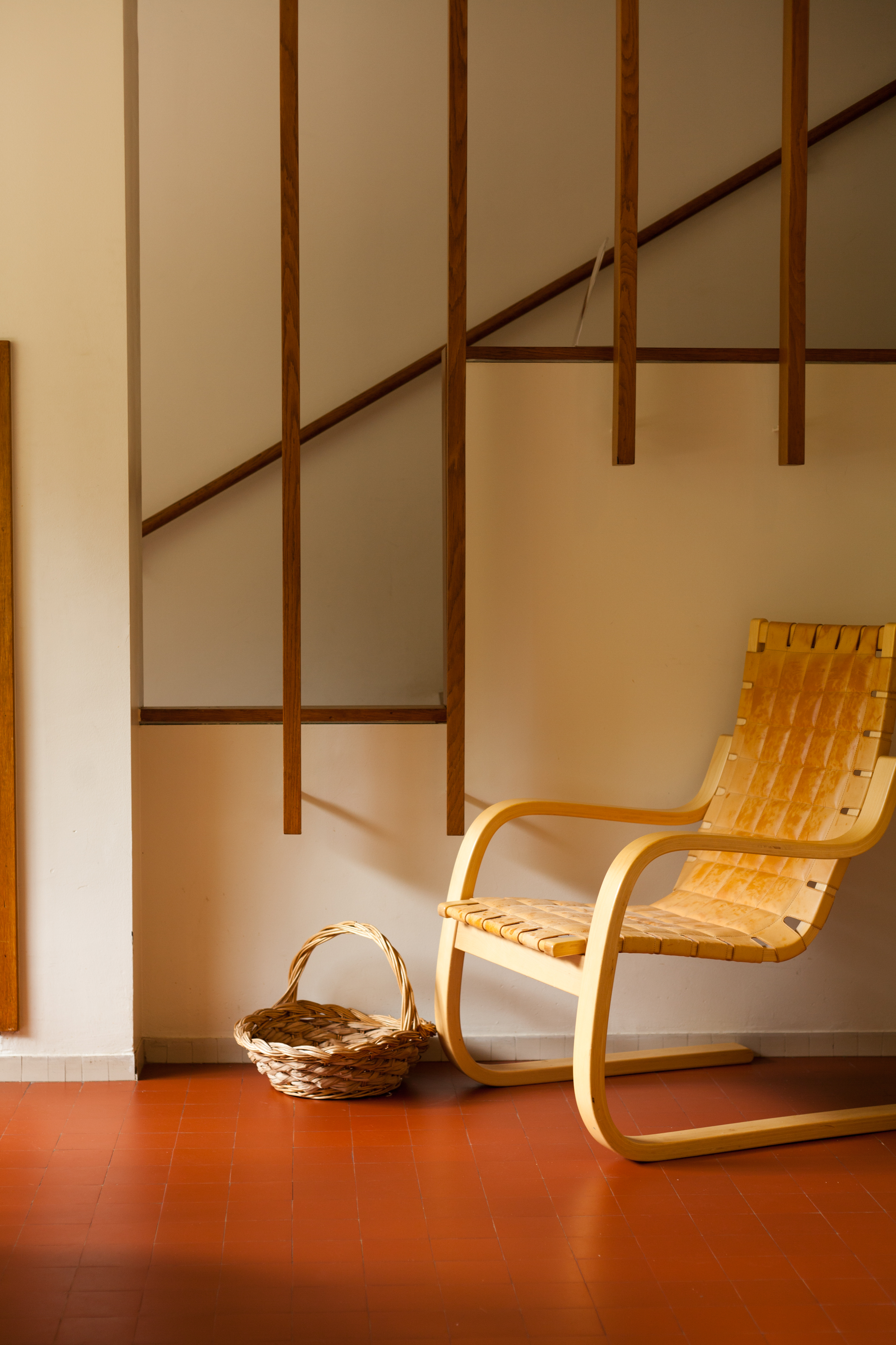
An armchair 406 in natural leather.
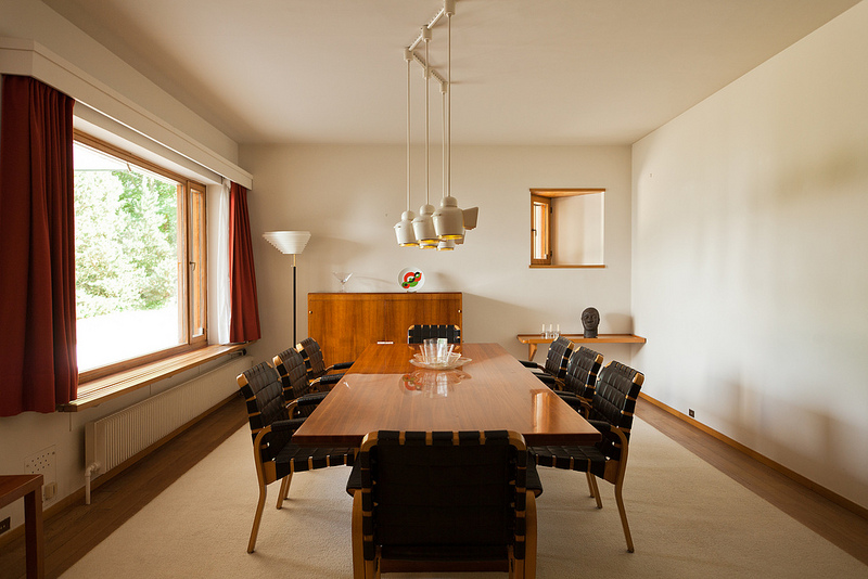
Many of the lighting fixtures were produced specifically for this project.
A room surrounded by books was very important to the client.
The exterior with lime-washed bricks.
The elevations in the landscaping.
Above photos by Doctor Casino.
—————–
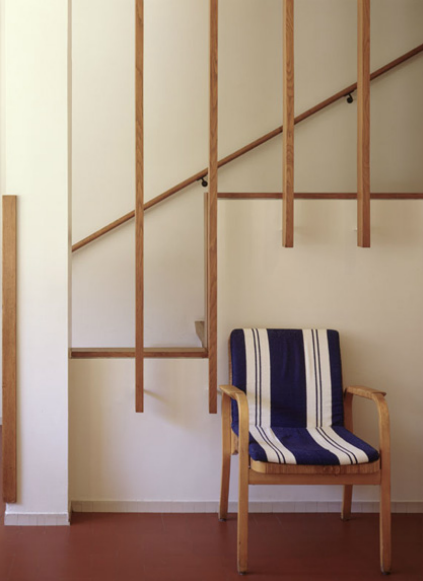
Some details worth taking a close look at.
Above photos from: http://www.maisonlouiscarre.fr/
——————–

This collection of photographs was something I’ve had bookmarked forever, and since it was featured in so many places I didn’t think it was necessary to share them. However, if we’re compiling photographs of Maison Louis Carré, it would be a sin to not include this set.
One of my favourite pendants, the turnip light. I’m hoping Artek will put this back into production at some point.
Photography by Ben Sandler
Just in the midst of finishing up this post our Lime-washer Ben, who is actually from Britain started lime-washing our own exposed brick wall. The elements of wood, copper, and white lime plaster are all inspired by Aalto’s natural palette and we’re excited to incorporate these elements in our new home.
I can’t wait to see what it looks like when it’s all finished.
Studio Junction workshop
It’s a rainy day here in Toronto, and I’m spending a quiet Sunday at the store reflecting on the past year and all of the amazing changes that have happened. There is nothing special about today, but it has a sort of significance for us because by this time next month we will have moved back into our home above the store.
Our mornings have consisted of talking about how nice it will be when we are back above the store, and our vision always includes enjoying coffee in various spots around the home. I go up almost every day to check on the progress, and I always find myself saying things like “Oh yes, the light is very nice here. This is the perfect place to have a cup of coffee.” In fact, there are 20 nice places to have coffee I think.
Now I feel a bit self conscious saying this next bit, but I think that if I acknowledge the stereotype all will be forgiven. Bloggers are often in the habit of apologizing about neglecting their blog, and we are guilty of this as well. We tell ourselves, once we are around nice surroundings we will be able to take more photos and talk with you more. I insist this is the truth, we will be back to our blogging ways soon enough.
Now I get a lot of people asking why we haven’t posted more photographs of the progress of our home, and I don’t really have a good answer. We’re always up for sharing most things, but this home is so intimate for us. I think over a time a mosaic of our home will be built with each post in the coming months. To just take a bunch of snaps of each room feels inappropriate. This is a space that needs time to settle in and evolve. Plus, if we show the whole house, how will we sell volume five of Mjolk?
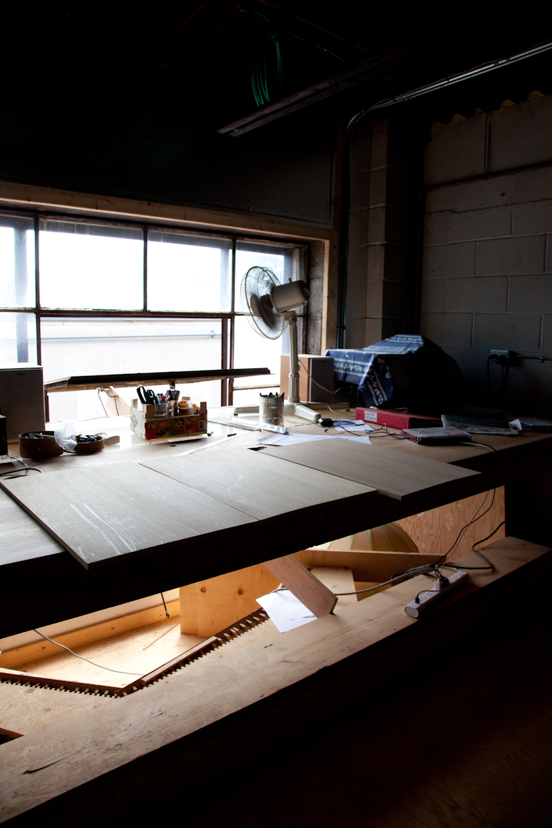
Anyway, I’ve been holding on to these photos of Studio Junction’s new workshop. A space that we have greatly benefited from, as most of our mill work has churned out from here. New machines were buzzing away as I stopped by to visit a forest’s worth of white oak slated to be milled into doors, windows, and cabinets.
The work space is in a large brick building with a cantilevered mezzanine.
The work desk.
A prized Japanese hand saw.
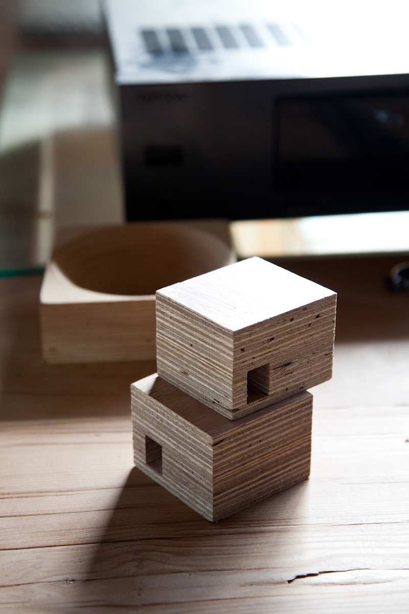
A micro building model made of laminated wood.
The industrial glass windows are operable from this sliding track mechanism.
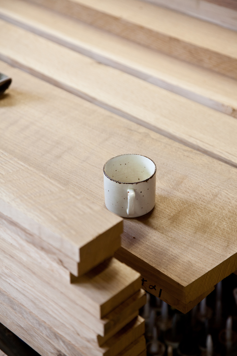
Piles and piles of white oak.
A huge slab of wenge being saved for something special – although we don’t know what that special something is yet!
The individual components for our doors.
The original light feature that was connected to the curve wall in our shop. The curve wall was originally part of an installation at the Gladtstone Hotel called “Come up to my room”. It was perfect timing because we commissioned our store shortly after and used the curved wall as a permanent feature at our store.
Seeing this, I wish we included the ceiling element as well!
The model of the infamous Courtyard House.
Only four more weeks to go. We can’t wait.
Pia Wallen Cross Blanket
Pia Wallen Cross Blankets are hard to come by, but we’re happy to report we received a decent amount of stock recently. As well, you’ll note the grey is discontinued and has been replaced by wild cotton, which is a pale blush colour. LOVE.
Pia sent Elodie a little gift – her baby slippers in the new wild cotton (blush) and polka dot style. Serious baby approves? Parents approve! Thank you Pia!
Nakashima Studio Part 3

We’re pleased to share our third and final installment of our trip to the Nakashima studio in New Hope. Today we’re taking a look into George Nakashima’s gallery, like previously noted we’re saving some photos for the book so this sneak peak will have to tide you over until next year!

There were beautiful illustrations of George Nakashimas buildings earlier in his career used for his portfolio and competitions. Note the signature at the bottom “I am a citizen of the U.S.” With a Japanese last name there was a lot of discrimination even though the architect was born in America and achieved a Masters in Architecture.

A sound sculpture by Harry Bertoia.

Floating stair case embedded into the stone wall.


Elodie on the Tatami mat.

One of my favorite pieces – The Conoid bench complete with antique indigo cushions.

Many aspects of the Nakashima compound were man made by George Nakashima, the plot of land was originally plowed farm land so elevations in the land, stone work, and most of the trees were planted by Nakashima himself. Although you would not expect that any of it was man made as it looks so natural in its setting.


The bridge separating Pennsyvania from New Jersey. We were staying at a hotel on the Jersey side in Lambertville.

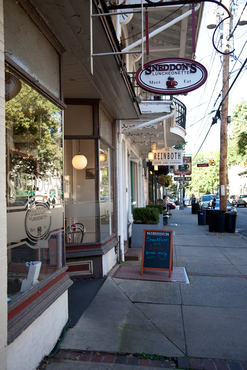
The local diner – Sneddon’s
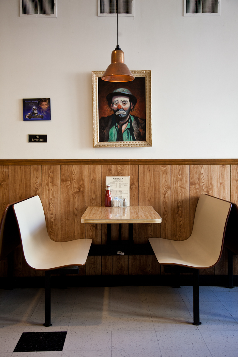
Copper lamps and sad clowns.
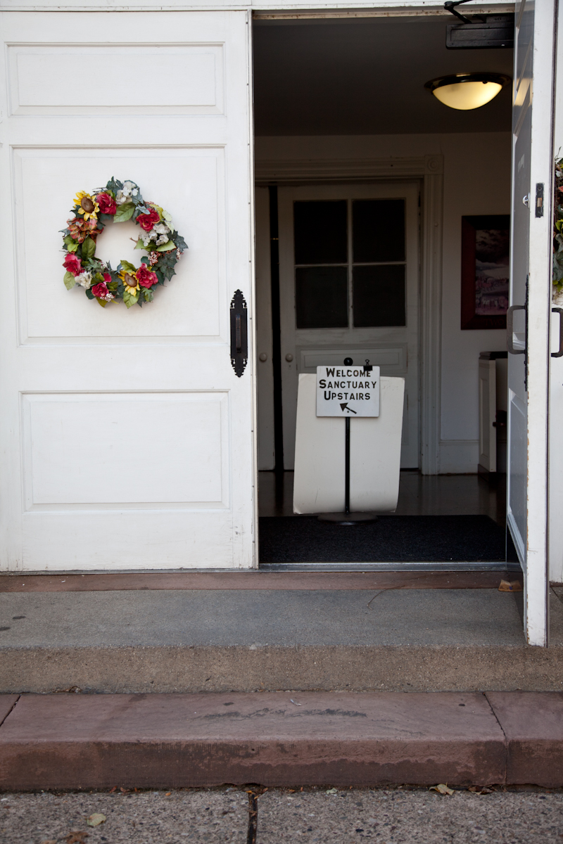

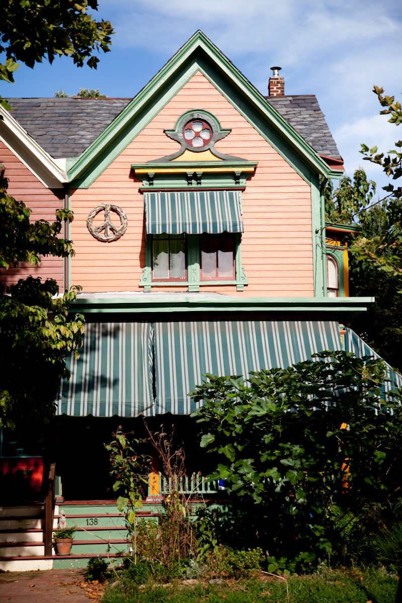
The area is unbelievably picturesque and lush.

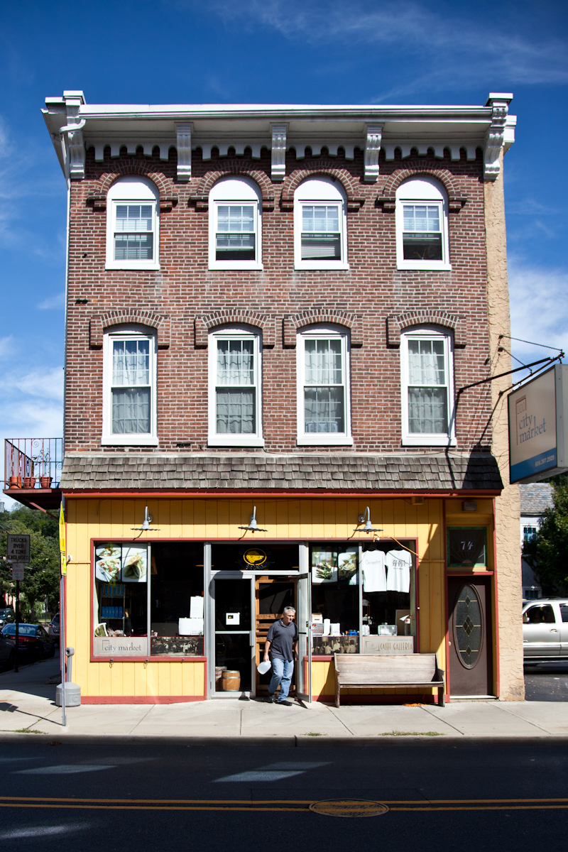
We asked a local jogger where the best place to get lunch in the city was and they told us about a cute spot called “City Market”.

New Hope Apple juice – so delicious.
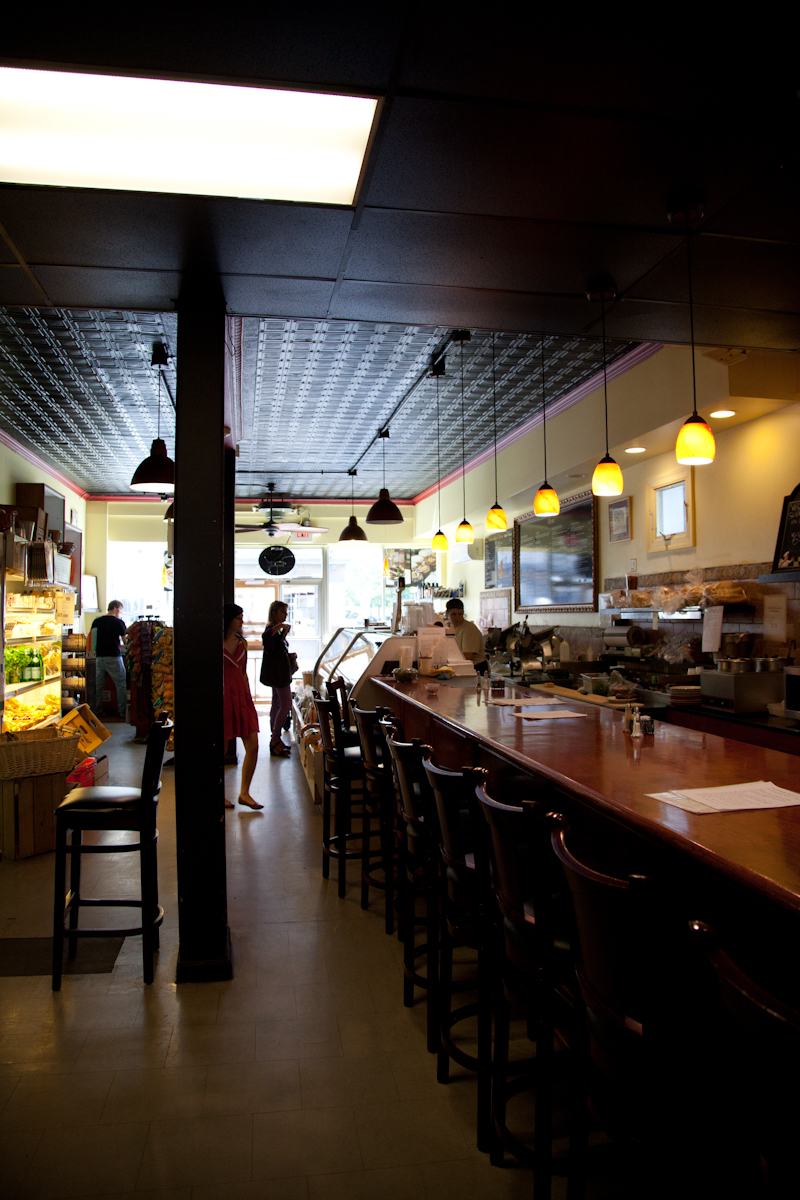
The deli acts as a hub for many of the locals. Lots of fresh food and good coffee on hand. I ended up getting a super American meal – ribs and corn bread!
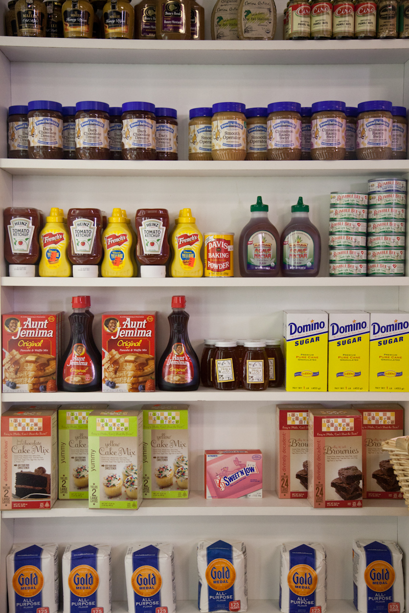
A collection of iconic American condiments all on one shelf.
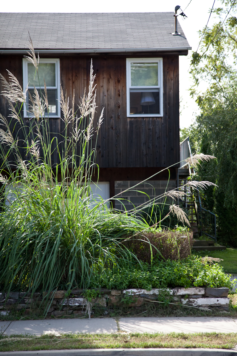
A beautiful cedar paneled facade with tall grasses. So tastefully done.
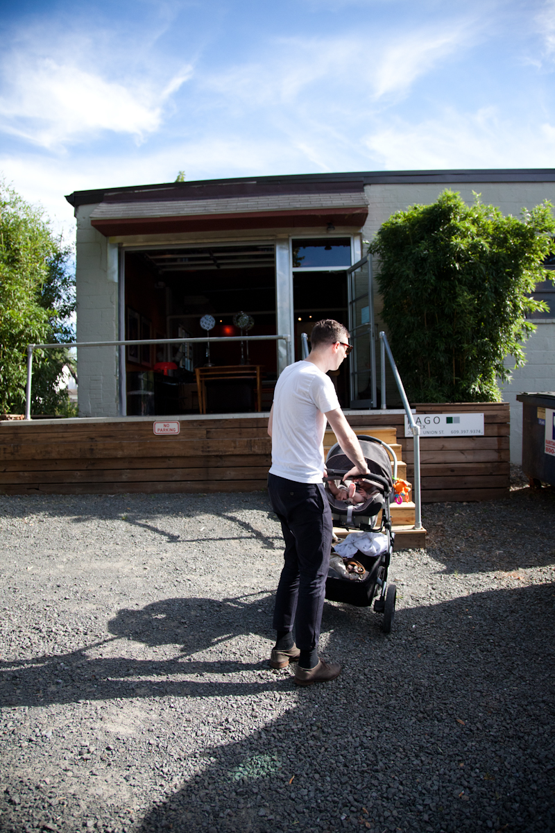
I didn’t even make this connection, but RADO auction house was actually in Lamberville. Lot’s of amazing things by Nakashima, Bertoia, and other big names on hand. We were lucky enough that they had a preview that day, it’s nice to see all of the work in person but it’s also overwhelming seeing that many beautiful things in one place.

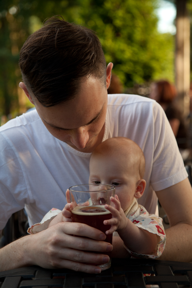
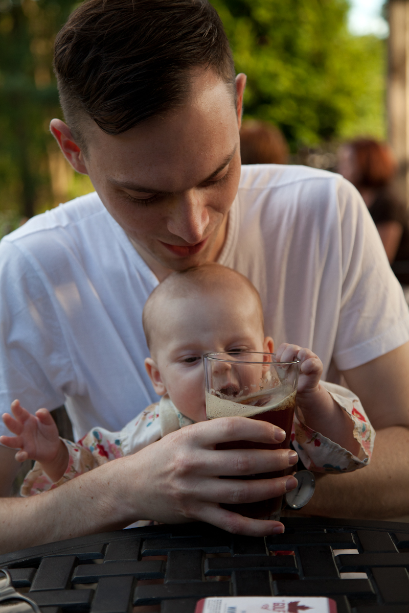


An apple is more her speed, she’s just starting to eat solids.


Om nom nom.


