New premium template: Expressions

A new premium HTML/CSS template has been published, called “Expressions”. It is a somewhat different kind of design compared to the previous templates, since it puts a lot of focus on a large image slideshow and a matching thumbnail gallery with lightbox popups. Expressions is built with standards-compliant HTML5 and CSS3, it is responsive and scales down to a custom layout on small-screen devices and it still offers the flexibility of a 12-column grid system which allows you to create any kind of layout you may want to. Basic form styles are included as well.

Expressions costs $4, and you can order it directly through the Expressions template page. Check out the screenshots and the live demo for more details:

Introducing: Luft – A premium HTML/CSS template

Today it is time to announce template #100 on andreasviklund.com, and it will be a somewhat different kind of release since it is the first commercial, premium website template on andreasviklund.com. The new template is called “Luft” (the Swedish word for “air”), and it is based on the Freestyle CSS grid – with a well worked-through design and a number of updates. In addition to the grid, it is the first responsive HTML/CSS template on andreasviklund.com – and it scales down perfectly to mobile devices. Luft is build using 100% validated and standards-compliant HTML and CSS. It is optimized for quick loading and uses semantically correct markup.

Premium templates with a special focus on design has been a popular request, since there are a lot of people who want to build simple and good-looking sites – while not making the sites look like tens of thousands of other sites. Luft gives you a pixel-perfect design, simple and well-structured. And the credit link in the footer can of course be removed.

To see what Luft looks like, go to the Luft order page and check out the screenshots. You can also see a live demo. Feedback is always welcome, and if you have questions – just ask.

Mobile website templates gallery added

Some of the HTML/CSS templates on this site include custom styles that makes it possible to build easy-to-read layouts for small-screen mobile devices such as the iPhone and Android mobile phones. Today, a new page has been added where these custom mobile template designs are highlighted: The mobile website templates page. It shows the mobile layouts as they appear on an iPhone screen, and there are links to live demos of the mobile layout of each template directly from the gallery page.

While none of the templates are based on responsive design principles, it may still be a good starting point for those who want to quickly build custom mobile websites. Future templates built with responsive layouts will be included as well.

New template: Inland Mobile

With the addition of this page, I also released Inland Mobile, a small-screen version of the Inland design. It features a simple mobile layout (as seen in the screenshot attached to this post) that can easily be added to sites built with the original Inland template. Feedback on the small-screen layout would be very welcome, and there will be similar updates to all templates in the Inland series over the next couple of days.

You can download Inland Mobile directly or read more about it on the Inland Mobile template page

Origo v1.1 released

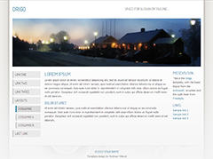
The free Origo HTML/CSS template has been updated to version 1.1. The new version adds two additional 2-column layouts, similar to the example layouts in the andreas01 template. Support for subpages in the navigation menu, as well as a CSS class that highlights the currently active page in the navigation menu, has also been added along with minor code fixes that replaced unused CSS classes in the HTML with appropiate CSS styling.

Download the updated Origo template directly: origo.zip (117 Kb .zip).

To read more about the Origo template and see updated screenshots and a live demo, go to the Origo template page.

WordPress 3.5 (beta 1) is released

A few days ago, the first beta version of WordPress 3.5 was released. As always, it introduces a number of new features. And as always, it is not recommended for use on live websites while since it is still an early beta version. Still, it may be worth checking out if you are a plugin developer or theme designer. I have tested it with all my WordPress themes to make sure that the themes will work once the final version of WordPress 3.5 is released. So far, I haven’t seen any problems, other than the fact that some of the newer features features are not supported. This shouldn’t cause any problems for existing sites, but it is worth keeping in mind.

More WordPress…

While on the topic, I would like to recommend a really good article written by Jesse Friedman for .NET magazine. It is called 20 common WordPress mistakes, myths and misgivings, and it provides a list of common errors and some arguments against using WordPress as a website engine, as well as some useful tips. In practice, it is short but very well-written list of why WordPress is well worth considering no matter what kind of website you are planning to build. Jesse Friedman is also the author of Web Designers Guide to WordPress, a book which I still haven’t read but which I have seen positive reviews about.

WordCamp Stockholm 2012

On October 22nd 2012, I am planning to attend WordCamp Stockholm 2012 at the Waterfront Congress Centre in central Stockholm, to watch a number of presentations and meet up with other WordPress users and developers. I will be there as a regular guest, not as a speaker. Come and say hi if you are attending!