• Disney Research makes plants interactive

    August 15, 2012 to Data Art by Nathan Yau

    Botanicus Interacticus from Disney Research turns plants into multi-touch surfaces, simply by placing an electrode in the soil.

    Botanicus Interacticus has a number of unique properties. This instrumentation of living plants is simple, non-invasive, and does not damage the plants: it requires only a single wire placed anywhere in the plant soil. Botanicus Interacticus allows for rich and expressive interaction with plants. It allows to use such gestures as sliding fingers on the stem of the orchid, detecting touch and grasp location, tracking proximity between human and a plant, and estimating the amount of touch contact, among others.

    And then botany education changed forever.

    [via Boing Boing]

  • Evolution of video game controllers

    August 15, 2012 to Infographics by Nathan Yau

    Evolution of Video Game Controllers

    From the department of old-but-new-to-me, Pop Chart Lab charted the evolution of video game controllers. There are 119 of them pictured in total.

  • Meryl Streep scatterplot

    August 14, 2012 to Miscellaneous by Nathan Yau

    Meryl Streep scatterplot

    Vulture plotted Meryl Streep's character faces on a cold-warm, frivolous-serious scatterplot. Sure, why not.

  • Network analysis on high school hierarchy of friends

    August 13, 2012 to Statistics by Nathan Yau

    Brian Ball and M. E. J. Newman analyzed friendship data from a high school and junior high, and found a hierarchy similar to the one in Mean Girls.

    Here we analyze a large collection of such networks representing friendships among students at US high and junior-high schools and show that the pattern of unreciprocated friendships is far from random. In every network, without exception, we find that there exists a ranking of participants, from low to high, such that almost all unreciprocated friendships consist of a lower-ranked individual claiming friendship with a higher-ranked one.

    So someone higher up on the totem poll had more people saying they were friends with him or her, but the popular one didn't necessarily feel the same.

    I told my wife this, and her reaction was basically, "Uh, yeah. And?"

  • Paintings as pie charts

    August 10, 2012 to Data Art by Nathan Yau

    Ten years, ten artists

    Expanding on his Vincent van Gogh pie charts, Arthur Buxton minimalized famous paintings from ten artists into more of everyone's favorite chart type. The color distribution of each pie represents the five most used shades in each painting. Like the first time around, you're either loving this or foaming at the mouth.

  • State stereotypes suggested by Google

    August 9, 2012 to Mapping by Nathan Yau

    Why are Americans so fat

    Renee DiResta got to wondering about state stereotypes, so she looked them up on Google and mapped them.

    In the months before a US Presidential election, the quality of political discourse hits new lows. Blue State/Red State tropes dominate the news cycle as the media gins up outrage over perceived injustices in the culture wars. It’s all about our differences. So I started wondering, how do Americans really think about "those people" in other states? What are the most common stereotypes? For each of the fifty states and DC, I asked Google: "Why is [State] so ” and let it autocomplete. It seemed like an ideal question to get at popular assumptions, since “Why is [State] so X?" presupposes that X is true.

    Roll over a state on the map, and the top four suggestions are listed. Hilarity ensues. "Why is California so... liberal, broke, anti-gun, and expensive?"

    [via @rachelbinx]

  • Review of Tufte course

    August 8, 2012 to News by Nathan Yau

    Thousands of people have attended Edward Tufte's one-day course on data graphics. Robert Kosara did not like it.

    My advice? Buy his books. Read them. They're good. Just realize that you're getting a historical perspective on data visualization, not the cutting edge. Understand that Tufte's ideas are a good starting point, not a religion. There are many things that Tufte doesn't know, including pretty much anything related to visual perception and cognition, recent work (less than 30 years old), and interaction.

    I've never been, but that's sort of what I expected. Has anyone had a different experience with the course?

  • Celebrating the joy of metering

    August 8, 2012 to Data Art by Nathan Yau

    Compass Brooch

    Meters, by Berlin-based designers Patrick Kochlik and Monika Hoinkis, celebrates the joy of measuring for the sake of measuring. The pieces include a compass brooch and a bubble level that you wear as a watch, which is nice because everyone likes to know where they're going while walking a level surface.

    [via infosthetics]

  • Short film imagines life with data and constant digital

    August 8, 2012 to Data Art by Nathan Yau

    In the what-happens-when-technology-takes-over-our-lives genre, Sight by Eran May-raz and Daniel Lazo, imagines a world where we wear contacts that augment our reality at such a high level that digital becomes physical. Life becomes a game, and everything is gamified, including an incredibly awkward date. But wait, there's an app for that.

  • Portal 2 timelines

    August 7, 2012 to Infographics by Nathan Yau

    Portal 2 timelines

    I've never played Portal 2 (or the first), but I suspect some of you will find these timelines by designer Piotr Bugno interesting.

    As a fan of Valve’s Portal 2 video game, I designed this infographic led by my curiosity to get a better grasp on its plot, on how mechanics informed the gameplay, and on the development of its main themes — good vs evil, descent vs ascent, destruction vs construction.

    Seriously, all meaning is lost for me on these. Any Portal 2 fans care to chime in?

  • Track and field Olympic performances in perspective

    August 6, 2012 to Infographics by Nathan Yau

    Long jump records explained

    We've been hearing Olympic records rattled off for the past week, but it's hard to grasp just how great these athletes are performing. I mean, we know they're doing amazing things, but just how amazing? Kevin Quealy and Graham Roberts for The New York Times put it into perspective with two videos, one on the long jump and the other on the 100-meter sprint.

    After I watched each, all I could think was, "Oh crap, that's good."

    The videos frame distances and times in a way that's immediately relatable, such as a basketball court to show how far medals winners jumped or how far previous sprinters would be behind Usain Bolt. Smooth transitions move you through different perspectives and pauses give focus to the most notable athletes, and although each video covers a lot of information, you never feel disoriented. They cover the overall picture, down to the individual, and back again.

    Good stuff. Give 'em a watch.

  • Fox News continues charting excellence

    August 6, 2012 to Mistaken Data by Nathan Yau

    Bush cuts

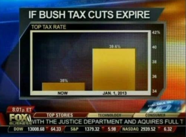
    Fox News tried to show the change in the top tax rate if the Bush tax cuts expire, so they showed the rate now and what'd it be in 2013. Wow, it'll be around five times higher. Wait. No.

    The value axis starts at 34 percent instead of zero, which you don't do with bar charts, because length is the visual cue. That is to say, when you look at this chart, you compare how high each bar is. Fox News might as well have started the vertical axis at 34.9 percent. That would've been more dramatic.

    Here's what the bar chart is supposed to look like:

    With a difference of 4.6 percentage points, the change doesn't look so crazy.

    [via Effective Graphs]

  • Olympic rings as data symbols

    August 3, 2012 to Data Art by Nathan Yau

    Artist Gustavo Sousa used the Olympic rings as data indicators for statistics like obesity, homicides, and number of billionaires. Each ring represents a continent, and the larger the ring, the larger the value. Simple and an interesting metaphor shift.

  • What planets would look like if they replaced our moon

    August 3, 2012 to Data Art by Nathan Yau

    Artist Brad Goodspeed imagined what the planets would look like if they were to orbit Earth, in place of the moon. His math is iffy, but the video is fun to watch.

    [via kottke | Thanks, Thomas]

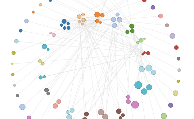
  • Circular Network Layout

    How to Make an Interactive Network Visualization

    Interactive network visualizations make it easy to rearrange, filter, and explore your connected data. Learn how to make one using D3 and JavaScript.
  • Twitter Political Index measures feelings towards candidates

    August 1, 2012 to Statistical Visualization by Nathan Yau

    Obama vs Romney

    In partnership with social analytics service Topsy, Twitter launched a Political Index that measures sentiment towards Barack Obama and Mitt Romney.

    Each day, the Index evaluates and weighs the sentiment of Tweets mentioning Obama or Romney relative to the more than 400 million Tweets sent on all other topics. For example, a score of 73 for a candidate indicates that Tweets containing their name or account name are on average more positive than 73 percent of all Tweets.

    The key is the comparison against all tweets for a sense of scale. As seen from the chart below, the index fluctuates closely with Gallup estimates.

  • Nigel Holmes on explanation graphics and how he got started

    August 1, 2012 to Design by Nathan Yau

    Some consider Nigel Holmes, whose work tends to be more illustrative, the opposite of Edward Tufte, who preaches the data ink ratio. Column Five Media asked Holmes about how he works and what got him interested in the genre.

    As a young child in England, I loved the weekly comics "The Beano" and "The Dandy." They were not like American comic books; they were never called "books," for a start. These English comics from the late 1940s and early '50s had recurring one-page (usually funny) stories featuring a cast of regular characters. They had names like Biffo the Bear, Lord Snooty, and Desperate Dan. The comics were printed on poor-quality newsprint, which seemed to go yellow as you were reading it, but there was something very attractive about them.

    I like the small dig on Tufte around the middle, while citing the paper that happens to find that Holmes' graphics were more memorable than basic charts.

    My own work at first was a little too illustrative, and Edward Tufte made a big fuss about what he thought was the trivialization of data. Recent academic studies have proved many of his theses wrong.

    It seems the arguments haven't changed much over the decades.

  • Network of political contributions

    July 31, 2012 to Network Visualization by Nathan Yau

    Political Moneyball

    The Wall Street Journal visualized major political contributions, according to the Federal Election Commission, in a piece they call Political Moneyball.

    Based on the money sent between the players (and other characteristics like party and home state), our presentation pulls players toward similar players and pushes apart those that have nothing in common. The players who are most interconnected (like industry PACs who try to make alliances with everyone) end up close to the center. Those who are less connected (like a donor who only gives money to Ron Paul) are pushed away from the center.

    Analysis was powered by CartoDB, and the network by Tulip.

    The challenge with these network graphs that have lots of nodes and edges is narrowing down what's useful. With yesterday's Internet map it's easy to relate, because you just search for the sites of interest, and the large ones such as Facebook and Twitter provide context.

    However, with Political Moneyball it's tougher, because there are so many entities you've never heard of. My suggestion: Start with the examples section (such as who the National Rifle Association supports) in the sidebar, and go from there. It'll be much easier to get into it.

  • Ascii Street View

    July 31, 2012 to Mapping by Nathan Yau

    Ascii Streetview

    Peter Nitsch created Ascii Street View, converting Google Street View to colored letters. Search for a location and experience the retro goodness. [via Waxy]

  • Map of connections in the human brain

    July 30, 2012 to Visualization by Nathan Yau

    Using a new kind of MRI scanner, scientists at the National Institutes of Health mapped the connections in the human brain, revealing an intricate, grid-like structure.

    "Before, we had just driving directions. Now, we have a map showing how all the highways and byways are interconnected," says Van Wedeen, a member of the Human Connectome Project. "Brain wiring is not like the wiring in your basement, where it just needs to connect the right endpoints. Rather, the grid is the language of the brain and wiring and re-wiring work by modifying it."

    [via Matt Mullenweg]

Unless otherwise noted, graphics and words by me are licensed under Creative Commons BY-NC. Contact original authors for everything else.