
A map in Cees Nooteboom’s novel In the Dutch Mountains shows the Netherlands improbably extended, via a narrow corridor, to a large territory on the Balkans (1). The idea of the map (and the novel) is to provide the Netherlands, well-organised to the point of dullness as it is, with a romantic counterweight, a colony on the rough edges of civilisation. Denmark doesn’t need such a fictional contrepoids. It has Greenland.
"From an artistic and cultural perspective, Greenland has always been the Orient of Modern Denmark," said Danish artist and curator Khaled Ramadan in a text figuring in a 2006 exhibition on 'Rethinking Nordic Colonialism'. Greenland has been the majestic canvas on which domesticated Denmark could project its national dreams of greatness - even if they came with a serious risk of frostbite.
Like the Netherlands, Denmark today is a small, unprepossessing country, minding its own business in its corner of Northwestern Europe. But to both countries are attached the phantom limbs of empires past.
The Dutch are clinging, ever more tenuously, to half a dozen islands (2) in the Caribbean, but they have colonial legacies from the Hudson Valley over Cape Town to New Guinea. The Danes once lorded it over much of England, then called Danelaw, and more recently held sway over bits of the Caribbean (3) and India (4). Of its Arctic empire, which once encompassed Norway and Iceland, only the tiny Faeroer Islands remain, and Greenland.
Greenland simultaneously dwarfs the Mother Country, and is dwarfed by it. In size, it is the world’s largest island (5), and about 50 times larger than Denmark. In population, it’s a few thousand Inuit short of 60,000 inhabitants, which only just measures up to Denmark’s 10th-largest city, Kolding.
In spite of its numerical advantage, Denmark has not swamped Greenland with colonists to outnumber the native Inuit, and further to its credit, it has been preparing Greenland via a decades-old autonomy for an eventual independence. For the moment, the Danish government maintains sole responsibility for the defence and foreign affairs of Greenland (6). Until its natural wealth is adequately exploited, Denmark provides a yearly subsidy in excess of $10,000 per Greenlander.
Nordic Colonialism, to re-use the phrase being rethought by Mr Ramadan, doesn’t seem like such a bad thing, in this case at least: rather benevolent, and nudging towards a happy end. But any colonisation, however benevolent, implies the imposition of social values, models and roles on the colonised. This has the potential to fray the social fabric of native communities. Strikingly, alcoholism and suicide are rife in Greenland, much in the same way these twin scourges have ravaged other colonised peoples.
The Aborigines of Australia, for example. In levels of poverty, rates of suicide and alcoholism, and life expectancy, Australia’s First Peoples are doing a lot worse than the national average. One poetic act of native revenge was effected on 26 January 1988, Australian Bicentenary Day. Exactly 200 years after Arthur Phillip of the so-called First Fleet had claimed Australia for Britain, the Aboriginal activist Burnum Burnum landed at Dover and planted the Aboriginal flag on the white cliffs, claiming Britain for his people.

This map depicts a similar role reversal, with the Danish colonisers and colonised Greenlanders trading places. Greenland’s familiar topography - a white, empty core surrounded by a thin crust of small settlements - is transposed on the equally familiar map of Denmark. The coastline is extremely jagged, as is the Greenlandic one, from the erosive force of the gletschers flowing down from the massive central ice shelf. This is what Denmark might look like if the Inuit had colonised Denmark - and brought along their climate.
The map legend and the city names are in both Danish and Greenlandic - as they are on maps of Greenland, but here, it’s the Danish names that are ‘native’ and the Greenlandic ones that have been imposed (7). Reflecting the balance of colonial power, it’s the native names that are between brackets. The ‘colonial’ name is in capitals.
As in Greenland, large tracts of the interior are named after people - Greenlanders instead of Danes, this time. The best-known Greenlander to the outside world perhaps is Jonathan Motzfeldt, who served as the first and third prime minister of autonomous Greenland. He gets a large Land named after him in the south of Jutland.
The intended effect of this map is for the Danish to experience being on the receiving end of colonisation. But in a double irony, most of the Greenlanders lending their name to frozen pieces of Denmark have... Danish surnames.
Many thanks to Mikael Parkvall for sending in this map, found here at the website for the exhibition on Rethinking Nordic Colonialism. The map was designed by Inuk Silis Høegh and Asmund Havsteen-Mikkelsen.
---
(1) I’ve seen this map only once, in the novel’s original Dutch-language version (title: In Nederland) and don’t have a copy. Anyone?
(2) Actually, more like five and a half. Aruba, Bonaire, Curaçao, Saba, St. Eustatius, and the southern half of St. Maarten (the northern bit being French) together used to form the Netherlands Antilles, a separate ‘country’ within the Kingdom of the Netherlands. Presently, the count is three countries (Aruba, Curaçao and St. Maarten) and three ‘special municipalities’ (Bonaire, Saba, St. Eustatius).
(3) The Caribbean bits are now the US Virgin Islands. The Danes held on to what they called the Jomfruøerne until the 1916 treaty that sold them to the States. Some place names on St. Croix (Christiansted), St. John (Hansen Bay) and St. Thomas (Charlotte Amalie, after a queen-consort of Denmark-Norway) still reflect the Danish era.
(4) A Danish Museum in the old Danish Fort are all that remains of the Danish colony of Tranquebar (1620-1845), now the small seaside town of Tharangambadi in the southern Indian state of Tamil Nadu.
(5) The world’s largest island that is not a continent, to be exact. The world’s largest island per se is Australia (3,269,629 sq. mi, 8,468,300 km2), but it is also considered the world’s smallest continent. At 836,330 sq. mi (2,166,086 km2), Greenland is the largest non-independent territory in the world. If independent, it would be the world’s 12th-largest country, between the DR Congo and Saudi Arabia.
(6) This includes arguing with Canada for sovereignty over tiny Hans Island, and with the Russians for sovereignty over the North Pole (and, more to the point, over the natural resources in the Arctic seabed).
(7) My Greenlandic is rather wobbly. Can anyone provide translations?

What to think of others? Stereotypes provide a simple answer to that complex problem. Most such answers, to borrow one of H.L. Mencken's bons mots, are neat, plausible, and wrong. If they do contain a kernel of truth, they often say as much about the spouters of the cliché as about its spoutees. Australians especially, separated from the rest of the civilised world by distance and language (1), suffer from this type of gross generalisation.
Contrary to the stereotype of the corked-hatted bushwalker, your average Australian is a city-dweller, more familiar with indoor plumbing than with outdoor predators. Nearly 90% of the continent-sized country’s 22.6 million inhabitants live in cities, with over half of all Ozzies residing in no more than five of the country’s largest metropolitan areas (2).
For this urban version of Australia, we conveniently have another stereotype at the ready. Drip-fed into our collective consciousness by sempiternal soaps like Neighbours and Home and Away, this Down Under is an endless suburbia under a cloudless sky, within earshot of the ocean surf. The perfect paradise, were it not for the teenage heartbreak, family feuds and other domestic crises erupting weekly, with eerie regularity.
Surely, a genuinely local perspective will do away with these sweeping generalisations? Yes - if only to replace them with a more detailed set of clichés. No matter whether the scale is global or local, humanity always tends to divide itself into Us and the Others, reserving its most favourable opinion for the Self. These four miniature maps of Sydney do precisely that.

An unintended bonus: as Sydney’s geography is relatively unfamiliar outside of Australia (3), these maplets provide basic lessons in both the physical and social geography of the country’s most populous city.
The maps all show a land mass consisting of a central peninsula, bordered by two bays, next to a body of water. We may assume - safely, I would think, even without cribbing off Wikipedia - that this is the Pacific shoreline of southeastern Australia, and that the peninsula forms the core of Sydney’s metropolitan area.
The four windows on Sydney’s social geography together constitute an interesting composite image. Each miniature map is conceived as an Us vs Them landscape, but from a different perspective. Might we achieve some stereographic depth by overlapping these four admittedly very subjective caricatures?
The four perspectives provided here are, clockwise from top left: the North Shore, the Eastern Sub(urb)s, the Inner West and the Shire. Each of these zones is easily identifiable on the map, as they are the only unambiguously positive labels on each one. The North Shore is the Fatherland (top left), the Eastern Subs are Enlightenment (top right), the Inner West is Cultured (bottom left) and the Shire is, simply Australia (bottom right).
These positive labels - and the names given them in the other maps - go some way towards painting a sociological picture of the areas. Might fatherland indicate that the North Shore is a predominantly conservative and northern European enclave? Does enlightenment indicate that the Eastern Subs are awash with buddhist spiritualism? Would cultured mean that the people of the Inner West are actually well-educated enough to bother going to that fantastic Opera House? And could the simple sobriquet Australia be seen to infer that here we have to do with honest-to-god, salt-of-the-earth, archetypes of authentic - and probably quite rural - Australian life? The nomenclature Shire itself already suggests a rural setting.
It’s interesting to see how these impressions are underscored by how each area labels the others. Here’s a bit of amateur sociographic triangulation:
The North Shore, to the enlightened Eastern Subs, is Tony Abbott Land. As I have no clue who that is, this is not very helpful. But to the supposedly civilised Inner West, the area is Mordor. This chimes with the tendency to caricature people more conservative than oneself ‘to the right of Genghis Khan’. If the Shire is rural old Australia, it makes sense for them to see their better-off conservative co-citizens as their Rich Anglo Brother(s).
To the conservative North Shore, the Eastern Subs are the pits of decadence, filled with Wankers and Queens. The Inner West sees them as Bourgeois Pigs, while to the Shire they are, quite simply, Satan. Does enlightenment include burning at the stake?
The Inner West is tarred with three not totally dissimilar brushes: Hippies, Nouveau Riche and Socialism. The opinion of the Shire is entirely unanimous: Bogans. This typically Australian epithet defines someone who is lower-class, unfashionable and a bit rough around the edges. Although it is used here as a derogatory term, it can also be self-applied as badge of honour.
So what about Sydney’s other areas? Not much love for the large, tan area out west: Out There, Someone has to live there, Cultural cringe, Refugees. Is this a neglected part of the city, far out into the commuter belt - Sydney’s answer to London’s Dagenham?
The area between this bit and the North Shore is defined mainly by what it is not: Not the North Shore, Not even Sydney, Not sure what to think. Another part of the nondescript sprawl that is endemic to large cities? Maybe, but apparently a very god-fearing one, as to Inner Westerners, this is a.k.a. the Bible Belt.
The area between the Inner West and the Shire receives both praise (from hip Eastern Subbers, for their kebabs and souvlaki) and scorn (from the Inner West: Do they even have small bars?) For the Bogans of the Shire, this supposedly ethnic melting pot is Too close for comfort.
Less clear is why North Shorers would take a daytrip to an area only otherwise defined as rich in Yummy ethnic foods, and what the deal is with the Campbelltown Art Centre in the southwest. But maybe that is something that can be cleared up by Sydneyites themselves - be they Bogans, nouveaux riches, Satanists, Bible Belters. Or even Tony Abbott.
This map found here on Black Maps, a blog about Science + Comics + Politics + Maps, being the reflections of an amateur cartographer. Many thanks to the commenters pointing out that it first appeared in Tharunka, the student newspaper of the University of New South Wales. Click here for a better look at the relevant cover.
-----
(1) Australians speak Strine, a distant relation to English.
(2) Sydney, Melbourne, Brisbane, Perth and Adelaide, in descending order of magnitude, add up to more than 13 million inhabitants, well over half of all Australians.
(3) To me, at least. And I suspect that for many other non-Australians too, the mental map of Sydney is blank but for a bay, a harbour bridge and an opera house.

This rudimentary map, showing an Iran crudely cut in two, is currently making the rounds of social media in that country. Its message, as clear as it is simple, is that Iran is a house divided (1). More particularly, it is also a stark repudiation of controversial measures for ever stricter gender-based segregation in the Islamic Republic.
A country map is as powerful a symbol of national unity as a flag or a head of state. Yet many countries are as fundamentally defined by their internal divisions as by their external extremities. Belgium, a vaguely triangular piece of toast, is neatly sliced in northern and southern halves by the Dutch-French language border. The continent-splitting Ural Mountains define the brobdingnagian Russian state as both a European and an Asian power.
Iran too has internal divisions that belie the apparent stability of its national borders. So much so that to stress the country’s multi-ethnic make-up - Kurds in the northwest, Arabs in the south, Baloch in the southeast, and others - is almost tantamount to questioning its territorial unity (2). This map steers clear of that can of irredentist worms, by drawing the line straight across the - solidly Persian - core of the country.

Yet at first glance, this map does seem to depict a physical border, hotly contested and deeply entrenched - think the Western Front of World War One, or the Berlin Wall during the Cold War. Left to right, three lines appear to denote a solid wall, the actual demarcation line, and a barbed wire fence, consecutively. But this border is completely virtual, unrelated to any ethnic divisions or topographic obstacles on the ground (3).
For this is about two other rifts - firstly in the minds, between Iranian liberals and conservatives (4); and consequently in the increasingly gender-segregated public sphere (on public transport, in university auditoriums, etc.) The legends on the map, in Farsi, read:
Islam’s rules for segregating the sexes are open for interpretation - and are applied with a huge degree of variation throughout the Muslim world. Living in one of the strictest Islamic environments, Saudi women are all veiled up and have nowhere to go, lacking the permission to drive. But in secular societies, women who self-identify as Muslim may lead lives that are virtually indistinguishable from their non-Muslim counterparts, sartorially and otherwise. Iranian women are situated somewhere between those two ends of the spectrum: obliged since the Islamic Revolution (1979) to wear the veil in public, yet able to participate in public life to a much larger degree than their Saudi sisters.
To which degree? That is the subject of an ongoing tug-of-war between moderates and conservatives in Iranian politics. Just how relative those terms are, is shown by the fact that the Iranian president Mahmoud Ahmadinejad - no bleeding-heart liberal he - is now coming out against some proposals for yet more gender segregation. This map, mocking the length to which some would go to separate Iranian men and women, is with the Iranian president on this issue - although one senses, from its acerbic tone, that there might be little else of agreement between the mapmaker and the president.
Clearly, in the complex world of Iranian politics, this battle of the sexes is a proxy war between clerical hardliners and other political forces within Iranian society.
More about that in this article at Radio Free Europe/Radio Liberty, whence this map was taken. Many thanks to Mike Beidler for sending it in (and for providing the translations for the Farsi captions).
-----
(1) “A house divided against itself cannot stand”: the quote is associated with Abraham Lincoln, in an 1858 speech describing the US right before the outbreak of the Civil War. Lincoln was actually citing Jesus Christ, from Matthew 12:25.
(2) See one of the earliest maps on this blog: #8.
(3) The line does seem to traverse Tehran, located just south of the Caspian Sea. Is there an east-west divide in the city between more and less conservative areas?
(4) These terms are relatively neutral, but nevertheless subjective. Either side no doubt uses more polarising definitions for the opposing camp.
(5) Might this geographical distribution reflect the traditional seating arrangements in [shi’ite] mosques?

When you think of it, borders are paradoxical. They connect what they aim to divide. A borderline marks, with guillotine-like precision, where two territories separate; but no matter how far they expand in either direction, those territories resemble each other closest at their common boundary.
Borders can be impenetrable or irrelevant, and possess any degree of permeability in between: highly militarised, annoyingly bureaucratic, or merely symbolic. In any of those degrees, borders retain an iconic status. They’re humankind’s answer to the shorelines and mountain ranges of geology.
Without borders, a map is blind. With those lines, cartography is armed with a elementary tool for basic triage: here from there, us from them.
But those boundaries serve another function. They mould the territory they circumscribe into a reassuringly familiar shape. This geographic Gestalt is why, even though the genesis of borders is mostly obscured by history, and their relevance is often obsolete, we get worked up when confronted with an alternate set of borderlines.
Those alternate borders fascinate us because of their imaginative out-of-placeness. Take a look at Jefferson’s proposal for new states in the US’s new Northwestern Territories, for example: they seem all wrong - probably only because they never made it off the drawing board [1].

This map plays into our fascination with borders, both the iconic ones and their alternate versions. The linear base map shows the US subdivided into its constituent states and counties [2]. The colour overlay reveals so-called ‘call data communities’.
The extension of these areas was calculated by MIT and IBM, analysing anonymised call data. The map delineates zones in which people are more likely to call someone inside those areas rather than outside of them. The result is a revelatory re-mixing of states of America. Some split, others merge with their neighbours.
Some suggested names for a few of these new communication-based communities (or ‘communicities’). For upstate New York: Seneca. For the West Virginia-western Pennsylvania state: Monongahela, after the river (and the valley) that connects them. For Virginia and Maryland: Chesapeake. For more, see here at Underpaid Genius. Or here at the NY Times.
Many thanks for all who suggested this map: Jennifer Berg, Alex Meerovich, Serena Palumbo, Guy Plunkett III, and Jacob Schlegel. Hope I didn't miss anyone. Original context here at MIT's Senseable City Lab.
------------------------------------------------
[1] Another map of alternate US state borders, mentioned earlier on this blog: C. Etzel Pearcy's 38-state proposal (#5).
[2] 50 states and 3,143 counties or county-equivalents, to be exact. The latter denomination includes the 64 parishes of Louisiana and the 18 boroughs of Alaska.
[3] For more on the history of the Panhandle’s separateness, see #84.
[4] The only part of Missouri extending below 36˚30’N, at one time called ‘Lapland’, because it is where “Missouri laps over into Arkansas”. It was included in Missouri rather than Arkansas on the lobbying of a local planter, who argued that the area had more in common with neighbouring Missouri river towns than with the Arkansas hinterland.
[5] The German opening move for the First World War. See #138.

Over the centuries, the high seas have served as a blank canvas for cartographers’ worst nightmares. They have dotted the oceans with a whole crypto-zoo of island-sized whales, deathly seductive mermaids, giant sea serpents, and many more - a whole panoply of heraldic horrors. As varied as this marine bestiary is, mapmakers have settled on a single, favourite species for land-based beastliness: the octopus.
Real octopi are sea creatures, of course. But the Cartographic Land Octopus - CLO for short - need not worry about being in the right ecosphere. Being fictional, it is not restricted to the sea. It can (and need) do only one thing: instill map-readers with fear and revulsion. But the CLO's pedigree does stretch back to the ocean. It is clearly descended from an older monstrosity, equally fictional but wholly sea-bound: the Kraken, a giant squid whose enormous tentacles dragged whole ships down to their watery graves.
I suspect it’s those tentacles that explain why the octopus became cartography’s favourite land monster. They turn the CLO into a perfect emblem of evil spreading across a map: its ugly head is the centre of a malevolent intelligence, which is manipulating its obscene appendages to bring death and destruction to its surroundings. This is perfect for demonstrating the geographic reach of an enemy state’s destructive potential. It can even be used on a more abstract level, showing dangerous ideologies insipidly infiltrating and/or strangling the world.
The Cartographic Land Octopus was born two-thirds into the 19th century, when the intra-European tensions were slowly gearing up towards the First World War; it flourished until the end of the Second World War. But it still maintains its grip on the cartographic imagination today, as will be shown towards the end of this concise timeline of CLO cartoons.
But before we get biographical, some categoric disentangling. As a graphic concept, the CLO overlaps with tow similar tropes. Firstly, the non-cartographic cartoon octopus (NCCO): like the CLO, this specimen is used to demonstrate the wide-ranging grasp of a particular evil, but unlike it, there is no map involved - even though all that grasping often implies a spatial element. Case in point are the popular depictions, in the late 19th and early 20th century, of monopolising, price-fixing business trusts like Standard Oil as destructive NCCOs.
Secondly, the anthropomorphic map. These show countries or continents in human shapes, either totally abstract, and mostly in the map margins (like the plump ladies symbolising the riches of Africa, Europa, Asia and America, seated in the four corners of antique world maps); or actually in the map, contorted to conform to the outline of the nations they represent (John Bull made to crouch like England, Marianne striking a France-shaped pose).
Anthropomorphism - and more broadly speaking, zoomorphism - had always been a fairly popular cartographic method [1]. The migration of the Kraken to land, somewhere around 1870, can be seen as an escalation, symbolising the hardening of international attitudes. The offending nation was refused the benefit of humanity, which would have allowed some primal empathy: even if Germany was represented by its loony Kaiser, it was still human, and thus not beyond redemption.
Perhaps as with spiders and other creepy crawlies, humans feel instant, instinctive and intense revulsion for the many-legged octopus. The CLO is aimed squarely at these feelings. Its aim is to signal: This is the primeval enemy, and it needs not just to be defeated, but to be destroyed.

Humoristische-Oorlogskaart (1870), from BibliOdyssey's post on satirical maps.
This Humorous War Map may well be the earliest traceable example of the CLO. It was produced in the second half of the 19th century by J.J. van Brederode in Haarlem, the Netherlands. It is one of many such maps circulating at the time across Europe, using the light-hearted medium of anthropomorphic cartography to illustrate the tense international situation. The map’s innovation was to show Russia not as its Czar (or, as also was quite common, the Russian bear), but as a belligerent octopus. The legend explains the contemporary geopolitical context of the map:
The Octopus (Russia, the great glutton) no longer thinks about the wounds received during the Crimean War, and advances its armies in all directions. After having stemmed the Turk’s advance, the Russian marches forward, hoping to crush Turkey like he did with Poland. It seems Greece is also desirous to occupy and exhaust Turkey from another direction. Hungary is restrained only by its sister Austria from attacking Russia. France, still smarting from its recent defeat, is studiously inspecting its arsenal. Germany is observing France’s movements, and is prepared for all eventualities.
Great Britain and Ireland are carefully monitoring the situation, and are prepared to prevent Russia from imposing itself on Turkey, or interfering in the Suez. Spain is taking a much-needed nap. Italy is toying with the Pope, while the rich King of the Belgians is securing his treasure. Denmark may have a small flag, but it has reasons to be proud.

Serio-Comic War Map for the Year 1877, here on Barry Lawrence Ruderman Antique Maps Inc.
The Brederode map is dated 1870, thus preceding Fred W. Rose’s nearly identical Serio-Comic War Map (1877) by several years. Yet it is the latter cartographer who is considered the great populariser of the anthropomorphic map - and the LCO. Rose in any case seems to have been more prolific, producing several variations on the Serio-Comic Map, and an updated version of it in 1900.
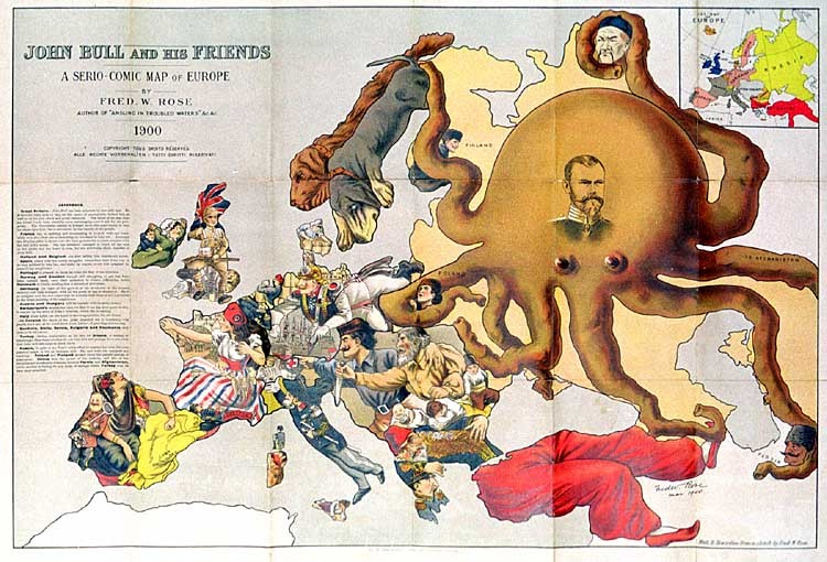
John Bull and his Friends - A Serio-Comic Map of Europe (1900), here on Livejournal.
Rose’s 1877 map is very similar to the 1900 one. But while Russia still is the offending protagonist, tentacling its way into its neighbours’ affairs, the nature and direction of some of the anthropomorphic nations has changed, reflecting an altered political landscape. Whereas France in the 1877 map is an old general aiming cannon at Germany, still frustrated by its recent defeat in the Franco-Prussian war of 1870-’71, France in 1900 is Marianne, dressed in the revolutionary colours, looking away from Germany, and toward Britain. A like-for-like comparison would lead us too far, but the legend of Rose’s 1900 map provides some explanation:
Great Britain - John Bull has been attacked by two wild cats. He is however able to rely on the stores of ammunition behind him, as well as his own pluck and great resources. The letter at his feet from his friend Uncle Sam, would be more encouraging were it not for the post-script. The Nationalist section in Ireland has taken this opportunity to vent his abuse upon him, but is restrained by the loyalty of the people.
France too, is scolding and threatening to scratch with one hand, while with the other she is beckoning on Germany to help her. Although the Dreyfus affair is thrust into the back-ground she is much occupied with her new doll's house. She has somehow managed to break all the toys on her girdle and her heart is sore, for she attributes these disasters to John Bull.
Holland and Belgium are also calling him unpleasant names.
Spain, weary with her recent struggles, remembers that John was in no way inclined to help her, and looks up hoping to see him attacked by some of her neighbours.
Portugal is pleased to think he holds the Key of the situation.
Norway and Sweden though still struggling to get free from their mutual leash, turn their attention to John's difficulties, while Denmark is kindly sending him a present of provisions.
Austria and Hungary will be content with dreadful threats
Switzerland's satisfaction that her Red Cross has done good service, is marred by the news of John's victories, which she is reading.
Italy alone holds out the hand of encouragement to his old friend.
In Corsica the shade of her great departed son is wondering why people don't act, as he would have done, instead of growling and cursing.
Turkey, resting comfortably on his late foe Greece, is smiling at the thought that these troubles do not harm him and perhaps he is not sorry that John will not come to much harm.
Russia, in spite of the Tzar's noble effort to impress her with his own peaceful image, is but an octopus still. Far and wide her tentacles are reaching. Poland and Finland already know the painful process of absorption. China feels the power of her suckers, and two of her tentacles are invidiously creeping towards Persia and Afghanistan, while another is feeling for any point of vantage where Turkey may be once more attacked.

A Humorous Diplomatic Atlas of Europe and Asia (1904), here on ffffound!
This map, published in 1904, is an interesting, non-western take on the LCO. It was produced by Japanese student Kisaburo Ohara at the beginning of the Russo-Japanese War. The text box on this Humorous Diplomatic Atlas of Europe and Asia reads:
‘Black Octopus’ is the name newly given to Russia by a certain prominent Englishman [i.e. Fred W. Rose]. For the black octopus is so avaricious, that he stretches out his eight arms in all directions, and seizes up every thing that comes within his reach. But as it sometimes happens he gets wounded seriously even by a small fish, owing to his too much covetousness(sic). Indeed, a Japanese proverb says: “Great avarice is like unselfishness.” We Japanese need not to say much on the cause of the present war. Suffice it to say, that the further existence of the Black Octopus will depend entirely upon how he comes out of this war. The Japanese fleet has already practically annihilated Russia’s naval power in the Orient. The Japanese army is about to win a signal victory over Russia in Corea & Manchuria. And when… St Petersburg? Wait and see! The ugly Black Octopus! Hurrah! Hurrah! for Japan.
Where Rose’s octopus spread its tentacles only on the western edge of the Russian empire, this Japanese version aptly illustrates the true, bi-continental nature (and reach) of this giant country. In Asia, it is reaching across China via Manturia (sic) into the Yellow Sea near Korea - where the Russians maintained a naval presence at Port Arthur, the site of their great defeat in 1905 [5]. Three Asian tentacles are further engaging Tibet, India, Persia and Turkey - all part of the so-called Great Game, Russia and Britain’s struggle for dominance in Central Asia.

The Prussian Octopus (1915), here at the University of Toronto Map & Data Library.
Whether imperial, soviet or post-communist, Russia is a favourite subject of octopodal cartography. So was its near-namesake, Prussia. A CLO map of the German Empire’s core state was discussed earlier on this blog [2]. Here is another one, dated 1915. The rather comical head of this Prussian Octopus is centred on Berlin, and its tentacles are scraping together extra territory from the general neighbourhood.
“We do not threaten small nations,” declared the German Chancellor on December 10th, 1915: “we do not wage the war which has been forced upon us in order to subjugate foreign peoples, but for the protection of our life and freedom.” The pictorial map is a commentary on his words. It shows how Prussia has stolen one province after another from her neighbours and, like a baleful octopus, is still stretching out her tentacles to grasp further acquisitions. The territories included in the original Kingdom of Prussia are marked [dark grey]. The territories since absorbed to negotiation, force, or fraud are marked [light grey].
The list of provinces acquired by Prussia, each draped with a tentacle, reads:
The voracious Prussian octopus has a playmate to the south, although the Prussian tentacle around the Austro-Hungarian’s rather doleful-looking head might indicate that the two monsters are frenemies rather than BFFs. Be that as it may, the relationship between both octopi seems responsible for the spread of Austro-Prussian expansionism into the Balkans:

How Communism Works (1938), here at Vulgar Army.
The CLO need not necessarily symbolise a classic, territorial threat. Ideologies are easy targets for octopus-based propaganda: poisonous creeds have mental tentacles - invisible, and thus more dangerous. This stark, alarming illustration is the front page of a pamphlet by the Catholic Library Service (1938). It portrays communism as a hydra with the face of Stalin, and its tentacles curling around Spain (the Soviets had been heavily involved on the - losing - Republican side of the civil war), extending also towards the US.

Confiance... ses amputations se poursuivent méthodiquement (1942), here at the Victoria and Albert Museum's digital collection.
The CLO itself is ideologically neutral, a gun for hire to each side of the argument. Here, we see the octopus used against the West. This propaganda poster, produced in 1942 by the pro-German Vichy government in France, shows Churchill as the head of a wounded octopus, its bleeding tentacles chopped off by the superior forces of the Nazi Axis. The locations evoked here are the sites of Allied military action against the Vichy-French, causing French casualties. The poster tries to rally French sentiment against the English - also by implying that the Anglo-American Alliance will use the war to steal the French colonial empire, a large part of which was situated in Africa. It also gives the impression that the war is going badly for the Allies, stating:Confiance, ses amputations se poursuivent méthodiquement (‘Have faith, [Churchill’s] amputations are progressing methodically’]. Just a matter of time before the Axis wins the war...
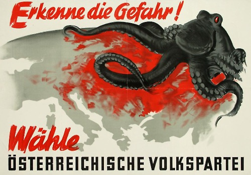
Erkenne die Gefahr! (1949), here at Vulgar Army.
The end of the war hardly means the end of the octopus. During the Cold War, great ideological chasms remain, large enough to fit a giant squid. In 1949, the conservative Oesterreichische Volkspartei exhorts Austrian voters with this poster to Recognise the danger! More words are unnecessary, the message is clear: the ominous, blood-sucking octopus advancing from the east is the spectre of communism, which has just gobbled up large parts of Eastern Europe [3].

Non! La France ne sera pas un pays colonisé! (ca. 1950), here at Vulgar Army.
Approaching from the opposite direction,both geographically and ideologically, is this American octopus, ready to devour France and all its Frenchness. This time, it's the (French) communists appropriating the evil octopus trope for their political purposes.

United Underworld (1966), here at Indie Squid Kid.
The voracious hydra returns in self-parody rather than as geopolitical satire in a 1960s Batman movie with Adam West and Burt Ward as Batman and Robin. The Caped Crusader is facing a cartel of his four worst enemies (the Joker, the Riddler, the Penguin and Catwoman). This United Underworld has its own logo: an octopus strangling the globe.

Russia in 2008, here at Toon Pool.
The CLO made a full circle of sorts in 2008, when Graeme Mackay, a cartoonist for the Hamilton Spectator, a Canadian newspaper, updated the earliest octopus maps to show Putin again as a Russian hydra. In this period, a newly-resurgent Russia was reasserting its influence in the ‘near abroad’, i.e. those now independent republics that had been under Moscow’s sway until the end of the Soviet Union in 1992. By adapting a cartographic cartoon with a pedigree of over a century, Mackay proved the viability and adaptability of the Cartographic Land Octopus, which continues to stretch its tentacles across the globe to this very day.
Many thanks to all those who sent in octopus-based cartography, including Sarah Simpkin (the Prussian Octopus) and ArCgon (the Russian Octopi from 1877 and 2008).
Special mention should go to Vulgar Army, a fantastic website I discovered while researching this post. It’s dedicated specifically to Octopus in Propaganda and Political Cartoons, and is the source of many of the maps in this post. Check it out for extra helpings of maps and even more cartoons - all octopus-based. If it exists in the real world, there is a community obsessing about it in cyberspace: Vulgar Army’s blogroll refers to a dozen other websites devoted to octopi and other cephalopods.
---------
[1] Some examples discussed earlier on this blog: #141, #162 and #473.
[2] See #510.
[3] At that time, the Soviets were still occupying the eastern bit of Austria itself; Vienna was divided in Allied sectors much like Berlin. This may explain the wordless reference to the communist threat. The Soviets withdrew from Austria in 1955, on condition of the country’s enduring neutrality. The movie The Third Man (1949) provides an atmospheric sketch of the situation in ‘Four-Power’ Vienna.
Frank can be reached at strangemaps@gmail.com.