« Proposed Activity for Video on the Web | Main | alt attributes authoring practices »
Is your (mobile) browser ready for the Web?
I co-chair the Mobile Web Test Suites Working Group: this group aims at improving the interoperability of browsers on mobile devices through the development and the diffusion of test suites for Web technologies that work on mobile devices.
Karl mentioned before on these pages one of the tools we have been developing, but I would like to focus today on our most recent (and rather exiciting) deliverable: the Web Compatibility Test for Mobile Browsers.
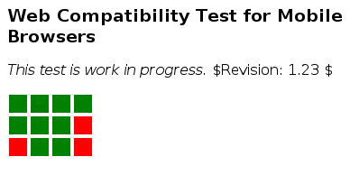
That test, in the same spirit as the ACID tests, combines in a single page tests for 12 Web technologies, ranging from well-deployed (but often poorly implemented on mobile devices) technologies such as HTTPS and PNG, to technologies we believe will matter in a year or two (like SVG animation and CSS Media Queries).
Tests are visualized by squares, sorted roughly in order of difficulty (first line, well-deployed technologies, second line, technologies increasingly used today, third line, technologies for tomorrow), and a browser needs to render each square in the same tone of green to pass completely the test - which as far as I know, no currently released browser (on mobile devices or elsewhere) does.
Enough words, everybody wants to see pictures, so here come a few screenshots of the test rendered in a variety of browsers:

Blazer 4.3.2.1

Opera Mini 4.1 beta 1

PSP's Netfront

Android emulator webkit-based browser
Firefox 3 beta 3

Internet Explorer 6
Test design
- So, what's the guiding idea behind this test?
- To make it easy to spot at a glance how ready for the Web your browser is; given that we target in particular browsers installed on mobile devices, the test needs to be fairly quick to load, not too large in dimensions, and surveying a range of technologies that are relevant on mobile
- How does it relate to the ACID tests?
- The ACID tests were clearly an inspiration for this test, but there are some significant differences:
- the test doesn't try to detect specific bugs in well-known browsers - a rather large tasks on mobile devices where the number of browsers remains much larger than on dekstop computers -, it simply helps visualize rough support for a given technology;
- the test is mobile-friendly in its dimensions and weight, allowing it to give meaningful results on a wider range of devices.
- Couldn't you find a better name?
- No, actually, we couldn't! We thought about calling it a "mobile ACID test", but since it is not an ACID test, we preferred something more descriptive of its real nature; but we're very interested in better suggestions!
- Why is X in there? Why isn't Y in there?
- While we have documented the reasons of our choices of technologies, we're very much open to suggestions for modifications, additions, and improvements (especially in the form of concrete markup to add in the test); so please send them in to our group list public-mwts@w3.org (publicly archived)!
Running the test
Running the test is as simple as pointing your browser to its address, namely http://dev.w3.org/2008/mobile-test/test.html.
Entering an address is a pain on a phone? Quite often, indeed, so a couple of alternatives to save you a bit of that pain:
- if your phone has a camera and a QR code reader (which you can probably find out on your preferred search engine), you can point your camera's phone to the following code, and it will open the right page in your browser:
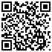
- otherwise, here is a shorter equivalent URI for the test:
http://tinyurl.com/37e33p
Contribute!
Want to help us with this? Here are a few ideas of how you can contribute to the impact of this test on interoperability:
- run your test on your browser and send a screenshot to www-archive@w3.org (publicly archived) with the name and version of the said browser; we'll add submissions to our screenshot galleries; to get a screenshot of your phone in action, you can either use a screenshot application on your phone if it has one, and if it doesn't, you can simply take a picture of it with your camera :o)
- Kai Hendry has started posting screenshots on Flickr, so if you're about to do the same, make sure to use the same
wcttag; - send suggestions for additional tests, or improved tests, or more generally, feedback on the selection of tests to our group list, public-mwts@w3.org (publicly archived), or simply on as comments below;
- simply talk about this test around you, in your blog, to your prefered browser vendor, etc.; the more visible this test goes, the more likely it is to have an impact on browser vendors!
Filed by Dominique Hazaël-Massieux on April 16, 2008 6:58 AM in W3C・QA News
| Permalink
| Comments (11)
| TrackBacks (0)
Comments
Looks interesting. One more battle zone.
Opera 9.5 Nightly passes them all, as is just as "released" as Firefox 3 beta 3
The WebKit-based S60-browser on my Nokia E70 fulfills only half of the criteria in this mobile-test. Squares 5,7,8 and 10,12 are red! Yes, the M-Zine MobilePublisher has immediately announced this test.
Entering an address is a pain on a phone? -> Opera Link
How did you manage to test Firefox?
If it's the desktop version, then Opera 9.27 passes all but one. 9.5 passes all.
Nokia N95 (classic) with v20.0.015 firmware gives the same result as MobilePublisher's E70 - ie 5,7,8,10,12 are red. Squares 1 and 2 have a slight multi-coloring on their right hand edge.
I've published an update on the collected results so far on the MWI Team blog: http://www.w3.org/blog/MWITeam/2008/04/22/firstresultsofwebcompatibility_test
Opera Mobile 9.5 beta build 405 is the best yet (Screenshot). Their new beta is amaaaazing, can't wait for the final!
It's a little fuzzy, used my Cell phone to take a picture of my PDA...(what a twisted world we live in) But here is a screenshot of my Nokia n810 running the test. 5 squares come up red, 7 green, no odd colored ones.
Interesting side note.... When I used the zoom feature on the n810 and changed the zoom to more than 100% i got different results. at 120% the second box in the first row became mult-colored, at 150% the second box in the third row was 50% larger than the other boxes. 180% the second box in the third row was large enough to cover the box on its right.
Leave a comment
Note: this blog is intended to foster polite on-topic discussions. Comments failing these requirements and spam will not get published. Please, enter your real name and email address. Every individual comment is reviewed by the W3C staff. This may take some time, thank you for your patience.
You can use the following HTML markup (a href, b, i, br/, p, strong, em, ul, ol, li, blockquote, pre) and/or Markdown syntax.
I've been told that Opera 9.5 and Webkit nightlies pass all the tests (although I'm not sure they count as "released" browsers).